HOME | DD
 DaveWhitlam — Contemplating Pebbles - paint

Published: 2009-09-19 22:31:48 +0000 UTC; Views: 1538; Favourites: 45; Downloads: 65
Redirect to original
Description
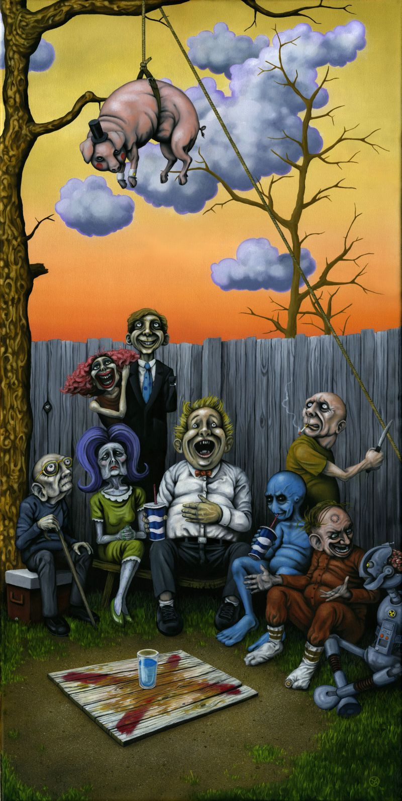
Oil on canvas 50x70cm. Based on an earlier digital image.Related content


Comments: 13


nice to see a spot of colour in your work, excellent stuff!
👍: 0 ⏩: 1

Thanks - about time I did something colourful!
👍: 0 ⏩: 0


Thank you. It's probably the brightest and most colourful painting I've done so far.
👍: 0 ⏩: 0


i have checked out the first appereance of the admiral after nemi-san mentioned here, and i would go with this version, maybe its because i have seen this one first.. don't know.
very authentic ..
beautiful.
👍: 0 ⏩: 1
Thanks - there was certainly more work put into this version, but in a way it's lost some of the character of the original drawing. I've got a lot still to learn about painting in oils, so it's more challenging/rewarding than photoshop at the moment - glad you like it!
👍: 0 ⏩: 0

I liked your old version more even if there's more details in this piece, and it also made me notice details I didn't see in the old version (by some reason, I've never seen the boat before, but when comparing the pictures I realised that it was there, all the time). The reason why I liked your old version better is that I enjoyed the smile on the old man's face, and the fact that the old version was a bit "blurry" and not as sharp in textures and lines as this one. While the other one resembles harmony in being yourself to me, this makes me think of some kind of sadness.
Still, that doesn't mean that this is bad work! It's beautiful still.
👍: 0 ⏩: 1
Thanks - I actually hadn't noticed how much the smile had changed until you mentioned it - and you're right, this version is much sadder looking than the original. I never set out to perfectly reproduce an image when creating a painting, so the paint tends to dictate it's own moods and embellishments. I'm not sure which I prefer of the two versions, but I like the fact that they're both different.
👍: 0 ⏩: 0