HOME | DD
 DavidDeb — Dae darklight WIP

#daenerys #game #thrones #desbois
Published: 2014-09-03 22:01:24 +0000 UTC; Views: 1571; Favourites: 54; Downloads: 0
Redirect to original
Description
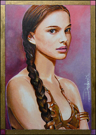
Just a word on how I deal with 'darklight' portrait type when a part is quite dark and a part very light.So I colored the face in royal blue bout where it's needed, it's not perfect, far from it.
I find it better to usually go very strong in color from the start even if it looks like it won't be ok at all
 (Smile)") see first pic, you'll understand
see first pic, you'll understandThen you go with the colorless blender and the supply bottle to keep it quite wet moving the color away as you want.
After you are satisfied, you can redo your bordering lines with a prismacolor premier pale blue that will easy color over dark surfaces and even correct some parts to diminish the royal blue value. That's the hardest part, doing dark color in a face is always a bit tricky.
Related content


Comments: 6

I love this image because you get to see how you create it. Your work seems even more amazing now
👍: 0 ⏩: 0


I'm always impressed on how great pieces of work look like at the early stages. It's almost impossible for my mind to comprehend the process...which certainly is a compliment. Even better to know that you use Prismacolor markers.
👍: 0 ⏩: 1

I think the reference to Prismacolor Premier pale blue wasn't reference to a marker:
images.utrechtart.com/products…
👍: 0 ⏩: 0