HOME | DD
 Davidgtza2 — Epic Logo Challenge Entry
by-nc-nd
Davidgtza2 — Epic Logo Challenge Entry
by-nc-nd
Published: 2008-10-15 00:26:26 +0000 UTC; Views: 3000; Favourites: 32; Downloads: 59
Redirect to original
Description
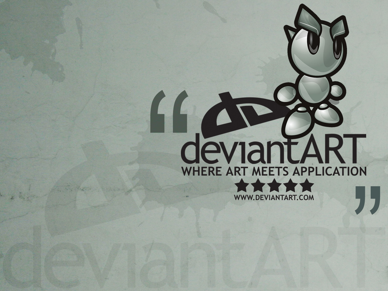
I sketched out some logos right after the contest was announced, i just hadn't actually done any in the computer. Anyways, pretty much every idea sucked and this is the only one that i actually liked.Its supposed to be uneven too.
(fella's head is from fella's official file)
PS. The logos look like they're bad quality, these are 100% vector, made in illustrator but when i transferred them to photoshop they kinda lost quality
Related content


Comments: 15

do you know how to get to the dA page(NOT the home page the account page)
👍: 0 ⏩: 0


👍: 0 ⏩: 1
")

It has a lot of character, and I like the tilt! It's one of the few really good designs I've seen in this contest. :3 Good luck
👍: 0 ⏩: 0

Yeah but they're not new, i never erase them
👍: 0 ⏩: 1

I do'nt know if you want any suggestions? But im going to say one thing =] The D looks a little like an backwards h, maybe if it went down a bit more? just saying =]
Other than that, its really great!
👍: 0 ⏩: 1
crap, you're right... ")
👍: 0 ⏩: 1
Sorry! just trying to help you win! lol
👍: 0 ⏩: 0

