HOME | DD
 DavidHakobian — Jagged Lands
by-nc-nd
DavidHakobian — Jagged Lands
by-nc-nd

Published: 2011-06-14 10:30:35 +0000 UTC; Views: 1534; Favourites: 50; Downloads: 45
Redirect to original
Description
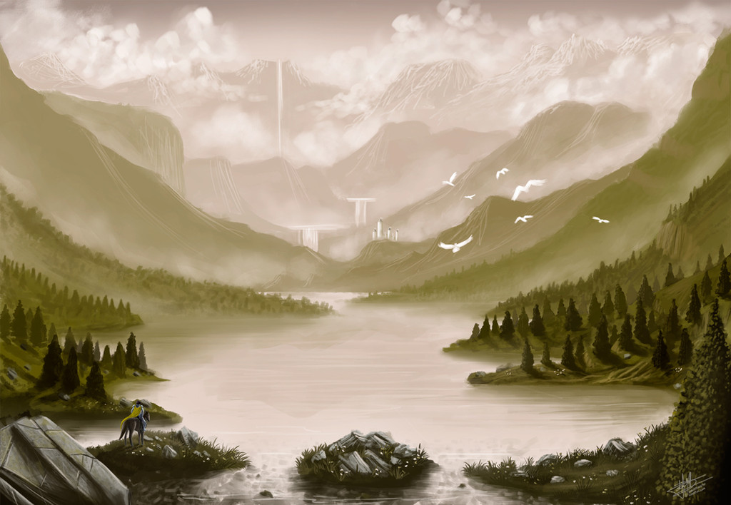
Photoshop + Trust tabletcomments & critiques are welcome!
Related content


Comments: 37


Stunning! Possibly my fav of your works. Just wish it was bigger.
👍: 0 ⏩: 1

I'm really glad you like it Simon.  (Smile)")
👍: 0 ⏩: 1
I understand. I just find the texture, lighting and mosaic effect you have on the formation to the left of the image. So pleasing on the eyes and i think it would make a fantastic desktop wallpaper.
👍: 0 ⏩: 0


Cool design , I like the style you paint in !!! But you should work on your water... coz right now it doesn't look like one...
👍: 0 ⏩: 1
Hey I've seen your works on Artists Arena! Thank you for your comment! Yeah, I need to work on a lot of things in general...
👍: 0 ⏩: 0

Wonderful design of the rocks! It looks like some anchient temple and those birds are the guardians of the holy shrine or something like that
Beautiful picture!
👍: 0 ⏩: 1
Thank you very much for your comment!
👍: 0 ⏩: 0

Thank you, I appreciate it!
👍: 0 ⏩: 0

I'm here to the return the favor, and I hope what follows will be useful to you too ")
The mountains are quite well rendered, and they occasional irregular shapes keeps monotony at bay. The structures design is also quite nifty looking. A more gradual shift between the more rendered stonework of the main body and the mosaic like wings could integrate the effect a bit more, but that may be a matter of taste. Also on the topic of rendering, I find the clouds a little flat. They are so close to your well rendered mountains that their lack of volume seems too abrupt. Some very subtle highlights to give the clouds some body, especially close to your peaks, would quickly fix that
Now, onto my specialty, composition. I don't always follow my own advice, but that hasn't stopped me thinking about it
These aren't rules as such, just some knowledge mixed with personal opinions. The landscape format gives a very peaceful impression. Unless you put some serious tilt into it or very strong points of view with disruptive forms, peaceful is what you'll get. It's good for an overall view and to give an epic scale of a landscape. The key here is landscape. Even quite big objects, unless very skillfully placed, won't seem that big. They won't loom at the viewer.
For you work, this is the easiest one to develop further, because you just have to add some stuff and not start from scratch. Now the next question is, what do you want to look epic here, the structure or the landscape? If the landscape, go more panoramic. Expand the horizon we see and show us this desolate and jagged place. And with extra canvas you can also sneak in something to balance out that tail.
If it's the structure you want to showcase though, I think one way would be to frame it more. It would need a bit more canvas space, and some closer shapes so you can build a frame. Rocks, shadows and stones seem to be what you've got for making that frame. Some more foreground could also put more depth into the image as well as serve as part of the frame. A cave opening is one way, but you don't have to go that far to make such a frame. Some close boulders and foreground should be enough. You can also use one of those shapes to balance out the tail. Basically, we are giving the viewer a more specific location, and compare the scale of that to what it's framing. I often end up thinking of Petra on this, which is a decent example. [link] and this [link] (where it's framed and I'll have to admit, partly obscured, by shadows)
And from our own DA, some beautiful examples of framing
[link] [link] [link] [link] [link]
Another option is to do both, and just make your frame encompass more.
As for the trickier alternatives, you have portrait and other more verticual canvases. If you want your structure to loom at the viewer, we'd have to stand a lot closer to it, and maybe even look up. Here are some examples of such looming [link] [link] [link] [link]


👍: 0 ⏩: 1
Thank you so much for this wonderful critique! ")
You're awesome Birgitte!
👍: 0 ⏩: 1
You're very welcome
👍: 0 ⏩: 0

Very nice texture! I love the setting and scene! Cryptic... I love it!
👍: 0 ⏩: 1


Wow, you've got a really great conception - the pic really caught my eye
I love the strong shading of some parts. Generally, I like shading at all - it somehow reminds me Dali's Persistence of memory ^^
👍: 0 ⏩: 1
Thank you for your kind words! It's really cool that it reminds you such a great painting!
👍: 0 ⏩: 0

…Monkey Applauds you, as do I !
Beautiful linear work, great composition and use of colour…Awesome Work!
👍: 0 ⏩: 1
Thank you for your time! I'm glad you like it!
👍: 0 ⏩: 1
David!
The proficiency you have with a modern media,
your gallery has in many cases have astounding compositions,
you have a great eye for detail, and awesome use of colour!
…My friend!
It was my Pleasure!…..
👍: 0 ⏩: 0

Very nice and clean, the ligh effects are really smooth and the whole concept blends together nicely.
👍: 0 ⏩: 1
Σε ευχαριστώ για τα καλά σου λόγια!
👍: 0 ⏩: 1


Such an interesting looking landscape... I wonder what kind of forces would sculpt the earth like that.
👍: 0 ⏩: 1
Thank you! I think that it'd have been the long lasting kind, cause it'd take nature ages to sculpt such shapes...
👍: 0 ⏩: 0

This is AMAZING. It gives me the same feeling as those books with epic adventures and long journeys
👍: 0 ⏩: 1
Thank you!! It was my intention to make the viewers feel that way, so it's nice to know that you felt it!
👍: 0 ⏩: 0

I like this. It has a wonderful mosaic feel to the focal point. I think if you seperated the river bank and mountains that follow around on the right (behind the focal construction) with some atmosphere it would give a much better impression of depth of field. good work though.
👍: 0 ⏩: 1
Thank you very much for the feedback Chris. I had some thoughts of adding some atmospheric fog around and behind the focal point, but then I thought that it might separate it from the background too much...I'll give it a try though, according to your advice and see how it'll look.
👍: 0 ⏩: 1
yeh it should work- not too much just enough to haze the background details a little. it works better with a blue sky- but should be fine.
👍: 0 ⏩: 0