HOME | DD
 decline — Capturing

Published: 2004-11-04 07:14:47 +0000 UTC; Views: 2596; Favourites: 22; Downloads: 1010
Redirect to original
Description
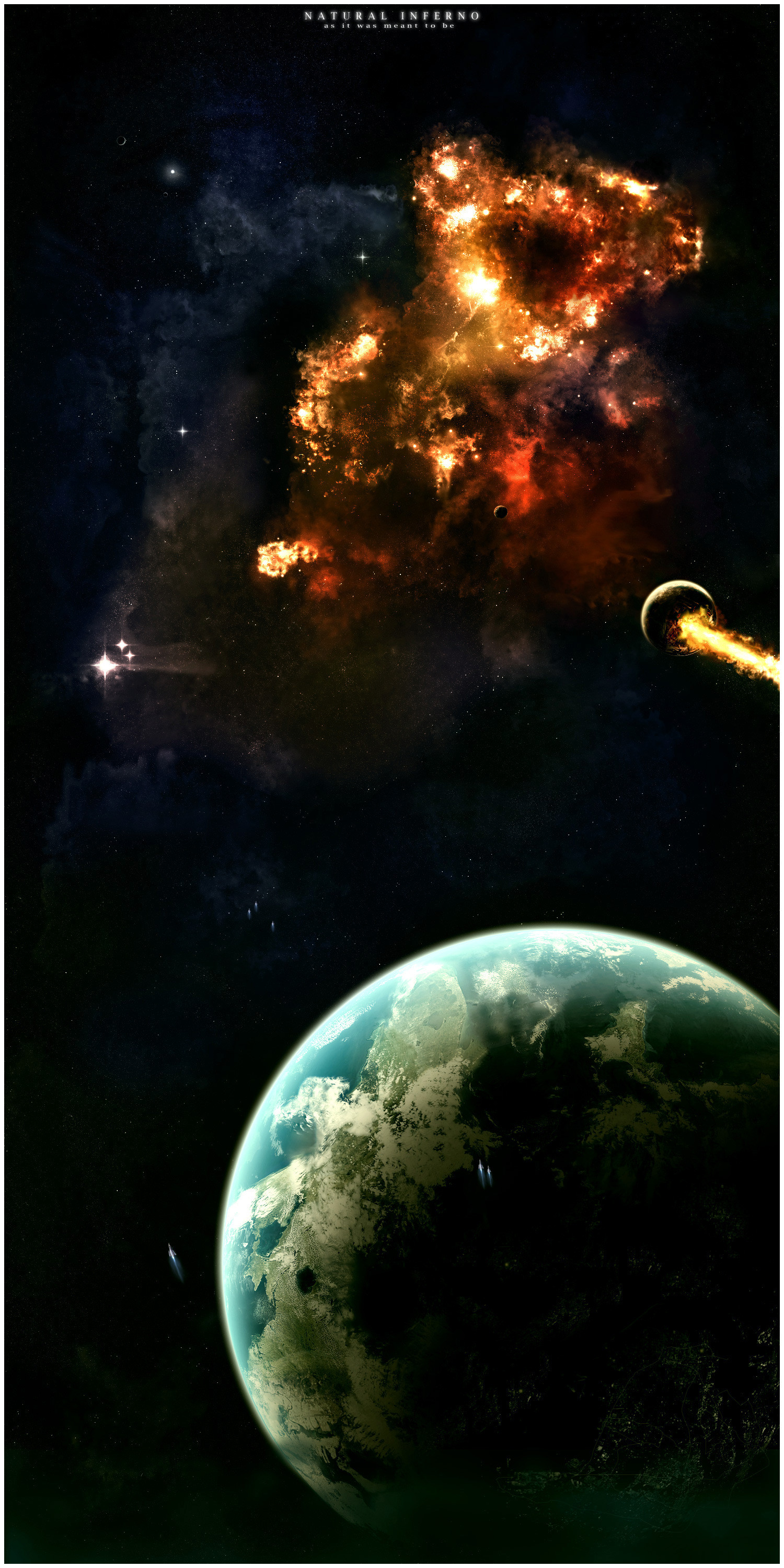
<A more normal space pic, tried to focus on depth and some(!) reality, not overblown nebulas..
Tell me what you think. Does it look real or too much photoshop alike?
Related content


Comments: 25

wow that is awesome man! great texture, lighting and DEPTH! great job! keep it up
shadowmann

👍: 0 ⏩: 0

DON'T CHANGE A THING!!!!!!! a....amazing......o_.
👍: 0 ⏩: 0


I think if the clouds/nebulas had a bit more texture to them (cloud-like texture) they wouldn't look so computer-y.
Other than that it's pretty good!!!
👍: 0 ⏩: 0

Simply beautiful. It has just the right balance of dark and light; very inspirational, too.
👍: 0 ⏩: 0

nono keep in the white frames. They bring out the lighter colors in the picture. Some subtle shades of pink would add to it, but its just breathtaking as it is. Bryce? Never used the program, but heard its complicated. I envy your digital skills.

👍: 0 ⏩: 1

Thanks.
Bryce is not that advanced, at least compared to other 3D landscaping programs. It's not any good for modeling, but works fine for landscapes.
👍: 0 ⏩: 0

remove the white frame, it's annoying on the screen
very nice composition
")
👍: 0 ⏩: 1
I kinda like white frames. But if the viewers don't like them I might just drop it.
👍: 0 ⏩: 0

i like this..very nicely done..keep them comming
👍: 0 ⏩: 1

nicely done Although in honesty, could introduce a few more colours
 (Wink)")
👍: 0 ⏩: 1
I actually had some explosion coloured colours in it at first, but it kinda screwed the whole feeling of depth and stuff. In my opinion.
👍: 0 ⏩: 0

Gorgeous - just the right balance of dark and light - not too much detail but there is definitely enough - lovely colour!
Og.
👍: 0 ⏩: 1
I tried to find the right balance, I dont know how it went, but its nice to see you think I succeed..
👍: 0 ⏩: 0

")

hi m8, you're doin real nice works. really your works are great.

👍: 0 ⏩: 1
")

 (Smile)")
Thanks!
Maybe there are other species, it is a huge space, but we might want to solve our own problems before thinking about other species?
👍: 0 ⏩: 1
