HOME | DD
 Deems — Is it really so Vindiktiv?

Published: 2006-10-12 20:48:30 +0000 UTC; Views: 1075; Favourites: 20; Downloads: 4
Redirect to original
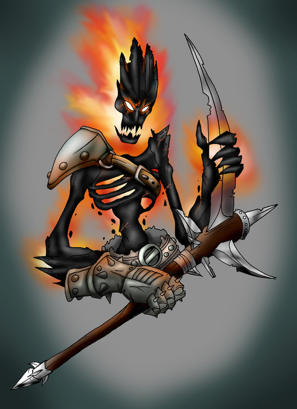
Description
This is my sword, Vindiktiv- and ice-blade with the sole purpose of ripping out organs. Designed during a slow history class, It's gone though a million and one redesigns with the only constant being it's a broadsword with a hook like a demented meat cleaver. In the end, it ended up looking pretty good (with omg perspective a bit!) and I churned out this. Now colored....fear my lacking skills! Any and all crits or compliments are appreciated, so please comment. ^^LinearT: [link]
Related content


Comments: 13


You did a good job on the perspective it's very interesting, however I got a couple of pointers for you when it comes to photoshop colouring.
Ohsobad backgrounds will never help anything. If you can't think of one/be bothered, just leave it plain white or see through, this just really ruins the image. This is mainly because the blue background is too similar to the blue streak on the sword.
Metal colouring; needs a lot more contrast. Metal is incredibly reflective so the main thing is to remember bright over whelming highlights. You've done a bit of reflection on it and it looks okay but really you could make it so much more. Naturally I recommend finding some real metal and staring at it a while. Even try drawing it in pencils to get a feel of the shading.
The hilt; It looks quite good, but perhaps make it less black on the shadow side or add more shading on the other side to balance it a bit.
The blade; You'll never find a pure black living thing anywhere, so it's kinda unrealistic to draw it. This black needs some depth and highlights/shadow. Blacks an incredably hard colour to make work, most painters mix a primary colour in to balance it out and I suggest you do the same. Also the blue streak.
while, I really like the shape of the blue thing. It kinda seems like you decided to do flat colours for the piece then changed it later on. Gotta keep things consistant. The blue needs some deepth, same way as the others.
You're going okay for a beginner, but I advice you go search for some tutorials and try to learn some tips on their colouring styles and such.
I hope I haven't been too hard on you. Good luck with future work.
👍: 0 ⏩: 1

o.o
That is the most in-depth comment I think i've ever received. Thank you a million times over! I'll take all of your' ideas to heart, searching for tutorials and getting rid of black included.
👍: 0 ⏩: 1
No worries, I like commenting. I saw your work at the Tavern and figured you wouldn't mind some blunt comments.
I've joined theTtavern so you'll see me looking around and commenting at your work more.
👍: 0 ⏩: 1
Ooh, makes sense. ^.^ crit is always appreciated by my betters.
Cya' round!
👍: 0 ⏩: 0

noice color and I still like this sword. all is cool.
👍: 0 ⏩: 1
")
ty Ryan, sir
👍: 0 ⏩: 1

I like it. ^^ Nice highlightyness on the gold bits. If I might make a suggestion, using dodge on the highlight setting might make some brighter shiny bits if you want them.
👍: 0 ⏩: 1
I tried, its what i did, actuially..but i took it away cause i couldnt make it look like the right Kind of shiny. >>
👍: 0 ⏩: 0

that loos sweet....totaly diggin the coloures......if you had used a contrasting coloure for the background it would stand out a lot more dude....but thats all thats bad i think....and since ure just starting with digital stuff i think its is awsome keep at it and ull go far my friend
👍: 0 ⏩: 1
Lol..thanks man. Means alot. I might make a background with Yellow or some other warm color since they'll contrast...see how it looks.
thanks for the imput!
👍: 0 ⏩: 1
no probs...and if ye whan to know more about contrast just get a trust coloure wheel out....the oposit coloure contrast were as coloures next to eachouther work togeather
👍: 0 ⏩: 0