HOME | DD
 Deepblu742 — Tethered Outpost Closeup 2
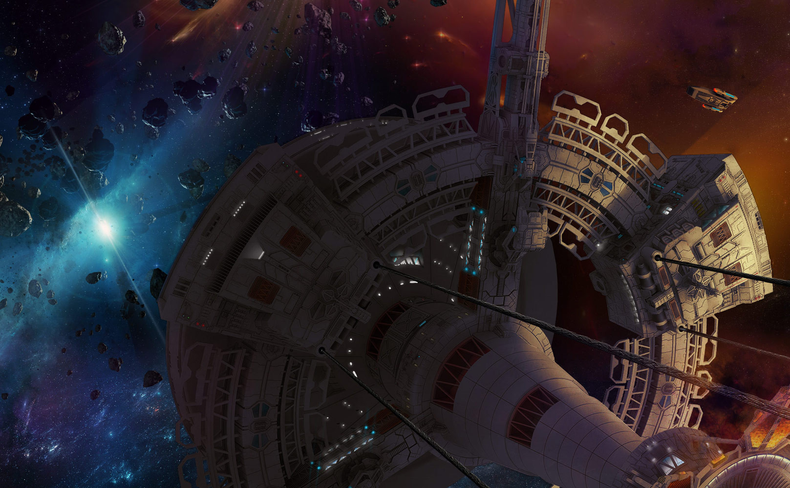
Published: 2012-07-17 04:41:30 +0000 UTC; Views: 1069; Favourites: 9; Downloads: 45
Redirect to original
Description
Yep, the full work is here: [link]Related content


Comments: 8

I LOVE the compositing, The only thing is that the station does not feel real. I think that the faces of the model look too flat.
👍: 0 ⏩: 1

The station was a flat gray monotone clay render I brushed to provide every shadow & light you see, I initially did it with one light source, giving it a dusty muted brown hue from all the space dust it might have accumulated. Your comment is definitely valid, perhaps adding a second ambient light source would give it more depth? I'll remember that for possible future update, thanks!
👍: 0 ⏩: 1
I have been thinking about this picture and the bigger version. I had no idea that much work goes into these kinds of art.
I think I have narrowed what make it feel wrong down to 3 things:
_1. The cone/cylinder - It has a realistic gradient but does not feel real, I think that diffident color panels should make it up Ex. [link]
_2. The Lighting - You put so much detail in the darker areas, but our eyes are drawn to the light. But the light is not in the 1/3 lines so it feels awkward.
_3. The Nebulae - In the bigger picture, the nebulae is all around the edge and adds too much noise making everything seem busy. It reminds me of Video Copilot's PERFECT Composting: [link]
_Hope Everything helps and you don't thing I am too pushy or anything
👍: 0 ⏩: 1
Wow well, shiver me timbers, a honest critique on dA! Ok, I'll field your thoughtful points in kind:
_1. Ya know, I had hope for more texture/grit/panel maps for the more bland areas of the station but time constraints nixed it, sadly...just like paid projects...as much I love fantasy projects for the infinite time & Da Vinci styled perfection, the real world (like my job, enjoying life outside a computer display) Simply limit my max involvement in a piece. Perhaps your best critique is where & how to maximize my time? Like focusing on near objects than background elements, then I hear you.
_2. True, I did really love the dark lighting but I thought the chaos around the station would be the focus. Guess in your case, my friend, I was wrong  (Smile)")
_3. Being a nebulae, not so much. My thought process for it: The alien ship emerges from the outer haze of a gaseous planetoid that the Federation station is "tethered" to. Picture the viewer looking up from the outer edge of the atmo to see the edges of gas. Sadly, my skills weren't adequate to visually transmit the specular depth of this other than the blue lightning traveling within.
You're right Raf, it was a burly amount of work, this alone took a more than a few months over various nights to fully realize, so much trial and error, mostly because I made this to be a print monster, 40x20 inch @ 300 dpi so it demanded more effort than most who crank out widescreen monitor size...I thank you for taking the time to really dive into this bro, it means a lot! 
👍: 0 ⏩: 1
No matter how many times I say it, "Amazing detail" will never suffice
_2. The Dark Lighting does add, It is just the parts that are too bright that take away. There is so much detail in the picture, Some bringing focus on the station. But once I look there all the brighter parts like the atmosphere and the planet want me to look away.
_3.I see what you mean. I think that the atmosphere is a little flat and might be too colorful. Also, the reason I thought that it was a nebula was because it looks liketiur.
And Just for the record, I know far less that you, and could never pull off something this nice.
- Hope it helps and clears up some things
👍: 0 ⏩: 1
2. Hmm, too much contrast then? Maybe more reflected ambient light from the gaseous cloud below on the shadow of the station might help.
3. Liketiur? ")
That's fine, you don't need mega-super-art skills to provide a thoughtful critique, thanks for taking the time. I'm always open to feedback & it certainly does help.
👍: 0 ⏩: 1
I would not say contrast, That section with the flare is great. Now that I think about it, I feel like the lighting is inconsistent since I can't feel/tell where the light source is.
Liketiur - *facepalm* - I have no idea what happened there - I think I was going to say that It looks like it is in the distance because the ship and the station look like they are overlaping it. The atmosphere might also look a little flat and maybe too colorful.
👍: 0 ⏩: 1
Interesting you mention it, I wanted to put in hazy lightbeams coming from the upper left through the atmo gas to show the light source placement but they looked odd, unconvincing and diminished the composition of the sky. That probably is a problem of lack of research/skill more than the idea, once again I pushed myself with the scale and number of elements in this and just ran out of time & energy. One has to set a personal limit on a piece, to prevent burn-out or creative block. My obsession to detail is pretty high, which is why I have such a small amount of work compared to others.
I gotcha, it's that overlapping station arm on the lower left that makes it look like the gas is behind it! Added to list of future fixes. *gasp* too colorful, you mean there is sucha thing?
 (Cool)")
👍: 0 ⏩: 0