HOME | DD
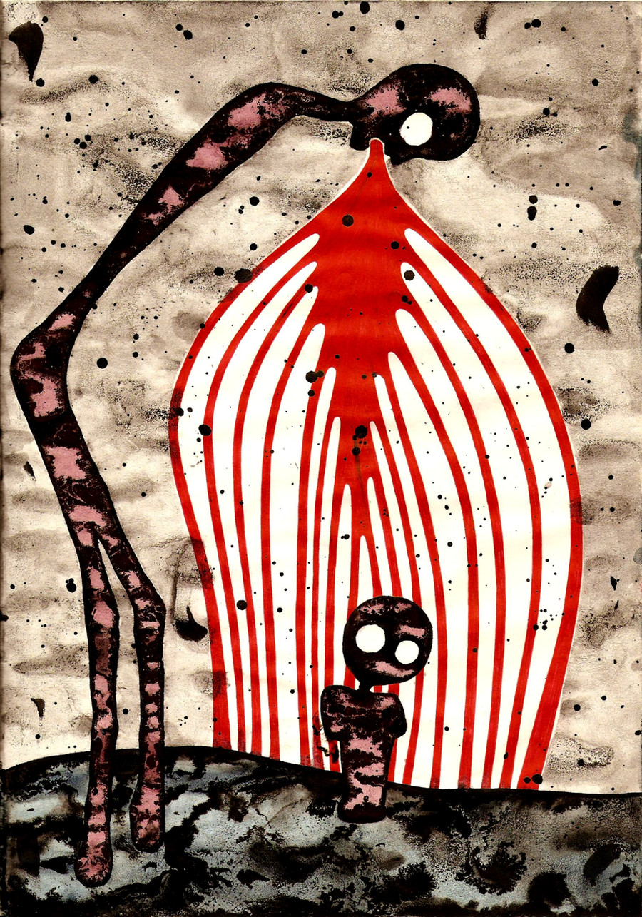
 def-jux — Blood Moving

Published: 2004-04-17 16:24:30 +0000 UTC; Views: 2406; Favourites: 52; Downloads: 481
Redirect to original
Description
A quickie in ink (Smile)")
Related content


Comments: 25


Great character. I really like the sketchy / trashy look of the piece. Well done.
👍: 0 ⏩: 0

oh
I love this
and alll your other work
I am watching you
👍: 0 ⏩: 0

that is so... dark... and .. bloody? But good work. Nice (If I can use THAT word ")
👍: 0 ⏩: 0


it somehow manages to be both something that would disturd some people and something cute.
👍: 0 ⏩: 0


A beauty in Ink. The basic simple colors and design are fabulous. Wonderful work.
👍: 0 ⏩: 0


Reminiscent of your older work, but with more depth than previously. I like it when you stick to bold primaries. This is excellent.
👍: 0 ⏩: 0

")

Nice! I love the red lines and such. great work!
👍: 0 ⏩: 0


I just can't get over your style. I love this piece - the Red is so dark - yet it stands out the most. Such a beautiful piece.

👍: 0 ⏩: 0

O_o i absolutly love it, the contrast is what grabs me most
👍: 0 ⏩: 0


i love this style...and the colors are brilliant. love the grungy macabre look here...very very nice
👍: 0 ⏩: 0

very moving.
love the darkness and emotion of this.
are the red-and-white stripes supposed to stand for something?

👍: 0 ⏩: 0


Beautiful, love the style ^_^
Glad I caught it on recent updates
👍: 0 ⏩: 0

