HOME | DD
 depthskins — Splash Advertising Concepts
Published: 2006-06-16 20:06:02 +0000 UTC; Views: 4686; Favourites: 12; Downloads: 412
Redirect to original
Description
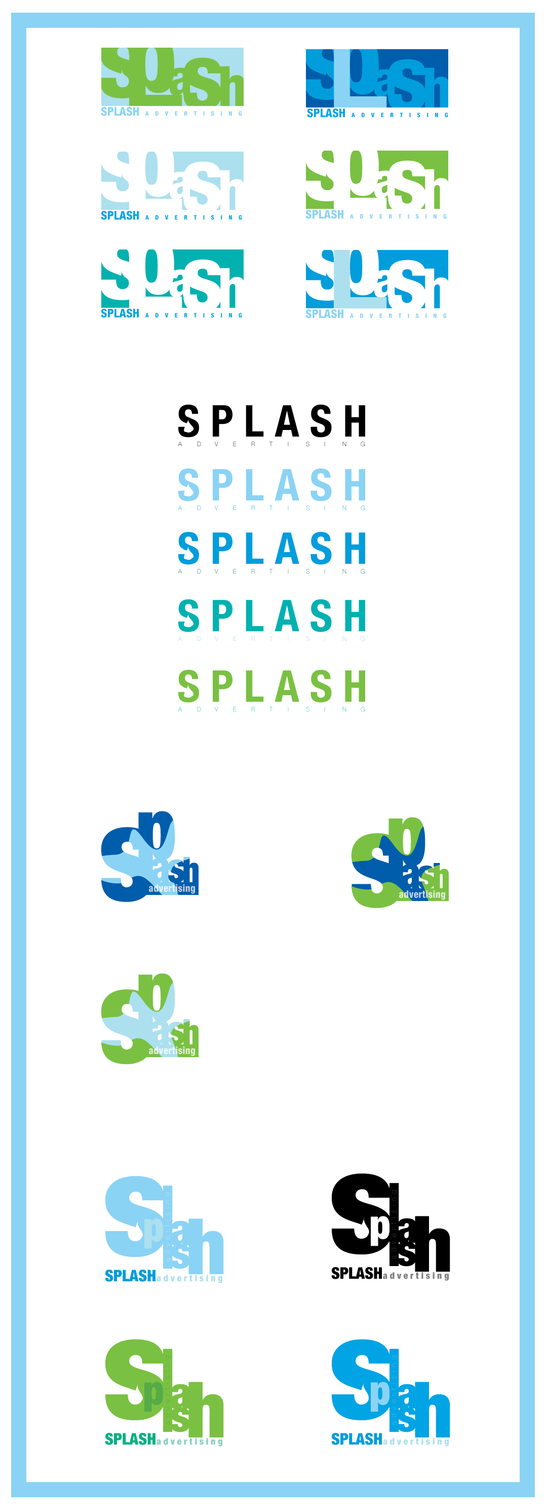
Final Project:Splash is an actual advertising agency which my lecture worked for. So, he made us develop a series of logos for splash. What you see are my concepts in which I'm pretty proud of.
Related content


Comments: 22

i liked the first one on the third package... good work
👍: 0 ⏩: 0

I like the second set, it's simple and easy to see, but at the same time it looks nice.
👍: 0 ⏩: 1

I agree. I like that one too.
👍: 0 ⏩: 0

the second concept rocks! great use of the raindrop in that one, as well as the first one.
👍: 0 ⏩: 1


")

Pretty cool.
The only thing I can see is in the second set where it appears to be a droplet within the "S", the drop seems to be hitting the sides of the lower part of the S. I don't knof it that was intentional or not.
Looks good though man, great concept and ideas. The third set is especially awesome.
👍: 0 ⏩: 0

agree with Willsq that it hard to read a word, like the last one, it is well done it's look more like Spah not Splash for me but maybe it's only me see it that way  (Smile)")
👍: 0 ⏩: 1
I agree too but I liked the concept so much I couldn't get around it.
👍: 0 ⏩: 0

Mmmm... yep, some of them will have problems with ranging. And with fax... you will not be able to read the logo after it.
👍: 0 ⏩: 0

I guess I'm not really one to critique, but if these are logos then I guess they should be really simple and easily-readable. You've got nice ideas here and good branding, but certainly designs 1 and 3 are a tad too complicated, and need to be looked at twice to take in the word, which is of most importance seeing as it is the company. Like I say, the ideas are sound as is the look, but in my opinion the type design could use a tiny bit of improvement on the designs I mentioned anyways.
Then again these are just first concept designs, so you've still got the later stages of perfecting to go I suppose.
I just felt that there's no point in just saying "amazing", as that wouldn't really help. Nice ideas though.
👍: 0 ⏩: 1
thanks alot man. That's what we need. More comments like this rather than just saying amazing. I appreciate you like it and I appreciate that more can be done. I actually know what you're talking about because when submitting it I realise for one of them I can't see 'l' but I'm over this project now. lol.
👍: 0 ⏩: 1
No problem mate - I'll keep watchin your stuff
👍: 0 ⏩: 1

hmmm... now i can see them, i'd say
2nd design, in forth logo design group, except with a splotch in the background, and the black text to a deep blue.
👍: 0 ⏩: 0

I like these! They're simple enough, but fun. Good work!
👍: 0 ⏩: 0

.. and you should be!
They all look very sweet, and I'm really jealous now.
Keep it up, Damian!
")

👍: 0 ⏩: 1
thanks. will try to keep it up.
👍: 0 ⏩: 1
hmmm.... i rekon they'd look good, but unfortunately i can't see them
👍: 0 ⏩: 1
i dunno, the thumb and image aint showing up for me, i'll try in flock instead of FF
👍: 0 ⏩: 0