HOME | DD
 designslave — Wheee
Published: 2005-03-08 14:36:22 +0000 UTC; Views: 795; Favourites: 21; Downloads: 29
Redirect to original
Description
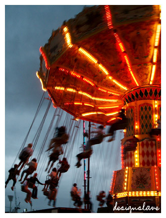
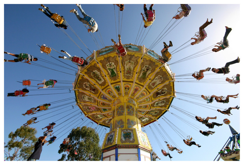
I like how there's the blurry and sharp contrast in this photo.Related content


Comments: 18


Wow, it looks very professional.
I love the lihgting and colours, how its getting dark outside, but the brightness of the merrygoround contrasts.. with the reds and oranges..
I love it.
👍: 0 ⏩: 2

Aww thanks 

👍: 0 ⏩: 1
haha 
But honestly amazing

👍: 0 ⏩: 0
To tell you the truth, I attracted to this shot so much, that I gotta make it a favourite (Smile)")

👍: 0 ⏩: 0

The bright red/orange tones look so good against the sky. It's a great pic.
👍: 0 ⏩: 1

hey neat-o. you can't go wrong with spinning lights.
👍: 0 ⏩: 0

awesome shot!!!
👍: 0 ⏩: 1
Then do it! I'd love to see what you come up with ^^
👍: 0 ⏩: 1
there arent any things like here in perth at the moment.. have to wait for the royal show to come along
👍: 0 ⏩: 0

")


i agree, i love the contrast between sharp and blurry. I also like the bright, cheerful colors of the carousel against the darkening sky.
👍: 0 ⏩: 0


