HOME | DD
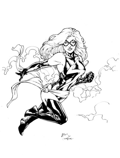
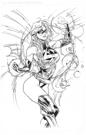
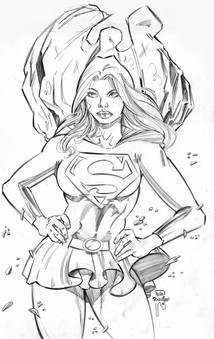
 devgear — Ms Marvel Inks

Published: 2011-07-31 05:58:01 +0000 UTC; Views: 7543; Favourites: 173; Downloads: 531
Redirect to original
Description
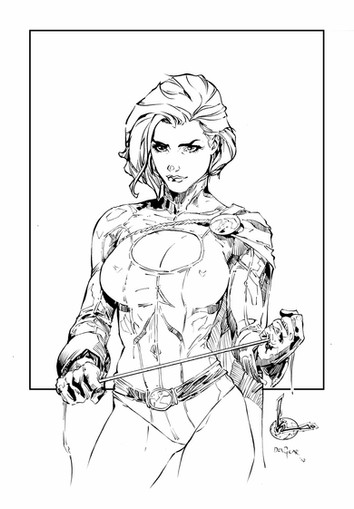
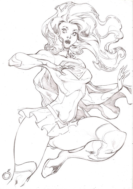
Got the pencils from the Rocafort files...You may notice I did something different with ken's lines than I usually do! Was experimenting with the line weight more than before. Hope you like!
*note*
I was mystified before, during and until just now about her legs in this picture. I couldn't figure it out, but realize it is her waistband flowing over her leg.
Download for 300dpi *Please read my terms of use*
Related content
Comments: 53

Threw some color on this: [link] Hope you like it.
👍: 0 ⏩: 1

This is AWESOME. I am trying my hand at inking Mr. Rocafort's Ms. Marvel. Her hair is a...challenge.
👍: 0 ⏩: 1

That's very cool, and thanks! Just be sure to make her leg not so confusing.
👍: 0 ⏩: 1

Yeah, I saw that, but for me, my printer cut off the rest of her leg just below the knee, so i don't have to deal with that, but keeping my hand steady for everything is my biggest problem. NOTE TO OTHERS: Don't try inking in the school library. People are tend to shake tables.
👍: 0 ⏩: 1

I used to shake a lot. Just be confident and make your lines faster. You'll see a difference.
👍: 0 ⏩: 1

I featured this beautiful line art in my journal: [link]
Thanks for allowing others to color your lovely work!
👍: 0 ⏩: 1

Thank you, and it's always a pleasure to collab with other artists!
👍: 0 ⏩: 1

no point in talking much about when you ink Rocafort, it allways looks good
👍: 0 ⏩: 1

A different take on the lines. Thanks for the appreciation!
👍: 0 ⏩: 0

About your note - I was too and all I know is if this was for a "company" the editor would have the artist change that. Still it's a nice piece.
👍: 0 ⏩: 1

Thank you. Now realizing what is going on, I know I could have adjusted my inking to better define it.
👍: 0 ⏩: 0

lol i wasn't quite sure what was happening there either, until i read your comments
👍: 0 ⏩: 1

I'm sure I could have made it easier to see in my inking, but as I mentioned, I didn't understand what was happening!
👍: 0 ⏩: 0

Yeah, the leg thing creeped me for a second too. Thanks for the explanation. Excellent work.
👍: 0 ⏩: 1

It still does, even tho I know what it's supposed to be! Maybe some colors will fix it up right! Thanks bro!
👍: 0 ⏩: 0

GAH!!
Beautiful result man. Yeah the legs are but hard to understand, the rest of the image outweighs that though. The line weight variation is certainly worth the experimentation.
👍: 0 ⏩: 1

Many thanks bro! I'm hoping colors will clear it all up!!
👍: 0 ⏩: 0

I love Ms. Marvel
This is a pretty awesome go at her!
👍: 0 ⏩: 1

Kens lines are always awesome to work on! Thank you
👍: 0 ⏩: 0

This is fantastic! The lineweight vareations work reeally well!
👍: 0 ⏩: 1

I'm glad you think so, thank you!
👍: 0 ⏩: 1

wicked! *saves high res*
though I'm kinda wondering what's going on with the legs below the knee down there. I can't seem to follow which leg is which (but I know that's how he drew it so not blaming you)
👍: 0 ⏩: 1

I know! I was thinking it might come together and make sense...but sadly, no!
👍: 0 ⏩: 0

I love working over his lines...he is a genius! Thank you
👍: 0 ⏩: 0

Goodness your inking is so lovely. The difference in line weight is so..drastic and precise and really pops, it works so well with his pencils I think, his drawing style and yours.
👍: 0 ⏩: 1

Thank you! Compared to how I have usually inked his work, this is very different!
👍: 0 ⏩: 1

You're very welcome. (:
They both look good but I have to say, I think I do like this style a bit more. It's more..varied? I think is the word. More of it's less evenly distributed I think, which looks more..I want to say 'realistic' but I don't think that's the right word. jfdksl. I'm not sure of the word, but it looks nice!
👍: 0 ⏩: 1

well, I'm continually experimenting and growing in my art. Thanks again!
👍: 0 ⏩: 1

Experimenting is good, as long as you don't use your creations for evil.....don't......don't...
👍: 0 ⏩: 1

haha....well I noticed I gave her six fingers on her left hand...is that evil??
👍: 0 ⏩: 1
| Next =>
