HOME | DD
 DEVlANT — DEVlANT Journal Design + CSS

Published: 2008-04-16 18:25:28 +0000 UTC; Views: 60625; Favourites: 50; Downloads: 253
Redirect to original
Description
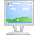
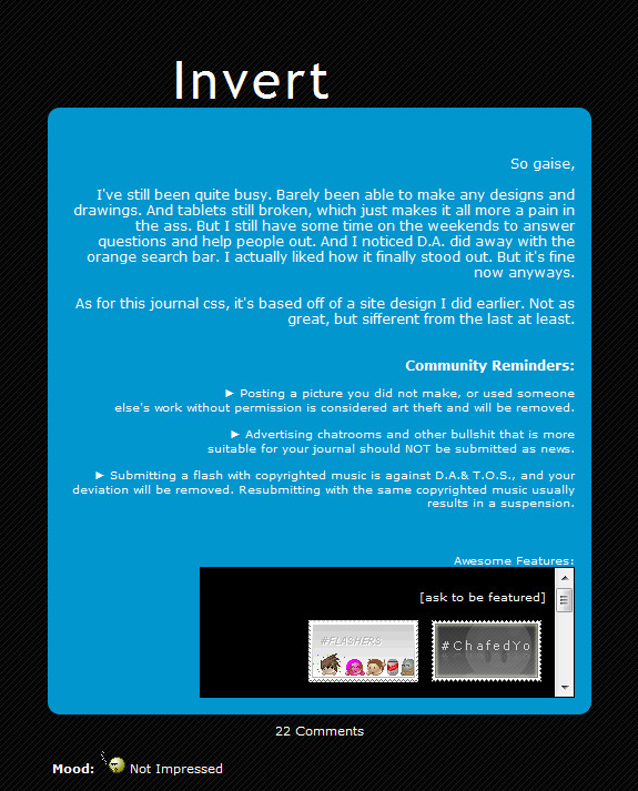
Edit: check it out in action here [link]Wooo! Check out the CSS Journal design.
I'm thinking of getting a sub
 so I thought I'd make my self a css for my journal
 ")
It'll mean I'll be able to have a stamp collection and stuff
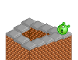
I tried to make it fit with my jungle emote avatar and ID and I think it turned out pretty well
 (Smile)")
if there's any way you think I could improve it just say
 (Wink)")
Related content


Comments: 62


I've seen so many awesome journals like this.
Awesome!
how did you do that ?
👍: 0 ⏩: 1

The artwork on it's amazing.
👍: 0 ⏩: 1


put emoticon people on the mountains that would be cool
👍: 0 ⏩: 1


i'll probly do it my self
i'm usualy quite good at that sort of stuff
👍: 0 ⏩: 1


👍: 0 ⏩: 1
keep plowing at it and it'll come
👍: 0 ⏩: 1

👍: 0 ⏩: 1
by... other peoples csscodes... right?
👍: 0 ⏩: 1

")

To make it more explosive
duh....
👍: 0 ⏩: 1


You couldn't improve on that if you tried.
👍: 0 ⏩: 1


Awesome! It's good to match, makes you look more professional
What you should do is make the textbox outline a thin version of the header, instead of just a black line
Other than that, very nice work! Good luck with that subby
")
👍: 0 ⏩: 1
i was going to do that but then i thaught it might be too hard
thanks anyway
👍: 0 ⏩: 1
aw, okay... you should at least make the rest of the border brown or green, so at least it matches
👍: 0 ⏩: 1
it is brown
it's just quite dark
👍: 0 ⏩: 1


Looks awesome, you've done a very nice job on the design
👍: 0 ⏩: 1
why thank you very much i'm glad you like it
👍: 0 ⏩: 0

Heh, you put it on caps, so it says "DEVLANT" instead of DEVlANT.
👍: 0 ⏩: 1
thanks ")
👍: 0 ⏩: 1
You're welcome.
(I absolutely love my avatar.)
👍: 0 ⏩: 1


Awesome design!

👍: 0 ⏩: 1
| Next =>