HOME | DD
 devouredex — Double Jade

Published: 2008-06-02 13:55:53 +0000 UTC; Views: 944; Favourites: 15; Downloads: 0
Redirect to original
Description
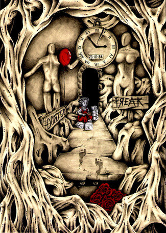
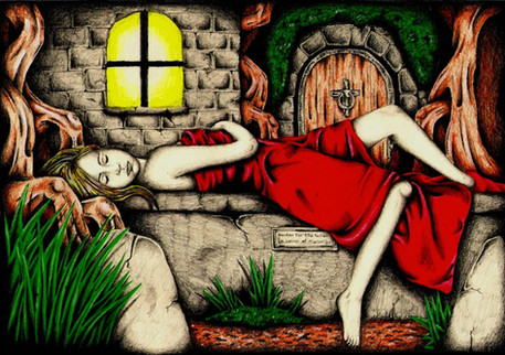
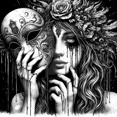
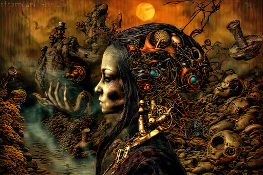
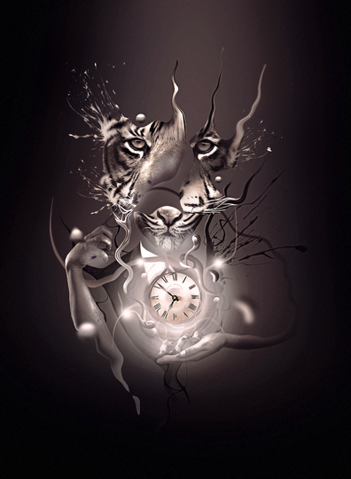
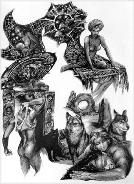
This is the first submission from me in 2008. Old work from early in the year.Fairly basic, left the shading raw this time, didn't really want to smoothen with anything like I usually do. I have adopted Black/White/Jade now instead of Black/White/Red.
Art © John Askew 2008
Art © devouredex 2008
Related content
Comments: 15

this is great! love the two different perspectives for this one too. great stuff
👍: 0 ⏩: 0

Very nice, good to see something from you again dude
👍: 0 ⏩: 1

Thanks. I got a boat load of old ones to put up from the last few months, including brand new ones.
👍: 0 ⏩: 1

love the color scheme... the jade really brings it together.
👍: 0 ⏩: 1

Beautiful poses and compositions. The colors are less sensual than the red but it's definitely beautiful and creates a very nice atmosphere. Are you sure this is Jade though? It looks more like Teal.
👍: 0 ⏩: 1

Its Jade (originally), the saturation dropped slightly when scanning, Jade and Teal do look fairly close in tone though.
Jade is just a little brighter, Teal, or at least the pencil I have is a little less in saturation than what you see above.
Yea I just got very bored with Red, wanted to tone it down a bit.
Glad you like it.
👍: 0 ⏩: 1

Ahh I see. Are you going to use Jade more often now?
👍: 0 ⏩: 1

yes I am, I have quite a few images to go up, they get more detailed and vibrant. Will try and fix the saturation issue as time goes on.
👍: 0 ⏩: 0

A very simple colour scheme, but a very effective one. Everything works well together. I particularly like the dark shadows. ^_^
👍: 0 ⏩: 1

Thank you. A single colour will always work with B/W, unless its Yellow or Orange.
👍: 0 ⏩: 1

No problem. You're very welcome. ^_^
Yes, that does seem to be the case. I do rather miss the red though. I guess I just have a soft spot for red, as much as someone who hates colour can have a soft spot for any particular pigment.
👍: 0 ⏩: 1

lol, I love colour, but i prefer single tones with b/w, stands out more than full colour
👍: 0 ⏩: 0
