HOME | DD
 digitalninja — Guilty Gear Sunset Process
Published: 2009-10-24 04:57:32 +0000 UTC; Views: 5837; Favourites: 61; Downloads: 155
Redirect to original
Description
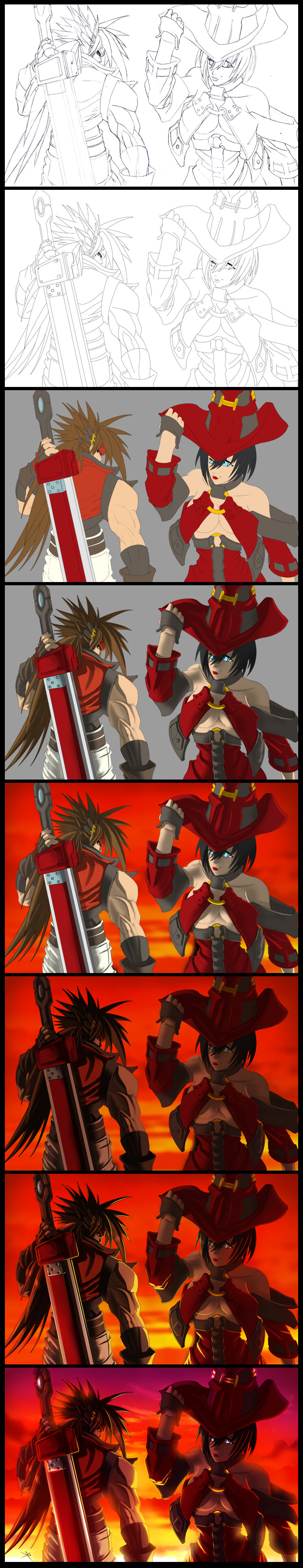
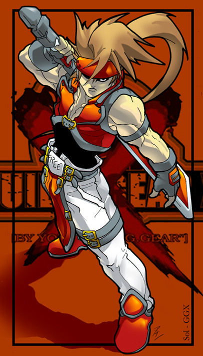
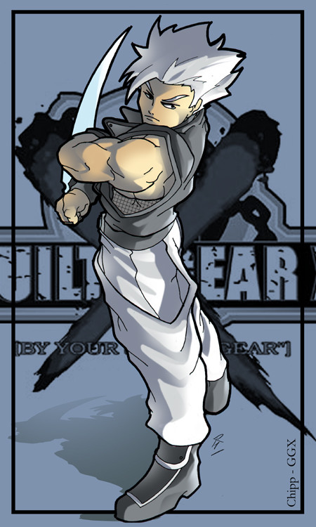
**WARNING LARGE FILE**This is a step by step process tutorial of one of my latest fanart works of Sol Badguy and I-no from the fighting game Guilty Gear.
You can see the full finished version here: [link]
Process:
1. Pencils using mechanical pencils on 11x17 copy paper
2. Scanned into photoshop and digitally inked with wacom tablet and basic photoshop brush and pen tool.
3. Base colors (Flats) for the two characters.
4. First quick shading pass for light source reference.
5. Painted in a quick background with a general color scheme I wanted for the image.
6. Adding the proper tone I wanted for the characters in the environment.
7. Added in rim and secondary lights given off from the backdrop, added ambient lighting to the shadows.
8. Painted in the rest of the clouds for the background, added haze and glare from sunset, color adjusted and tweaked saturation levels.
Hope this helps some people out there, if you have any question feel free to ask!
-DN
Related content


Comments: 20


Not that specific piece of art no, my coloring tutorial covers all the same techniques I use for all of my art, so it should have what you need to learn from. The only thing not covered is how to do backgrounds, which I need to make a new tutorial on.
👍: 0 ⏩: 1

I appreciate the reply. This doesn't look like your anime cell shading style. It looks different.
👍: 0 ⏩: 1
Same process but with added fx. I will do a tutorial for Photoshop fx in the future.
👍: 0 ⏩: 1
alright, cool! I will greatly appreciate that!
👍: 0 ⏩: 0


I have two major questions conserning the process you take in coloring your work. If you go and check my page I have a lot of line arts that I have scanned in and cleaned up a bit. I would like to know how you get such a thin line for the drawing because I always end up with a thick line in my attempts. The second question is how you do you do the flat color fill. I just can't seem to figure it out in photoshop lol. If you could answer these questions for me that will help me out tremendously thanks in advance. Oh and I can't wait for your Devil May Cry deviation!
👍: 0 ⏩: 1
The thin line work I do can be created using the photoshop pen tool. Basically instead of scanning in my pencils and coloring right on top of that, what I do is I will scan in my penciled art, put that on its own layer, then on a layer above I will use as a trace layer.
On the trace layer I will use the pen tool (not the brush mind you, but the pen vector tool). It takes a little while to get used to and I actually started using the same pen tool but in illustrator, until I realized I could just do the same process in photoshop and not have to hop between programs if I didn't feel like it.
So as a quick example, find a line on your pencil drawing you want to trace (lets say an arm). Take the pen tool and click on the origin of the line (so the origin point of the arm would be the shoulder) then move your cursor down the line a bit and click again where you want the line to end (so in this instance it would most likely be the elbow). Once you have the vector line created and while still selected on the pen tool, right click near the line and a menu will pop up, what you want to do is choose "Stroke" from this menu. You will see another menu that will give you the stroke options, once you click ok photoshop will then use what ever that last brush you had selected and stroke a perfect line down the curve of the vector line you originally made with the pen.
Whew.......
Ok as for the flat color, its pretty simple, just find a spot you want to fill (for an example lets say a characters hair) Find the magic wand tool in your side bar and click inside the area you want to fill with color (make sure its is an enclosed area, if there is a break in your line work the magic wand will go outside of the hair area). Once that is selected just go to the top menu bar and select :EDIT>FILL: and a menu will popup with directions. Make sure the setting are how your want it, click ok and you are done  (Smile)")
Hope that helps, if you have any more questions feel free to ask
-DN
 (Wink)")
👍: 0 ⏩: 0

I love looking at the whole process like this. I noticed how you added very few highlights. I think that's interesting because if it were me, I would have added a lot more and if I did that, it would just sort of obscure the image in a mesh of glowing colors, which would look terrible 
👍: 0 ⏩: 1
Thanks, I am glad it helped
👍: 0 ⏩: 0

really nice walk through man, I enjoyed viewing this a lot
👍: 0 ⏩: 0

great work! this is also a good tutorial for coloring
👍: 0 ⏩: 0

Hmm, I got a question. if you don't mind answering, what is the process in creating that background?
👍: 0 ⏩: 1
Well, first I figure out what I want the background to be, in this instance a sunset that can cast a red/orange light onto my characters.
So the first think I do is just fill the background with a generic vertical gradient that goes from yellowish white where the light source is coming from (sun), so a deep red/purple to where the glow will fade off into the sky. Once I have that I use a really large soft brush and using a bright yellow color (for the lower half) and dark red color (for the upper half) I go in and quickly paint in some blurry clouds on top of the gradient for placement.
Once I have the rough clouds where I want them, I go ahead and use a very small tight brush to add distinct edges and bumps to the clouds using real photos of clouds and skies as reference. While I do this I am making sure that the light is hitting in the logical place for where I add the detail. So since the sun is setting on the bottom of the piece, the clouds closest to it on the bottom will have lighting detail underneath, and a darker red shadow on the top since it's not being affected by the light.
Once I do all the detail work, I use a little trick to give it more depth. I do this buy duplicating all the layers and flattening all the duplicates into one single layer. I take that layer and I Gaussian blur it to a point where all the detail is gone. I then place the blur layer between the initial gradient layer and the detail work I did and set that layer to 'overlay'. This will give all the clouds a nice glow effect.
The very last thing I will do is tweak the color balance and the saturation levels of the clouds to make sure it looks the way I want it to behind my characters.
That's pretty much it
Hope that helps.
👍: 0 ⏩: 1
Thx man that helps a lot! One more question, the lighting on the characters looks really well done, is that the brush tool or some other trick?
👍: 0 ⏩: 1
mostly just a soft brush with pressure sensitivity on the my pen tablet turned on. The rim lighting (the really thing light strokes on the character outer edges) is was done just using a really thin brush.
👍: 0 ⏩: 1

")