HOME | DD
 dinyctis — Effulgence
Published: 2003-10-04 17:25:42 +0000 UTC; Views: 11332; Favourites: 186; Downloads: 3978
Redirect to original
Description
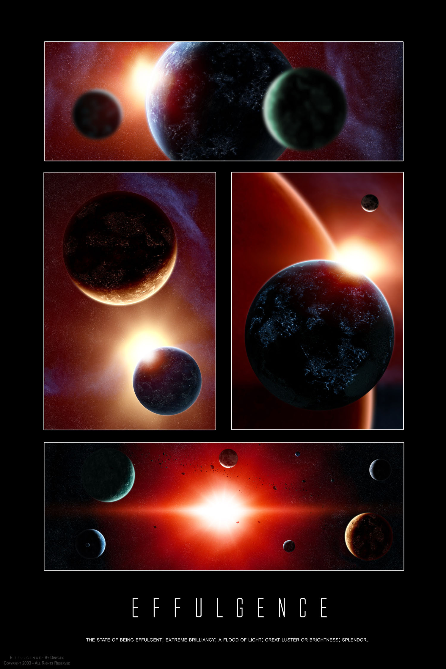
Effulgence:The state of being effulgent; extreme brilliancy; a flood of light; great luster or brightness; splendor.
UPDATE: If there is one thing i love, then its constructive feedback. I revisted a few things that my eye missed, and here is the final version with a few touches (better atmosphere for bigger planet in top piece, more star contrast in top and middle left pieces, and slight blur in middle left)
This is one of those deviations with an ironic story behind it, lets explain.
Im sure most of you heard about the blackout that affected the northeastern part of the United States and a big part of Canada. Because there was no light and nothing interesting to do, * superkev went to the beach and started taking pictures of insects. He's skill with depth of field always impresses me and i got the idea of trying to apply the effect to space scenes. So where's the irony here? Well, I got the inspiration for a light themed deviation from pictures taken due to the lack of "light."
OMFG THATS DEEP!!!1111one
So anyways, I originally started with a single work, but, as usual, lots of possibilities came up and i was hard pressed to pick one. I figured that i'd make a poster like this one, since i have an empty space in my wall and it would look pretty good there. So i made this with my room in mind, thats why i used that typo (which i can already tell lots of you are gonna hate).
Another thing that i got to experiment with was city lights on planets, you can see them in pretty much all of the sections here. You can tell that they look different in all of them, this is to show the different settings. Personally i like the ones from the top and right the most, since they are subtle. I also thought of using city lights to contrast with the fact that the blackout was the very base of the depth of field effect idea
")
I used photoshop for EVERYTHING except the asteroids in the bottom pic.
Things i like:
I like the sun in the top 3 pieces. I like how its not sharp and its rather smooth.
I like how the depth of field effect came out, it adds depth.
I like the color variations. I tried to make it all monochromatic, but the colors were more dramatic.
Things i dont like:
Im not satisfied with the starfields. They could use more contrast, but then again they would alter the feel of the piece for the worse. Suns always get in the way. However its nothing disasterous.
Thats about as technical and as thorough as i can get without boring the most of you (although i know many people dont even bother to read the descriptions, meh)
Big thanks to *superkev for his help on helping me get the depth of field effect right, and for pointing out that its impossible to actually get "pictures" like these in space, since the lens would have to be bigger than the planet and considering the distance at which the picture is taken.
I hope you enjoy this one, dont hesitate to leave feedback, as usual
 (Smile)")
Related content


Comments: 165

One thing I did notice on the top frame is that the planet on the left looks more blurry than the one on the right & the one on the right appears closer than the one on the left.. Wouldn't the planet on the left be a little bit more in focus?
👍: 0 ⏩: 1

the one to the right is closer to the " camera," the one to the left is in the middle, and the one in the middle is the one thats further away. I puposedly made the left one less blurry. However, light hits it in a different way so that is a lot darker, and that might highlight the blur a bit more than the other one
👍: 0 ⏩: 0

Holy shit, din... That IS DEEP!!!1
Your cosmic imagery is absolutely wonderful, and I find myself compelled to learn more about these feats of lighting and planetary imagery and report back with a more productive comment...
👍: 0 ⏩: 0

I like the pic better without the emphasis of stars, I look at this and the bright lights coming out from behind the planets makes me think of the beginnings of a new day (and also puts that Sting song in my head 
👍: 0 ⏩: 0

the blur in the top one is maybe "a bit too much of the good", but the rest has a nice depth feeling, plus your usual (")
👍: 0 ⏩: 0

pretty good, Love the textures on the planets,
things I like -> planet textures
color schemes
Things I dont like -> same texture used to much
-> Some planets are really heavy blurred?
-> starfield
-> lens flares, they look a bit computer generated, I dont know...
The overall piece is great but should be somewhat better.I know you can do better because you did it before, I like this piece, very simple and good but it needs a bit more work (I know you dont like this comment but it isnt ment to bring you down, your a great artist but I just dont like the overall feel of this piece, personal  (Wink)")
👍: 0 ⏩: 1
on the contrary, like thorough comments such as this one
lets address a few things:
"Some planets are really heavy blurred?"
the blurrier they are, the more the ones in the foreground will get emphasized. I tried a few settings but this is the one that i personally liked best
starfield: yea i know. When there are no suns at all they look pretty good, but otherwise, bah.
lens flares, they look a bit computer generated, I dont know...:
Doesnt the whole thing look computer generated?
")
👍: 0 ⏩: 1
they look generated by someone I worship ")
👍: 0 ⏩: 1
these were quickies actually. They took me 3 days
im gonna step away from space a bit and gonna go back to paintings
However, how could you say that this one is "bad"? have you seen "from earth 2" ? that one blows compared to this one!
not to mention "space weather,"escaping the firestarter, and "from earth"
👍: 0 ⏩: 1
lol... I mean their bad compared (I shouldnt compare shame on me")
👍: 0 ⏩: 0
Extremely beautiful.. I'm a sucker for anything space & this takes the cake.. Great work.. The last frame is probably my favorite.

👍: 0 ⏩: 0

This is nice, really great! ^_~
I have to check out that planet tutorial.... mmm...
👍: 0 ⏩: 0


Dude, this stuff looks amazing!...Yeah, I remember that Planet tutorial you made...it helped so much...
👍: 0 ⏩: 0
<= Prev |