HOME | DD
 dinyctis — Effulgence
Published: 2003-10-04 17:25:42 +0000 UTC; Views: 11332; Favourites: 186; Downloads: 3978
Redirect to original
Description
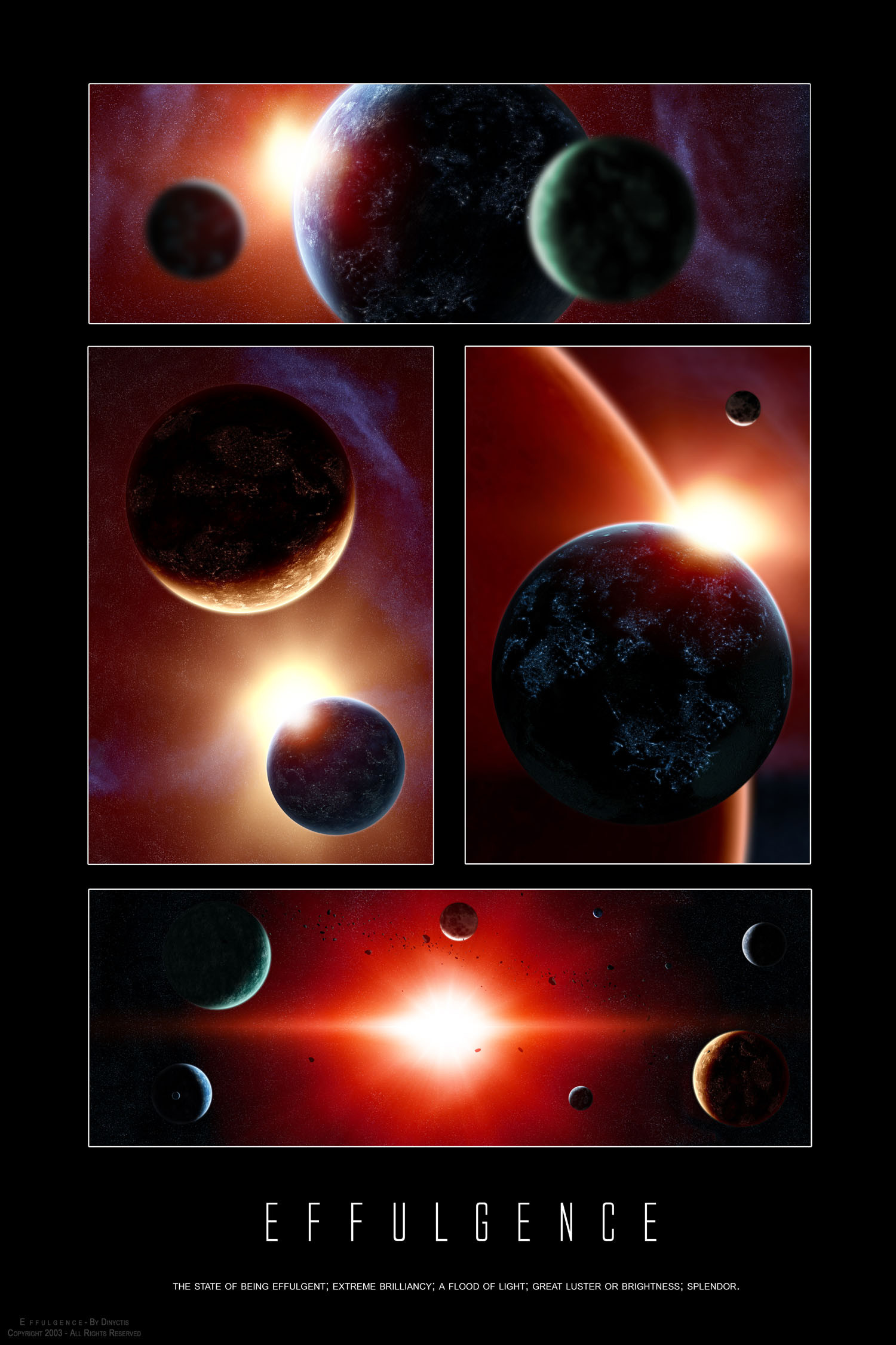
Effulgence:The state of being effulgent; extreme brilliancy; a flood of light; great luster or brightness; splendor.
UPDATE: If there is one thing i love, then its constructive feedback. I revisted a few things that my eye missed, and here is the final version with a few touches (better atmosphere for bigger planet in top piece, more star contrast in top and middle left pieces, and slight blur in middle left)
This is one of those deviations with an ironic story behind it, lets explain.
Im sure most of you heard about the blackout that affected the northeastern part of the United States and a big part of Canada. Because there was no light and nothing interesting to do, * superkev went to the beach and started taking pictures of insects. He's skill with depth of field always impresses me and i got the idea of trying to apply the effect to space scenes. So where's the irony here? Well, I got the inspiration for a light themed deviation from pictures taken due to the lack of "light."
OMFG THATS DEEP!!!1111one
So anyways, I originally started with a single work, but, as usual, lots of possibilities came up and i was hard pressed to pick one. I figured that i'd make a poster like this one, since i have an empty space in my wall and it would look pretty good there. So i made this with my room in mind, thats why i used that typo (which i can already tell lots of you are gonna hate).
Another thing that i got to experiment with was city lights on planets, you can see them in pretty much all of the sections here. You can tell that they look different in all of them, this is to show the different settings. Personally i like the ones from the top and right the most, since they are subtle. I also thought of using city lights to contrast with the fact that the blackout was the very base of the depth of field effect idea
")
I used photoshop for EVERYTHING except the asteroids in the bottom pic.
Things i like:
I like the sun in the top 3 pieces. I like how its not sharp and its rather smooth.
I like how the depth of field effect came out, it adds depth.
I like the color variations. I tried to make it all monochromatic, but the colors were more dramatic.
Things i dont like:
Im not satisfied with the starfields. They could use more contrast, but then again they would alter the feel of the piece for the worse. Suns always get in the way. However its nothing disasterous.
Thats about as technical and as thorough as i can get without boring the most of you (although i know many people dont even bother to read the descriptions, meh)
Big thanks to *superkev for his help on helping me get the depth of field effect right, and for pointing out that its impossible to actually get "pictures" like these in space, since the lens would have to be bigger than the planet and considering the distance at which the picture is taken.
I hope you enjoy this one, dont hesitate to leave feedback, as usual
 (Smile)")
Related content


Comments: 165

I don't think that FIELD OF VIEW experiment came out nice with this space theme. There's no way one planet could be out of focus and the other one in, considering this peice. The scale is just oo large and all should be focused. But none the less, it's brilliant. As you would say "effulgent"
👍: 0 ⏩: 0

This is very nice, i like it 
👍: 0 ⏩: 0

Not sure if i like the blur on the planets at the top, but the rest is simply amazing work. Love the typo, so there is one to prove u wrong ")
👍: 0 ⏩: 0

Love the different lightings here....Totally loving the harsh reds. 
👍: 0 ⏩: 0

:calp::calp::calp::calp::calp::calp::cal p::calp::calp::calp::calp::calp::calp::c alp::calp::calp::calp::calp::calp::calp: :calp::calp::calp::calp::calp::calp::cal p::calp::calp::calp::calp::calp::calp::c alp::calp::calp::calp::calp::calp::calp: :calp::calp::calp::calp::calp:
👍: 0 ⏩: 0

 (Wink)")

impressive work...the level of detail is just amazing...instant fav
👍: 0 ⏩: 0

Easily one of the best pieces ever in my mind. Except I think the green planet on top is too blurry.
But you do need a lot of work on one thing...
SHORTER ARTIST'S COMMENTS!
👍: 0 ⏩: 0

U R the master of planets!! and getting better by the minute!!

👍: 0 ⏩: 0


Fantastic work. I like the bottom pic of the red giant star (or a star going super nova) most of all. Geez it's all done so well. I'm very impressed.
👍: 0 ⏩: 0

Me encanta la composición que hiciste. Podría decir casi cinematográfica. Ojalá pudiera comprarla en deviantPrints, porque está espectacular.
Excelente trabajo, como de costumbre.
👍: 0 ⏩: 0

*drools* it's soo gorgeous!! I love it!!! +favs!!! @_@ it's soo cool
👍: 0 ⏩: 0


hmm...I don't really like the blurred planets...only because it makes it look like they are very small...like tiny models. But the city lights...I really love the city lights...Very well done
👍: 0 ⏩: 0

very nice work. The two near planets in the box at the top are too blurred imo. But overall excellent work.
👍: 0 ⏩: 0

Very nice, 

👍: 0 ⏩: 0

the planets, starfields and the suns are, imho, looking great.. however, the whole dof-thing feels "wrong" for a space scene, i dunno why.. maybe it is because, as you pointed out, it is impossible to take such photos.. or maybe the planets are too blurred.. i'm not sure. otherwise, it's good that you are experimenting, and - after all - it is a damn good image
keep it up!
👍: 0 ⏩: 0

do you keep on editing this piece? That's the 3rd time I had to wipe it out of my devwatch
👍: 0 ⏩: 1

i edited just once
maybe it shows up everytime i reply to a comment?
")
👍: 0 ⏩: 1
hmm no, as I think about it, perhaps I didn't remove it after I made the first comment, so I really only removed it twice 
so, slight constellations changes in the top and the middle left panels, and improved starfield, it's good, like that
👍: 0 ⏩: 1
am I looking into a mirror?
👍: 0 ⏩: 0

The DoF effects are cool, and I can see that you'll have lots of fun with these in the future. I'm glad I could help you add another tool to your rapidly expanding toolbox. Sweet work.
👍: 0 ⏩: 1

these are all nice....i like the bottom one the best...i dunno why...it just seemes cooler nice job on all of them
👍: 0 ⏩: 0

wow..awesome..it all looks great!

👍: 0 ⏩: 0


My favourite sections are the two middle ones.
The top frame the blurriness does not work for me: the sharp edge of the "in focus" planet behind the blurry planet seems somehow "wrong" - maybe if you gave the "in focus" planet more atmosphere blurriness in that area it would look better.
That is why I find the blurry planet in the middle right frame works better: the "in focus" planet has its edge blurred by atmosphere, so the two elements merge together well.
Anyway this is definitely one for the +fav.
👍: 0 ⏩: 0


Very nice! Love the way its separated and as always your designs are awesome! great job!
👍: 0 ⏩: 0


Simply beautiful that you reflect what's going on in our universe while the majority of mankind has not the slightest clue. I'm not even going to mention your skills, they're obvious anyway. All your works lead me to think deeper and deeper about the universe and its endlessness.
👍: 0 ⏩: 0

The colors and attention to realism is very good. You criticized your starfields but they do a good job of not taking away from objects in the pieces. All in all, these are some incredibly pieces. I wish I had better words and thoughts to give you input, but I don't. Great work and keep it up!
👍: 0 ⏩: 0


[i]OMFG THATS DEEP!!!1111one[/i]

👍: 0 ⏩: 0

I read descriptions
this is great though, I definately love the multiple shots... You should put this one up on deviantPRINTS for sure, because this would look great in any room... I love your spacescapes but I've got to agree with *alphaosiris though, I'd love to see what you could do in other arenas...
👍: 0 ⏩: 0

OMG!!!
Diny, you know.. You know that you pwn this category!!!!11one (you and `hameed )
This is fu*kin fab-tastic. I soo <3 it!
Do you mind if I re-arrange the images in this, and make a wallpaper for myself of them?


👍: 0 ⏩: 0

awesome, i really really love all the perspectives, but at the same time i would love to see a wallpaper of the bottom shot. +fav din the city lights look great.
👍: 0 ⏩: 0


wow this is freaking amazing!! I wish I had an ounce of your talent!
👍: 0 ⏩: 0

OH FUCK WHY DIDNT I EVER THINK OF THAT!
THE BLUR POV SHIT BRILLIANT!
*steals that idea*
👍: 0 ⏩: 0

Excellent job m8.
👍: 0 ⏩: 0

holy shitski!
something i noticed about your works, is that the sun is usually peeking behind a planet or two. it's good to see that bottom frame, with sun directly in the middle. i think you should experiment with non-space elements a little, just to see what you can do. i'm interested. very cool work cristian.
-Todd
👍: 0 ⏩: 0


<= Prev | | Next =>