HOME | DD
 dio-03 — Spidey, Now in Technicolor
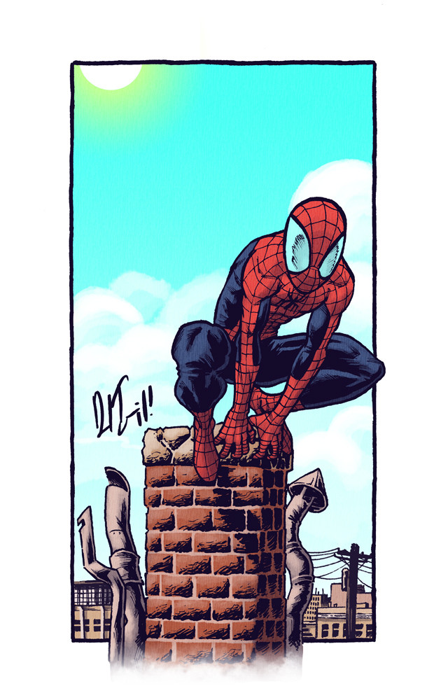
Published: 2011-04-09 02:02:10 +0000 UTC; Views: 4068; Favourites: 153; Downloads: 57
Redirect to original
Description
Here's the finished piece! Not much to say about this one. I personally like it.Hope-fully i'll be posting slightly more frequently, atleast for this upcoming week.
-Daniel
Related content


Comments: 19


ha! yeah they were about the most fun part of the drawing.
👍: 0 ⏩: 0


Las texturas que has añadido a Spidey y las chimeneas me gustan mucho, lo separan claramente del fondo. Gran trabajo, Daniel (como siempre  (Wink)")
👍: 0 ⏩: 1

Yeah there you go. I like the natural color as opposed to the typical razor sharp computer gradients.
Nice.
👍: 0 ⏩: 1
interestingly, I was specifically aiming for a warmer sunny color palette.
👍: 0 ⏩: 0

beautiful job on the bricks again!
But I don't like the sky, too much blue, and you should change the position of the sun, here it just "pops" at the top of the image. ou should juste remove it. + The light and shadows on the foreground would make the sun much more in the front than it is now.
Man, I must look like an as*hole to everyone, always making criticism ahahah.
👍: 0 ⏩: 1
hahaha! i'm sure they think you hate my work! i agree on the suns position. I actually had it much lower and brought it up to that top corner to see if it worked there, but even then i thought it was a stretch.
as for the sky, i like that blue. what i wanted was for it to contrast with the rest of the image. (which what i look for in every image: contrasts) but if you say its too blue, there's probably good reason for you to point it out.
👍: 0 ⏩: 1
I think you will still have contrast with a less bright blue, here I think of the care bears
")
👍: 0 ⏩: 0


Love it dude, it looks really tight. Only thing that bugs me is the right side of the chimney, but that might just be me.....
👍: 0 ⏩: 1
what about that side bothers you?
👍: 0 ⏩: 1
Looking at it I feel like the perspective is off, but when I pull back it looks fine. It's tricky really.
👍: 0 ⏩: 1
AH! that.
thats a bit of a cheat i do on perspective. there's actually none used in this picture. its just horizontal lines and verticals. its good for far away city-scapes. anyhoo, i imply angle by shading one side of it.
👍: 0 ⏩: 0

So nice and sunny.... which was somewhat unexpected, but a pleasant surprise!
👍: 0 ⏩: 1