HOME | DD
 dio-03 — The World Wide Web...

Published: 2010-05-16 03:28:34 +0000 UTC; Views: 1933; Favourites: 95; Downloads: 55
Redirect to original
Description
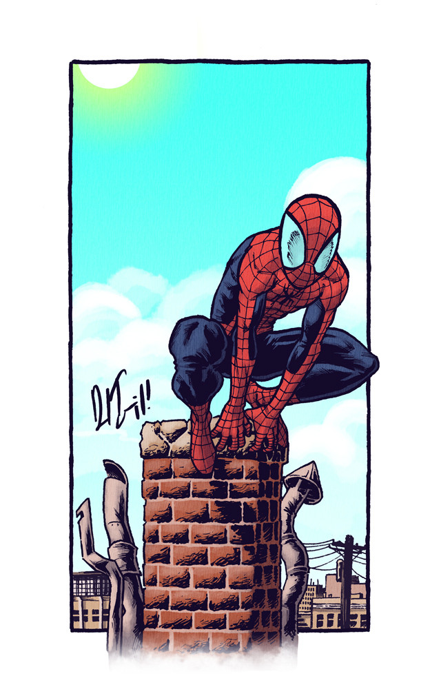
hey guys! this is something that started as bit of a doodle and morphed into something else, and then this. i like aspects of it, but there are things that seem off. i dunno what it is, specifically, but still, though i'd share with you all.hope you all like it.
-Daniel Irizarri Oquendo
Related content


Comments: 30


nahh, this type of thing was done a few years back for a feature that was essentially dedicated to mash-ups. i did about a years worth of that and had my fill. I try to focus a bit more on personal work or one-off superhero stuff now. Maybe sometime in the future i'll want to make viral content like this again. : )
👍: 0 ⏩: 1


really bold! I like the color scheme and the outlined web- very cool dude.
👍: 0 ⏩: 0

Buenisimo el entorno caotico de telarañas y la jerarquizacion por grosores de los distintos planos.
👍: 0 ⏩: 1
enverdad no es gran cosa hacer esta telara~a. si en algun momento te interesa te puedo explicar.
👍: 0 ⏩: 0

If you plan to do a sketchbook, you should use it as a cover (or a backcover).
Or maybe not, I dont know if there would be problem with Marvel.
But this one is a killer, just perfect!
👍: 0 ⏩: 1
thanks geoffo! i dunno if i'd ever make a sketchbook or what i'll do with it. 0___o but i'd put this one in it for sure.
👍: 0 ⏩: 1
Wll, I'm currently working on my second sketchbook, and this is very useful.
First, to make some money (ahah),
then it makes you have a "clean" portofolio to show to people,
and finally, I generally offer it to some people as my business card. This is so much better than just showing a business card, here people can judge your work.
I offered my last sketchbook to Tim Sale,Stéphane Roux and some french artists for instance. This is not much, but at least they will remember your work more easily.
👍: 0 ⏩: 1
ah! that makes total sense, really. i'll see if i can prep a couple for NYCC (if i get to go.)
👍: 0 ⏩: 1
Well even if you ain't, this is always nice to have a sketchbook to show.
👍: 0 ⏩: 0

AH! everyone seems to like the colors, its funny because i initially detested them. : ) but i'm glad you like them!
👍: 0 ⏩: 0


I think it would add a great depth if you made the close up webs much darker. This is very nice as is though!
👍: 0 ⏩: 1
thanks so much for the tip! i was thinking about making the foreground webs darker but they started to clash with the levels of the lines. what should i do in that case? darken the lines as well?
i've been taking some of my coloring cues from your work, trying to capture some of those neon colors that make your stuff sing. (obviously failing.)
👍: 0 ⏩: 0

thanks, man! i still can't do the crazy colors like you, but i'm trying.
👍: 0 ⏩: 0

creo que los muslos are a lil too thick and his butt is bit pointy.....just my take on it, interesting colors, catches the attention, i like it
👍: 0 ⏩: 1
i think in general he's a bit too thick. arms too. and yeah i guess the butt thing too.
glad u like it, though.
👍: 0 ⏩: 0

Qué color tan genial! Me gusta mucho el aspecto que adquiere con la línea coloreada. Y qué composición, con todas esas telarañas, me encanta.
👍: 0 ⏩: 1
gracias, cesar! yo todavia estoy debatiendo el color de las lineas, honestamente.-__- pero me alegro que al menos se vea bien.
👍: 0 ⏩: 1
Yo creo que ese color es muy atrevido pero acertado, hace que el dibujo no sea el "típico" de spidey. Además con el verde de fondo hace que destaque mucho más la figura
👍: 0 ⏩: 0

 (Smile)")
thanks man! i was trying to go for different colors, this might have worked or not, i'm not sure... still thinking about it.
👍: 0 ⏩: 0
whoaz, thanks, click! u being alive is awesome.. hadn't head from u in a while.!
👍: 0 ⏩: 1

I was on vacation and before that, busy with contract work and job finding!
👍: 0 ⏩: 1