HOME | DD
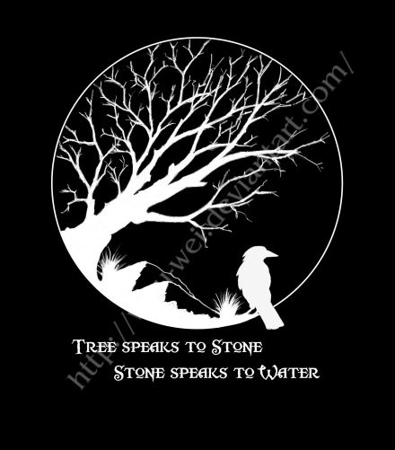
 DISENT — Vengeance Tree

Published: 2010-01-17 04:06:27 +0000 UTC; Views: 1149; Favourites: 17; Downloads: 0
Redirect to original
Description
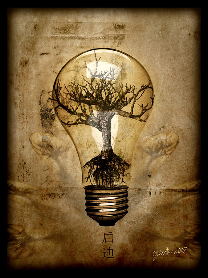
Something similar to my last piece, in that it's a drawing coloured on the computer....I'm just messing around with mixing a little more traditional elements with my digital work.Thoughts are welcome
------------------------------------------------------------------------
This work is © to Courtney (DISENT) Wooster 2009
Related content


Comments: 14


I can totally see something like this on my wall... I adore your work!
👍: 0 ⏩: 1

thanks a lot, I appreciate the thought

👍: 0 ⏩: 1


More trees!! And they are angry... be afraid!
I like it, my friend, the way you used only one color with variations make it elegant. That could be a great t-shirt (and I meant it  (Smile)")
👍: 0 ⏩: 1
Hey thanks Ronin, it was made with something similar in mind, glad you like
👍: 0 ⏩: 1
No problem my friend! And, really, if you will make a t-shirt with that, I want one.
")
👍: 0 ⏩: 0

I'm really digging this one, in fact I have a similar idea which I'm going to release soon
👍: 0 ⏩: 1
cool & thanks man i look forward to seeing your stuff
👍: 0 ⏩: 0

your drawings are nice dude, you should keep that up.
👍: 0 ⏩: 1
Thanks bro, was going to mix it up a bit more in the future...people seem to respond to traditional elements more so then the straight-up digital pieces.
👍: 0 ⏩: 0

You drew that? The only thing I don't like is the drop shadow on the text. I think it would look better if you gave the illusion that the writing was actually written ON the banner.
👍: 0 ⏩: 1
Thanks man & yeah i drew it...good spot on the text, that was the only part not hand drawn.
👍: 0 ⏩: 0