HOME | DD
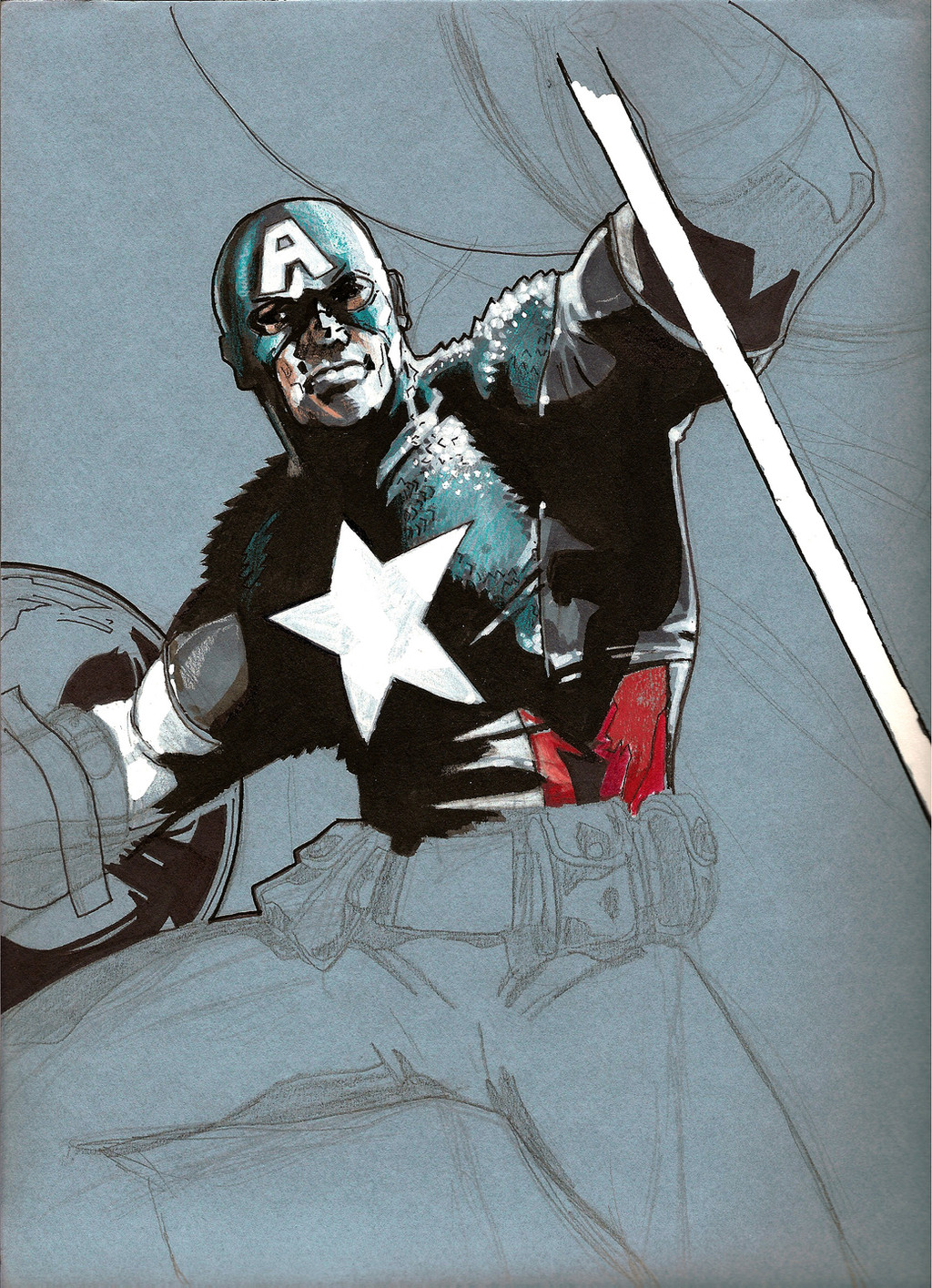
 dismang — quick Cap color sketch

Published: 2008-06-24 04:29:05 +0000 UTC; Views: 2830; Favourites: 92; Downloads: 88
Redirect to original
Description
another quick color study on 's Cap. sketch [link]edit: I pushed the reds a little more. I may update with another version that Mitch put on a fade. Thanks for the suggestions!
Related content


Comments: 24

did you change it? i just refreshed the image from 5 hours ago and the colors got darker, was that my computer or you?
👍: 0 ⏩: 1

Ha, yeah, like one second before your message- what timing! I couldn't do much with the background b/c I'd already flattened my working layers and b/c, well, I'm lazy. But I definitely wanted to push the reds slightly deeper. Mitch also messed around with it some more by fading the from the bottom up to add a little atmosphere- might update with that version later? I can't believe I've spent this much time on a sketch!
👍: 0 ⏩: 1
i know, we end up talking a critiquing something that was a sketch to begin with. but it was a great sketch and the potential to make it into a great piece was totally their and that's what art is about. thanks for being open and talking to me about the work and your process, i hope i didn't come across as some know it all, god knows i need a lot of help with my work. take care
👍: 0 ⏩: 0

I've got to say, you definitely bring the life to your husband's excellent lines. You make quite the pair, and I love your work!
👍: 0 ⏩: 1


This one is so good. Its my favorite one the two of you have done together so far.
")
👍: 0 ⏩: 1
Thank you Dan! Glad you found me on Myspace too
 (Smile)")
👍: 0 ⏩: 1
Thank you...I dont have many friends...on MySpace I mean. ")
👍: 0 ⏩: 0
nice color study. i have been looking at your pic for a couple of minutes and i was going to critique your color choice (positive and negative) but i realize that it's way to early for 'teacher mode' and maybe you don't want a crit. i get that way with artists who's work i like.
good job.
👍: 0 ⏩: 1
No way man! I would love a critique, tear it apart, it is the only way I'll get better. Just keep in mind this isn't a finished piece of art on either my side or Mitch's. Just about a 30 minute project for the both of us. Pleas by all means, teach away!
👍: 0 ⏩: 1
ha haha, i realize it's a quick piece, that's why i refrained. i was telling your husband when he did the original sketch that i liked it a lot but that it psychologically didn't quite fit C.A. he's not a shadow lurker and he's not muted. he's bold and he's visable. he doesn't have anything to hide, because he's on the side of justice and peace (why, he, bucky has a f-ing gun is beyond me, well it's cause bucky ain't no f-ing steve rogers) but with that, captain america is a symbol of the good things that america can do or that anyone can do, even a 9 year old kid picking up the book for the first time. he represents (and this all depends on the writer) a core beliefe that protects those who are oppressed. Batman (murky shadowlurker) really wants justice, because he wants revenge. Cap wants justice because he's seen the face of true evil, nazis. So psychologically your colors need to be strong. even if he's in the shadows. no watered down, opaque colors. strong bold, even if it's a dark hue, strong lights and darks and good mids.
for example
i just bought Conan: born on the battlefield TPB, by busiek and greg ruth. Greg works in grey and black washes not as dense as your husbands, but mitch has a great wash/brush sense about his work, which makes it strong. if you over lay those washes with sheets of color you lose the power of his inks to your coloring. with the conan work, greg did some over lay but also used a lot of hue adjustment and color adjustment to selected areas. with that he could keep the transparency of the inks while having dynamic color work that fit the scene and the character. check it out, it's good art.
so my two cents say, work with the artists style, it will change for your next project, you migh be doing mignola's work where you have to use flat color to boost his flat blacks, but for now, let your husbands washes come through, it will make the work more dynamic and the pros will realize the true talent that you have.
ok, that was probably to much and really who am i to critique a pro, i'm just a high school art teacher.
take care
👍: 0 ⏩: 1
I really appreciate your two cents! So you would suggest- higher intensity single colors that let the ink wash tell the value changes? And what kinda of hue and/or color adjustments to selected areas would you specifically suggest?
👍: 0 ⏩: 1
well i feel like in this particular pic, an I don't know why we've ended up focusing on this 'sketch' but there seems to be a lot of yellow in the shield, and i understand that its done to bring the bottom half closer to the viewer, optically, but my sensiblities say, more true red and less yellow. with the background. laying a sheet of blue turqoise (i'm horrible at naming colors) it becomes less dynamic. mitch has those splaters and dots, which bring attention and action to the background, give me some more color variation, while in the same family.
the blue for the suit is good, maybe even darker if you two are going for a silhouette (?) look. but pop that red, really push it. the gloves, the stripes, the shield. maybe mirror a little red in the background. ok, that's enough from me.
oh and this is totally a 2 way street. I know i don't post much, but if you ever see something from my side of the table that you want to talk about, drop me a note and let me know what you think. i need the feed back.
other colorist to immulate that are in the same style as your man. dave stuart over Maleev on the daredevil run, Tommy lee edwards on any of his work, (even though i think he does a little to much coloring and not enough blacks) and Bill Rienhold over jean Paul Leon in Earth X
(i do apologize if you know these works and i'm being redundant)
ok, now i have to go spend time with the fam
bye
👍: 0 ⏩: 0


Dynamic!!!
Your colors really bring the image to life!
👍: 0 ⏩: 1
