HOME | DD
 doubleleaf — Seth [The Embrace of Time]
Published: 2013-02-01 09:11:20 +0000 UTC; Views: 57237; Favourites: 1912; Downloads: 665
Redirect to original
Description
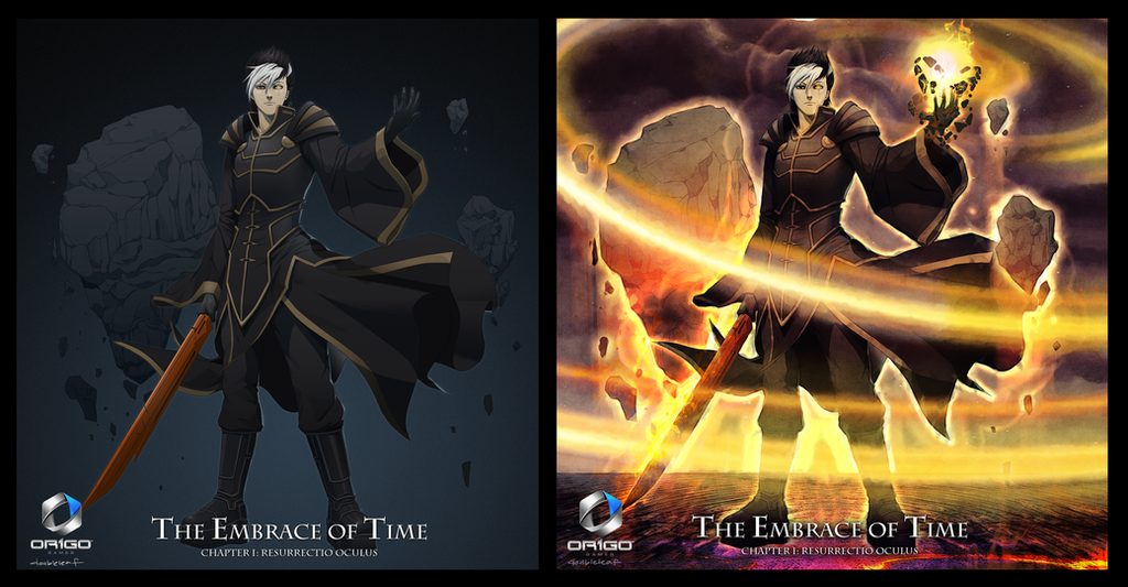
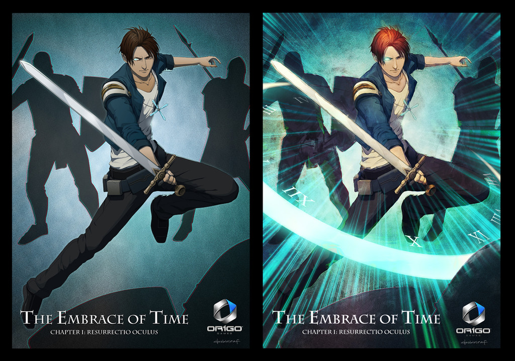
Another commission forHe's the villain c:
Left:My original drawing
Right:Their modified version
(Download Image to see bigger size)
-------------------
Photoshop CS6
Related content


Comments: 55

gotta say I seem to like your versions better, the other ones seem like they go a little overboard with the effects. :3
You are such an amazing artist, thank you so much for uploading your work!
👍: 0 ⏩: 1

It depends on what you are going for. As far as marketing, whatever feels more dynamic works best, so overloading something with cool effects help achieve that. With that said, I also like his better, you can appreciate the details of the drawing MUCH better
")
👍: 0 ⏩: 1
While I get what you're saying, there's a degree of what's too much, and what's thoughtful.
Spamming effects all over it takes away from it, and doesn't really make it more "dynamic" just more spammy.
I do get you though. :3
👍: 0 ⏩: 1
Lol I do understand your point, and you are right. I just wanted to sound smart is all XD
But yea, sometimes people go crazy with effects just to gain attention.


👍: 0 ⏩: 0


...woah thats pretty awesome!! lol keep that up, I love both the original and the modified version.
👍: 0 ⏩: 0

Wow, they really like to spiff things up don't they. Cool design though. I really like the outfit.
👍: 0 ⏩: 0


Oh how I wish I had the money to give to you to draw my OC ;__; your work is so fantastic
👍: 0 ⏩: 0


How do you feel when the alter your drawings like that? Does it bother you that they add and/or change stuff that you worked hard on or are you cool with it?
👍: 0 ⏩: 0


What the hell? I literally just drew something nearly identical to this like last week, though I was thinking about gravity, not time... still weird though.
👍: 0 ⏩: 0

Left = awesome. Right = awesomely cool. Both = I'm so jealous of the talent. XD
This looks really cool and I so wish I knew more on this story cuz the pics look great. XD
👍: 0 ⏩: 0


Their edit made your drawing look like *GENZOMAN 's (colors, background and effects)
👍: 0 ⏩: 0


I think theirs was too focused on the powers. It almost overwhelms your original drawing. So you could say they did /too/ much editing on their part.
👍: 0 ⏩: 1

I believe that was the point. They seem to want to convey just how powerful he is. Which to me looks like he's very powerful indeed.
👍: 0 ⏩: 1
That wasn't what I was trying to convey. I'm saying that the colors, brightness, contrast, and hues have been overly done. In the case of their editing, more is not better. Sharp lines, a bright flash with faded but still bright colors in the background. I simply don't see the editing as visually pleasing,
👍: 0 ⏩: 0


I personally like your original drawing better. The powers he is displaying in it makes him look more intimidating, because it's subtle. Glowy auras and flames makes him look a bit prissy. If he were to be a villain to be reckoned with, he should know a thing or two about utilizing his powers efficiently instead of wasting energy on making everything glow
On the other hand, if he is a fire mage, the modified version justifies him quite well.
 (Smile)")
👍: 0 ⏩: 1
I believe that was the point. They seem to want to convey just how powerful he is. Which to me looks like he's very powerful indeed.
👍: 0 ⏩: 0


WOWzers each picture gives a different feel. they are both awesome.
👍: 0 ⏩: 0

Jeez. Your work always amazes me, but their edits are magnificent.
👍: 0 ⏩: 0

| Next =>