HOME | DD
 dpcdpc11 —
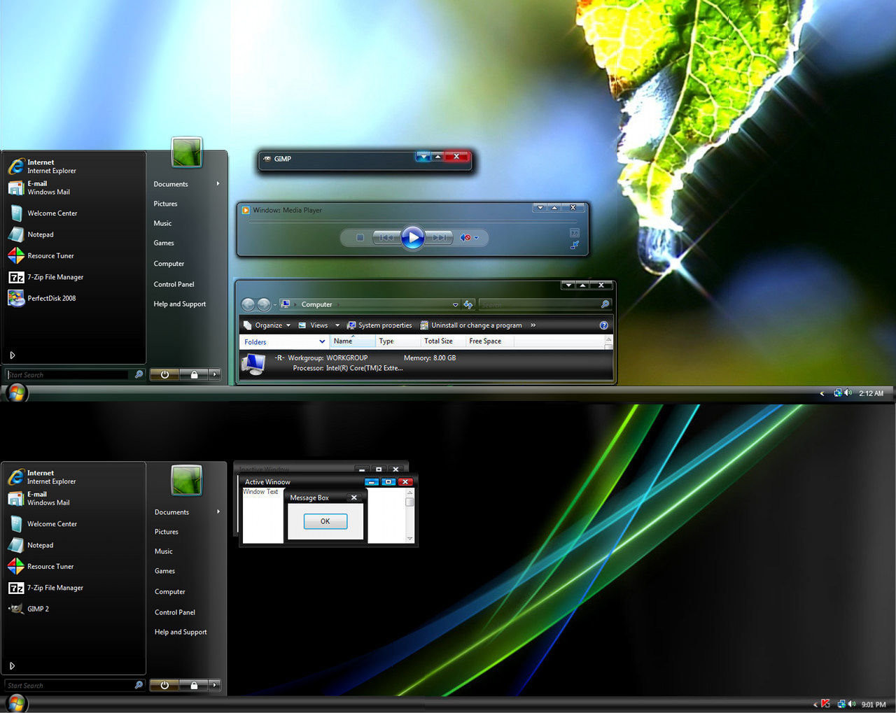
Leaf Visual Style for Windows7
by-nc-nd
dpcdpc11 —
Leaf Visual Style for Windows7
by-nc-nd

Published: 2011-03-02 05:35:50 +0000 UTC; Views: 504027; Favourites: 1540; Downloads: 163158
Redirect to original
Description
Get my latest Windows 10 themes: gumroad.com/dpcdpc11The much awaited Leaf Visual Style for Windows 7 is here!
6 SUBTHEMES INCLUDED: top, top-small-fonts, bottom, bottom-small-fonts + an extra variation of the bottom versions: Bottom Flat (normal and small fonts)!!!! Plus the same cool versions have now a new variation with changed window caption buttons!
View in action here: dpcdpc11.deviantart.com/art/Fr…
Note: if you like this theme, would you be willing to donate a mere 0.5€ as a symbol of your appreciation for me? If you are interested please click here: www.paypal.com/cgi-bin/webscr?…
UPDATE 14:
- NEW VARIATIONS!!! I've got bored of the caption buttons so I made another set of caption buttons which come as a extra versions of the same styles as before. Hope you like them! You can check'em out in a fresh screenshot here: dpcdpc11.deviantart.com/art/Le…
UPDATE 13:
- fixed the height of the All Programs section in Start Menu
UPDATE 12:
- another annoying bug that gave me 2 sleepless nights is finally fixed! I'm talking about the exaggerated height of menu and toolbar in Open and Libre Office. Users... enjoy!
UPDATE 11:
- the much awaited fix for the autoscroll mouse cursor in Firefox is here! It was the damn tooltip PNG in Explorer causing all the hassle. Glad I've finally fixed it! Still trying to fix the huge height of the button/toolbar of Open/Libre Office 3.3
UPDATE 10:
- finally fixed the More Options popup menu in Explorer. Thanks to solmiler
UPDATE 9:
- changed the selected item image in explorer and also the text color from white to black. The white text color was the same as in the details of items when searching in windows explorer which was pretty annoying, for someone using windows explorer.
- I've included another version in the package: bottom flat. What's that all about? It's a previous version of the taskbar which I like and kept alive. It's flat like you guessed and does not have that inner dark gradient that the normal version has. This works perfect on flat minimalistic wallpapers!
UPDATE 8:
- finally fixed the buggy display of fonts in microsoft office 2010 tabs. Thanks to jhanford for the suggestion!
Update 7
- Yes, another update... but it's a GOOD update!
- improved the Small Fonts versions: thinner window frames and also thinner scrollbars. Since some people have small resolutions on their display, I though this change would improve their experience and productivity using this theme, since the desktop space is so limited. Enjoy!
Update 6
- fixed the undetermined progress bar... try checking for windows updates and you'll see what I mean! Thanks to iBest for the bug reporting!
Update 5
- made some small modifications to the bottom taskbar version... added a pale dark gradient to give it a little depth. This will be more visible on simple wallpapers.
Update 4
- fixed the bottom taskbar... now it's smooth as silk!
- removed the aero reflections... now the taskbar and the window frames are all cleaned (thanks to troubada for pointing this out).
Update 3
- added SMALL FONTS version for Bottom and Top taskbar placement. The new font used is called Aller but since I don't have the License to distribute it, I can't include it in the package. Fortunately you can download it for free here: www.daltonmaag.com/Aller_Std_F…
Update 2
- added bottom version for the people who use their taskbar on the bottom. It's slightly different from the one on the top but I hope you like it!
Update 1
- fixed the extended start menu (thanks to sergiogarcia for the bug report!)
Package includes:
- 6 Theme versions: Top, Top Small Fonts, Bottom, Bottom Small Fonts + an extra variation of the bottom versions: Bottom Flat! What's that all about? It's a previous version of the taskbar which I like and kept alive. It's flat like you guessed and does not have that inner dark gradient that the normal version has. This works perfect on flat minimalistic wallpapers!
- Plus the same cool versions have now a new variation with changed window caption buttons!
- Fonts need to make it work perfectly, except Aller... read bellow!
- Explorer Navigation Buttons
- Windows Start Button: dpcdpc11.deviantart.com/art/Le…
Not in the package:
- Aller Font Family needed for the Small Fonts versions. Available for download here: www.daltonmaag.com/Aller_Std_F…
- gdipp - the tinny app that makes your fonts clear and smooth like those in Linux Distros. It's available in 32 and 64 bit flavors. Download here: code.google.com/p/gdipp/downlo…
How to:
1. Patch your system files and install the required fonts!
Be sure to patch your system files before you can use 3rd party windows themes. Use this tool to do it: www.windows7download.com/win7-…
Install the fonts found in the folder "Resources/Fonts"
2. Install the theme?
Copy the content of each folder inside the Theme folder to: "C:\Windows\Resources\Themes\" (Asuming that you're Windows 7 is installed on partition C)
3. Change the start orb?
Use Windows 7 Start Button Changer to change the start orb. You can find the needed tool here: www.door2windows.com/windows-7…
Launch Windows 7 Start Button Changer and choose the BMP from the "Resources/Start Orb - Leaf" folder and you're done!
4. Change the Windows Navigation buttons?
Use Windows 7 Navigation Buttons Customizer to change the Windows Navigation Buttons, resources available in the folder "Resources/Navigation Buttons"
Download the tool here: www.door2windows.com/windows-7…
5. Smooth Fonts like in OSX or Linux?
Use gdipp, the little app which changes you font rendering engine to make the fonts look smooth just like, or almost like in Linux or MacOS. Download here: code.google.com/p/gdipp/downlo…
Credits:
Thanks to jsz for the wallpaper used in the preview: jsz.deviantart.com/art/Maple-L…
Thanks for downloading!!!
Related content


Comments: 831

it's a free family font which you can find here: [link]
👍: 0 ⏩: 1

Awesome. Thanks for the link
👍: 0 ⏩: 1

EPIC! I have that wallpaper long long time...and now amazing theme for that!
good for you
👍: 0 ⏩: 1

I love this style completely. Only issue I'm having is with Office 2010's ribbon headers. Here's a screenie: [link]
If that can somehow be fixed, or you can direct me where to fix it myself, I'd be a super happy bunny
👍: 0 ⏩: 1
I have the same problem and I have no idea how to fix it... cause it's nothing broken from the theme's point of view... it's all about the font. Seems like the damn office suite doesn't really like custom fonts!
Works well if you replace the Ubuntu font with SegoeUI or some other microsoft font.
so that's the best solution I can five you at the moment.
👍: 0 ⏩: 3
FIXED IT! (I'm so proud of myself!)
Remove the FONT from "Windows and Caption Buttons"."Basic"
It seems that Office 2010 uses this font to decide how to display its tabs in Aero.
Got this info using Win7 Style Builder and comparing to stock Aero msstyle
👍: 0 ⏩: 0
I've uploaded a comparison pic: [link]
As you can see the font definitely has changed, so the theme must be playing a part here.
👍: 0 ⏩: 0
If you run a program that forces a switch into basic mode (no aero) it then looks right (this happens for me when I use SharedView and share my screen).
I didn't install the fonts as I like Segoe UI but the fonts as seen in the picture I linked are different than when in basic mode, so something is definitely going on with the theme.
It's not a show-stopper as this theme is so good in ever other way, but it does look a little janky.
👍: 0 ⏩: 1
thanks for the tip... that did the trick and fonts are looking nice on microsoft office tabs now.
other issues with the basic mode are really redundant since the theme doesn't support the basic mode.
the basic mode elements are there from the previous theme I've derived from.
Anyway for anyone reading this, I'll reupload the fixed versions tomorrow.
thanks again for your help my friend!
👍: 0 ⏩: 0

I LOVE the idea of the numbers in the taskbar.
👍: 0 ⏩: 1
thanks.. glad u like it! i thought to make something different!
👍: 0 ⏩: 0

i prefer to use the big fonts than the small fonts with thin scrollbars and frames
👍: 0 ⏩: 1
if there are other requests I'll make another version like that.
👍: 0 ⏩: 0

Updating my version (I'm using the Update 4) right now!!! Thanks again!!!
👍: 0 ⏩: 1

What do I need to do to have the number of the screens opened of each software? I mean in the screenshot you have Safari and the number 2 (I guess 2 tabs), and Firefox with a 3 (3 tabs or windows). Which specific of this theme makes that?
Thanks
👍: 0 ⏩: 1
You dont have to do anything... just use a software that supports multiple windows opened from the same icon on the taskbar... in the preview I have total commander (not safari) and firefox... that's Firefox 4 which has the options to show the tabs preview in the taskbar.
just open several windows of windows explorer for example and when you have 2 windows opened the number 2 appears, when you have more then 3 then the number 3+ will show up so there's nothing in the theme that needs to be fixed for you to show up those numbers.
Oh yea, one more thing... make sure you have the setting of the taskbar: Always combine, never show labels.
👍: 0 ⏩: 1
What I meant is that I want to have the numbers (which I just saw is something in the theme)in my own theme. So, now that I know it's made by the .theme and its files, I think it's all said. Asking how to get the numbers would be complicated for you and for me. Thanks!
👍: 0 ⏩: 1
I understand what you mean now. You have to edit your styles and create a PNG which contains the 2 and the 3+ characters.
👍: 0 ⏩: 1


Does this theme support Windows 7 x64?
👍: 0 ⏩: 1
yes it does... I made the theme using Win7 x64... but the theme is system independent... work on win7, win7 sp1, both x86 and x64... give it a try... it won't byte, I promise!
just don't forget to patch your system files... use this tool to do it: [link]
👍: 0 ⏩: 1
Yeah last night I grabbed all the necessary tools from door2windows. Will definitely try this out when I get home. Looks awesome!
👍: 0 ⏩: 1
cool... waiting for your feedback!
👍: 0 ⏩: 1
Just finished loading it all up. Looks awesome! I like that the fade effects on the scroll bars and Explorer trees are very visible.
A few things:
- I really like the back/forward buttons on the explorer window. Did you think of making them the same height as the folder location bar?
- I have a system update install notification on my Shut Down button in the Start menu. It creeps out the left side of the outline of the button. Not sure if that's fixable, but I wanted to let you know.
- Also, the theme seems to remove the button that expands the system tray icon box. I'd like it back
- It's a little difficult to read the titles in the superbar's window popups.
Other than that it's a solid theme and I plan to rock it for a while!
👍: 0 ⏩: 1
hi there... glad u like the theme... about your requests:
- I really like the back/forward buttons on the explorer window. Did you think of making them the same height as the folder location bar?
* of course... that was the point in the shape of the buttons but I can't... I've tried it and it seems there's a limited space awarded for the buttons so that is the maximum size I could make them.
- I have a system update install notification on my Shut Down button in the Start menu. It creeps out the left side of the outline of the button. Not sure if that's fixable, but I wanted to let you know.
* can you provide a screenshot? I might have forgot to skin that element since I don't get update notifications and I can't simulate that.
- Also, the theme seems to remove the button that expands the system tray icon box. I'd like it back
* the button is there for both the bottom and top version. It's a small up/down arrow. Screenshot also please.
- It's a little difficult to read the titles in the superbar's window popups.
* I don't exactly understand what you mean... the titles are white with black shadow... so they are readable on any background: light or dark... provide screenshot please.
👍: 0 ⏩: 1
- Ah ok. I kinda figured it was a limitation. Still looks awesome.
- Here's a screenshot. I was using the regular bottom version if it matters. [link]
- I switched to the top version and restarted to install the updates; it's there now. Just needed the reboot I suppose.
- I changed to a lighter background and the transparency got a little better to read the text on. When I first applied the theme (bottom) I had a color-stripe wallpaper, and it was a little more difficult to read. And it seems that after changing to the top version and rebooting, the background of the text calmed down and wasn't as fuzzy. So it just needed a reboot haha.
👍: 0 ⏩: 1
glad you fixed it in the end!
about the windows update icon in the start menu, it could be fixed by either moving the icon to right (which I can't do from the theme it self... or at least I haven't find out how) or I would have to make the shut down button wider which I really don't want to do now because it wouldn't fit well.
I'll see if I can do something about the updates icon.
👍: 0 ⏩: 1
It's not the biggest of issues since updates only come once in a while but I figured I'd let you know. Hopefully there's a fix.
👍: 0 ⏩: 1
I'll see what I can do about it!
👍: 0 ⏩: 0

")
thank you... even thought you have a huge screen, I hope you like the thin scrollbars and window frames.
👍: 0 ⏩: 0

This theme is one of the things I love about the Win7 modding scene; people releasing themes with not only functionality, but a sleek and elegant minimalistic beauty that exceeds my previous expectations. +fav
👍: 0 ⏩: 1
thank you! I see you see the beauty in the world like I do! I've collected the same items like you did probably at the same time as well... It's a pity not everyone see things this way... just take a look at this 'art' [link]
how could someone submit and them someone else download this ... this... thing!? this is beyond me... they say beauty is in the eye of the beholder, but this is ridiculous... in this case the beholder must be blind or something!
👍: 0 ⏩: 1

no problem  (Smile)")
👍: 0 ⏩: 1

Could you make the scrollbar thinner?
👍: 0 ⏩: 1
yes i could but it would take too much time to do that... besides I like it like that and I didn't get any other complaints on this matter to make a different version just with this feature.
👍: 0 ⏩: 0

feedback is also welcome after downloading!
👍: 0 ⏩: 0

Very good work dpcd, everything is working nicely now, thanks for your attention to detail and willingness to listen to people. As I don't want to use gdipp or anything like that, I edited the msstyle to only display Segoe UI regular to give it the accustomed Windows feel I was after. All in all a very nice VS, definitely a keeper  (Wink)")
👍: 0 ⏩: 1
You're welcome my friend!
And I'm glad that SegoeUI works for you.. I had enough of it to be honest... looks sooo borrring but since it's working out for you with my theme... I'm happy you found a compromise and still use my theme!
👍: 0 ⏩: 0

i got the set installed and it looks fantastic, however i cant seem to get the firefox, windows explorer or any of the other icons in the pic above done right. i got the forward, back and start buttons done ok. what else am i missing?
👍: 0 ⏩: 1
<= Prev | | Next =>