HOME | DD
 dpcdpc11 —
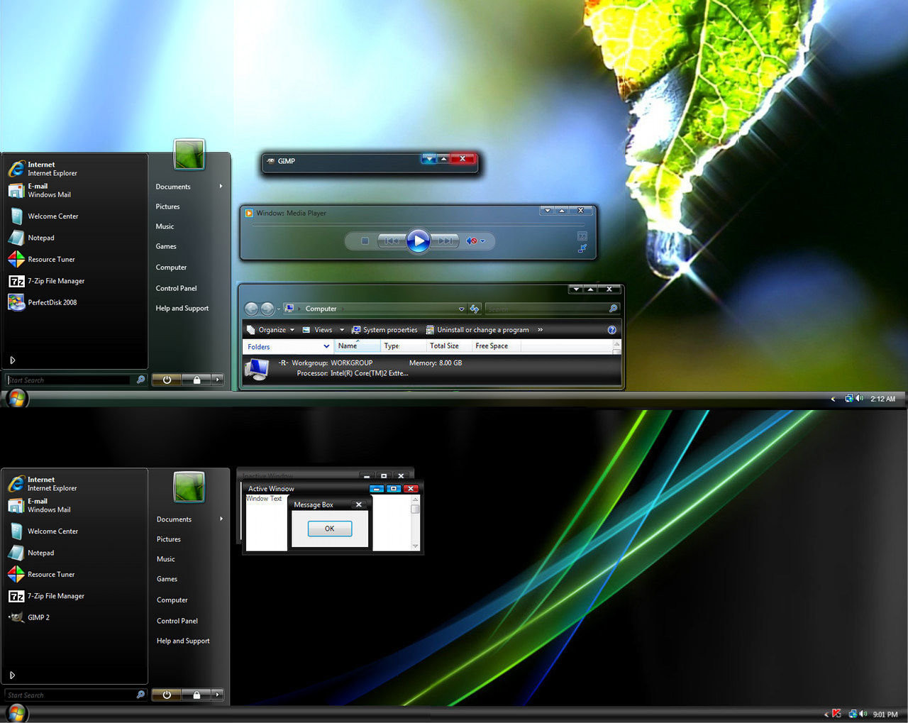
Leaf Visual Style for Windows7
by-nc-nd
dpcdpc11 —
Leaf Visual Style for Windows7
by-nc-nd

Published: 2011-03-02 05:35:50 +0000 UTC; Views: 504024; Favourites: 1540; Downloads: 163158
Redirect to original
Description
Get my latest Windows 10 themes: gumroad.com/dpcdpc11The much awaited Leaf Visual Style for Windows 7 is here!
6 SUBTHEMES INCLUDED: top, top-small-fonts, bottom, bottom-small-fonts + an extra variation of the bottom versions: Bottom Flat (normal and small fonts)!!!! Plus the same cool versions have now a new variation with changed window caption buttons!
View in action here: dpcdpc11.deviantart.com/art/Fr…
Note: if you like this theme, would you be willing to donate a mere 0.5€ as a symbol of your appreciation for me? If you are interested please click here: www.paypal.com/cgi-bin/webscr?…
UPDATE 14:
- NEW VARIATIONS!!! I've got bored of the caption buttons so I made another set of caption buttons which come as a extra versions of the same styles as before. Hope you like them! You can check'em out in a fresh screenshot here: dpcdpc11.deviantart.com/art/Le…
UPDATE 13:
- fixed the height of the All Programs section in Start Menu
UPDATE 12:
- another annoying bug that gave me 2 sleepless nights is finally fixed! I'm talking about the exaggerated height of menu and toolbar in Open and Libre Office. Users... enjoy!
UPDATE 11:
- the much awaited fix for the autoscroll mouse cursor in Firefox is here! It was the damn tooltip PNG in Explorer causing all the hassle. Glad I've finally fixed it! Still trying to fix the huge height of the button/toolbar of Open/Libre Office 3.3
UPDATE 10:
- finally fixed the More Options popup menu in Explorer. Thanks to solmiler
UPDATE 9:
- changed the selected item image in explorer and also the text color from white to black. The white text color was the same as in the details of items when searching in windows explorer which was pretty annoying, for someone using windows explorer.
- I've included another version in the package: bottom flat. What's that all about? It's a previous version of the taskbar which I like and kept alive. It's flat like you guessed and does not have that inner dark gradient that the normal version has. This works perfect on flat minimalistic wallpapers!
UPDATE 8:
- finally fixed the buggy display of fonts in microsoft office 2010 tabs. Thanks to jhanford for the suggestion!
Update 7
- Yes, another update... but it's a GOOD update!
- improved the Small Fonts versions: thinner window frames and also thinner scrollbars. Since some people have small resolutions on their display, I though this change would improve their experience and productivity using this theme, since the desktop space is so limited. Enjoy!
Update 6
- fixed the undetermined progress bar... try checking for windows updates and you'll see what I mean! Thanks to iBest for the bug reporting!
Update 5
- made some small modifications to the bottom taskbar version... added a pale dark gradient to give it a little depth. This will be more visible on simple wallpapers.
Update 4
- fixed the bottom taskbar... now it's smooth as silk!
- removed the aero reflections... now the taskbar and the window frames are all cleaned (thanks to troubada for pointing this out).
Update 3
- added SMALL FONTS version for Bottom and Top taskbar placement. The new font used is called Aller but since I don't have the License to distribute it, I can't include it in the package. Fortunately you can download it for free here: www.daltonmaag.com/Aller_Std_F…
Update 2
- added bottom version for the people who use their taskbar on the bottom. It's slightly different from the one on the top but I hope you like it!
Update 1
- fixed the extended start menu (thanks to sergiogarcia for the bug report!)
Package includes:
- 6 Theme versions: Top, Top Small Fonts, Bottom, Bottom Small Fonts + an extra variation of the bottom versions: Bottom Flat! What's that all about? It's a previous version of the taskbar which I like and kept alive. It's flat like you guessed and does not have that inner dark gradient that the normal version has. This works perfect on flat minimalistic wallpapers!
- Plus the same cool versions have now a new variation with changed window caption buttons!
- Fonts need to make it work perfectly, except Aller... read bellow!
- Explorer Navigation Buttons
- Windows Start Button: dpcdpc11.deviantart.com/art/Le…
Not in the package:
- Aller Font Family needed for the Small Fonts versions. Available for download here: www.daltonmaag.com/Aller_Std_F…
- gdipp - the tinny app that makes your fonts clear and smooth like those in Linux Distros. It's available in 32 and 64 bit flavors. Download here: code.google.com/p/gdipp/downlo…
How to:
1. Patch your system files and install the required fonts!
Be sure to patch your system files before you can use 3rd party windows themes. Use this tool to do it: www.windows7download.com/win7-…
Install the fonts found in the folder "Resources/Fonts"
2. Install the theme?
Copy the content of each folder inside the Theme folder to: "C:\Windows\Resources\Themes\" (Asuming that you're Windows 7 is installed on partition C)
3. Change the start orb?
Use Windows 7 Start Button Changer to change the start orb. You can find the needed tool here: www.door2windows.com/windows-7…
Launch Windows 7 Start Button Changer and choose the BMP from the "Resources/Start Orb - Leaf" folder and you're done!
4. Change the Windows Navigation buttons?
Use Windows 7 Navigation Buttons Customizer to change the Windows Navigation Buttons, resources available in the folder "Resources/Navigation Buttons"
Download the tool here: www.door2windows.com/windows-7…
5. Smooth Fonts like in OSX or Linux?
Use gdipp, the little app which changes you font rendering engine to make the fonts look smooth just like, or almost like in Linux or MacOS. Download here: code.google.com/p/gdipp/downlo…
Credits:
Thanks to jsz for the wallpaper used in the preview: jsz.deviantart.com/art/Maple-L…
Thanks for downloading!!!
Related content


Comments: 831

ok... glad the theme is working in the end as it should!
donate when ur ready... there's no rush here.
thanks in advance!
👍: 0 ⏩: 0

Been looking for a great new theme and this might just do it. Great work.
Would be appreciated if you could put more pics on how the theme looks.
👍: 0 ⏩: 1
you can see it in action here: [link]
👍: 0 ⏩: 1
Nice. definitely am trying this.
👍: 0 ⏩: 1


the small fonts update was a fresh breath of air  (Smile)")
👍: 0 ⏩: 1

Ill try it ")
👍: 0 ⏩: 1

The VS is lovely but VLC apparently has problems with it, all fonts are blind [link]
👍: 0 ⏩: 1
have no idea why VLC has that problem... but VLC on windows??? really??? come one... try Daum Pot Player, best media player for Windows: [link]
👍: 0 ⏩: 1
VLC is the best system-integrating player i tried - the post-processing is just unbeatable. I used MPlayer and KMP for a while but they weren't that good. Thanks for the advice, i'll give it a try

👍: 0 ⏩: 1
be sure to try the 64 version if you're using a 64 bit OS and use PotPlayerMini.exe or PotPlayerMini64.exe and not PotPlayer.exe or PotPlayer64.exe cause that's crap.
Pot PLayer is the rebirth of KMP... it's like a KMP-nextGen
👍: 0 ⏩: 1
Does it support Aero and drop shadow?
👍: 0 ⏩: 1
try it out for yourself man.. I promise it won't bite! you don't even have to install it... extract the content of the exe with 7zip and run PotPlayerMini64.exe
Shadow is not supported yet which is not a big deal anyway... and what do you mean by aero support?
👍: 0 ⏩: 1
I meant i like a perfect UI but some (great) apps come with their own skins like iTunes or Safari what match great with Snow but look a little like aliens on Windows (if you don't use this fake apple themes), otherwise MPlayer, VLC, FFox ... match with Aero Themes like Leaf VS
👍: 0 ⏩: 0
PLEASE restore the bmp numbers (explorerframe), i don't know which one is "hover" or "stop pressed" and stuff...that's complicated dude 
 (Wink)")
👍: 0 ⏩: 1
because if you happen to read the main comment, those bmps are to be used with this tool: [link]
and how on earth can you not tell which one is hover stop etc? are you using resource hacker or restorator?
👍: 0 ⏩: 1
Oops^^ never heard of that app (i ever used Restorator), now it makes all sense to me man...i'm sorry

👍: 0 ⏩: 1
np man! we all make mistakes
👍: 0 ⏩: 0

There's no theme file in the theme folder, so it's not possible to apply the theme :S, in the theme folder
there's only 3 folder:
bottom
bottom flat
top
👍: 0 ⏩: 1
yes.. funny! actually the theme file is in the theme folder cause the 3 folders of the subthemes are in the main theme folder... hope you understand my point.
👍: 0 ⏩: 0


Another update, thanks! Can you fix the font of the title bar? The font don't match with the rest of the system, take a look the image: [link]
👍: 0 ⏩: 1
That was the best font to use in the title bar... if I use droid or Ubuntu or aller font in the title bar the font looks ugly as hell... you can try it if you don't believe me. So since the title bar is an important information display, I wanted to make it look clear so that was the only font that looked good after trying many many others. You can mod and change the theme as you like for person use of course... it's really easy to change the title bar font using Windows Style Builder.
👍: 0 ⏩: 0


Simply beautiful theme!
What's the inspiration for the name?
👍: 0 ⏩: 1
thanks for downloading and the fav!
the inspiration was the great wallpaper I used in the preview which goes perfectly with the theme and also windows frames which are darken just like the light passing through a leaf, but without the green color of course.
👍: 0 ⏩: 1
I see; it all makes sense now! Great style.
👍: 0 ⏩: 0

what's the difference between botoom-flat & bottom, please enlighten me...
👍: 0 ⏩: 1
it's the taskbar... I'll edit the main comment in a moment and explain to others as well.
the taskbar is flat, in the flat version as in the normal bottom version the taskbar has an inner dark gradient to give it a bit of depth
👍: 0 ⏩: 0

another thing - the same thing happens to the 'get more results' button when the searchbox within the start menu is used.
👍: 0 ⏩: 1
last thing - when right clicking an icon without jumplists on the taskbar - there is no transparency.
👍: 0 ⏩: 1
that's a windows bug because the first time you click an icon without a jumplist the transparency is there... clicking a second time, the transp is no more, just a dark menu background.
I can't really explain why cause the PNG of the menu is of course transparent... it's the same PNG as the one in the menu with jump list... btw I've fixed the white text in the search list.
and one more thing, please don't reply to your own comment cause that doesn't appear as messages to me. Luckily I've seen your comment by scrolling to see the statistics of the theme.
👍: 0 ⏩: 0
love the visual theme...very usable and clean. small thing though - fonts are unreadable when viewing the searchbox results. (aka size/date, etc can't be read)
[link]
👍: 0 ⏩: 1
I know about that bug... that's a tricky one! but thanks for pointing it out anyway.
I'll update the theme once I get to fix that... but I'm not sure I can do it!
👍: 0 ⏩: 0

Perfect balance of light and darkness with high readability.
Great work!
👍: 0 ⏩: 1
thank you... that was my main purpose, to make it usable and not interfere with the user's productivity.
👍: 0 ⏩: 0


Hi, nice theme
I just wanted to say that in WMP the time isn't correctly displayed. I'm using Win7 ultimate on 1280x800 with the latest wmp
👍: 0 ⏩: 1
thanks...
about media player, link up a screenshot... my media player displays time correctly... and dunno if media player has anything to do with the theme.
anyway send me a screenshot and I'll see what I can do about it, cause from your comment I have no idea about which time are you talking about: the one in the play list, the one in now playing panel, or which one.
👍: 0 ⏩: 1
hi i posted the screenshot at [link] ty for your quick reply mate
👍: 0 ⏩: 1
here's my screenshot of WMP looking just fine: [link]
are you using the latest update of the theme? cause I've fixed some bugs since the first release... if not, please download the latest version and also make sure you have the needed fonts installed.
hope this helps!
👍: 0 ⏩: 0

Just wondering something; That font you have used in the preview to write your username and "Visual Style" where can i find that?
👍: 0 ⏩: 1
<= Prev | | Next =>