HOME | DD
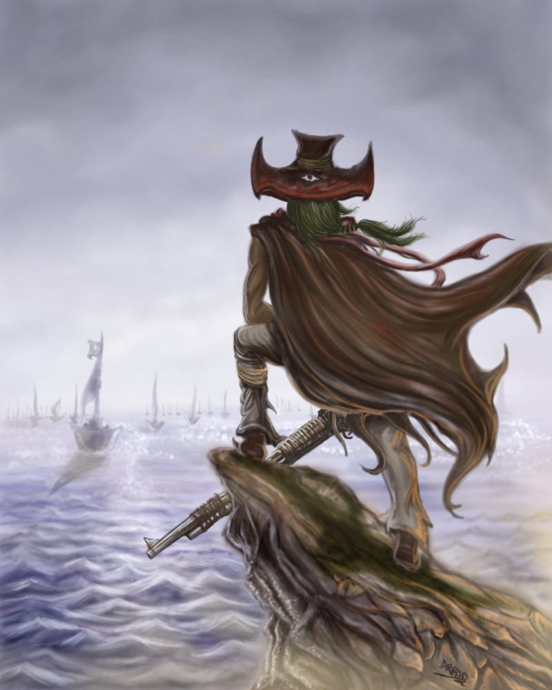
 DreadJim — Calm before the Storm
Published: 2004-08-08 16:42:30 +0000 UTC; Views: 2097; Favourites: 19; Downloads: 252
Redirect to original
Description
Calm before the Storm is my latest effort at depicting a simple character concept with an atmospheric perspective.Bearn "The Eye" Rosifick is a notorious pirate-hunter turned pirate on the loose, now hiding in Rawshank island. His ex-comrades have been issued an order to capture or kill Bearn.
Bearn got his "eye" nick for being an excellent marksman,known for his high body count during the Pirate Age. He is known to shoot men right between the eyes and he could even shoot without looking, thus the gimmick eye pirate hat he dons. Bearn is thus greatly feared by rival pirates and targetted by countless privateers.
After his pirate ship got defeated and his companions lost, Bearn concentrated on his shooting skills and since then, he has become a one man show, able to take on an entire ship of men with his wits and skills. Now, being mostly alone and armed with only his trusted gun,will he survive the league of Pirate Hunter Nagish?
Comm and crits welcome and appreciated...any advice on the sea would be nice as well
 (Smile)") enjoy...
enjoy...
Related content


Comments: 41

Very nice. I like your composition on this piece. The wrappings on the gun give it alot of character. Great job! Composition is great.
👍: 0 ⏩: 0

Excellent artwork - I like the way the viewer gets to look out to sea with him very much in the forground. Good work.
👍: 0 ⏩: 1

thanksya~
👍: 0 ⏩: 0

hee thanx dio~hope to seeya around more~
👍: 0 ⏩: 1

sure dude! i'm always here!! nah not always...
👍: 0 ⏩: 1
")

I'm PROUD to have you on my DevFriends'list!!Bwaahahhhhhhh!!!*cries from the beauty of your works*
👍: 0 ⏩: 1
awww.....thanks for ur comm~!!im honoured that ur on my list too~WWWAAAAAA!!!!
👍: 0 ⏩: 0

How long did you work on that story? It sounds like it's got a lot of potential... *rubs hands together gleefully*

👍: 0 ⏩: 2
and WHATS that evil expression means anyway!!!!ahha
👍: 0 ⏩: 0
lol, glad u like my words,im humbled ehhe...jus thought it up in awhile actually,when the idea of a figure watching over the seas hits me~
👍: 0 ⏩: 0

surprisingly peaceful despite the big scary warrior guy
")
👍: 0 ⏩: 1
hahah!nice comm, it'll be more peaceful if i'd make the sea all smooth and wave-less,which i tink is gonna look more unrealistic...>~
👍: 0 ⏩: 0

First thing I thought of when I saw this was a celt looking out over the english channel at a roman occupation fleet, and then I saw the gun
Love the dude with the gun, the rock hes standing on and how the wind is interacting with his cloak. Tis nice.
Im not sure the water and the shadows of the boats are too convincing however, doesnt look as natural as the foreground.
Great sky though.
")
👍: 0 ⏩: 1
ahah!~A celt!that crossed my mind once too@~ thankz for liking the dude, dude~yea man,actually they are there too be secondary elements as the dude is the main thing, but guess i took many ppl's attention to the other parts instead...i wanted to go for an impressionistic feel tho...
👍: 0 ⏩: 1
Yeah ok, fair enough, just that if you were going for the impressionistic feel, usually the main focus of the image should perhaps also be impressionistic. At the moment is seems very life like, and a different style to the water. That isnt to say its very good, it just looked like you swapped styles for the water, tis all.
👍: 0 ⏩: 1
yea man,tats true~but i just cant stop myself from doing at times~so i guess,the mix style i tink i have to find a way to fusion man~thankz for ur input,it has help mke to understand my own art as well~
👍: 0 ⏩: 0

I like this image, it leaves a lot unspoken and it is very dynamic. The water does look a little too orderly, paralel rows of triangular waves. Choppy seas (as this appears to be) tends to be much more chaotic than that. Also, check out some ships on the ocean - you'll see that they very rarely, if ever, cast a hard shadow on the water. A better way to 'connect' the ship with the water would be to put in a reflection, though I understand that this would be more difficult
Nice work, anyway. Great sense of depth, and the character is very well done
👍: 0 ⏩: 1
thanks for ur insight,and the crits....oh and that reflection thin i'll def change it!~ thanz man!~
👍: 0 ⏩: 1

great work! interesting hat
The clothing is superb, the sea, hmm, the waves look so unreal, the colours are wonderful
But I have to say that I like your other pics much better
👍: 0 ⏩: 1
thanz for the comp, hmm this pic does not live up to my other pics? well that might be coz its rather done quickly! OOps!
👍: 0 ⏩: 0

Crazy! Nice perception here! Yeah, i've been meaning to do one of these too, like focusing on the bg more than the character. This is a brilliant success, i think! My only crit is that the water looks a little, well, icy. Like it seems too jagged to be an ocean, know what i mean? The rock is done really well, tho. Take it from someone who's been trying to colour rocks for nearly a decade now and still can't seem to get it right! 
👍: 0 ⏩: 1
thanz so much for ur comm~!well at first i made the sea look peaceful...then i decided not to leave it as it is,and instead add in waves,then without ref i jus doodle the waves and it turns out like this~ thanks for apprep the rocks and the idea too
👍: 0 ⏩: 0

wooo looks cool... but the stone/rock thingy he's standing on looks weird... lol... but overall good job
👍: 0 ⏩: 2
ya i agree wit u,it does look wierd for a rock,by the sea...but i kinda like how it turns out anyway,as this world of my pic isnt relli on earth itself,lol thanks
👍: 0 ⏩: 0
ya i agree wit u,it does look wierd for a rock,by the sea...but i kinda like how it turns out anyway,as this world of my pic isnt relli on earth itself,lol thanks
👍: 0 ⏩: 0


wow looks great.; love the detail. You're right the sea needs a bit of extra work.. the waves aren't that pointy and are white/gray on top which glides into blue/green in between.. they are sort lines that come towars you but they kinda of criss cross each other. I hope this helps you a bit!
👍: 0 ⏩: 2
hehe,thnx,hmmm criss cross each other?thats confusing...tink i betta get ref next time lol...
👍: 0 ⏩: 0
hehe,thnx,hmmm criss cross each other?thats confusing...tink i betta get ref next time lol...
👍: 0 ⏩: 1

nice but somehow i find it slightly not as nice as your other works
but at least the guy is not afraid of backstab attempts as he got a eye behind hide head
👍: 0 ⏩: 1
haha,which works do you mean? well tats jus a hat man....
👍: 0 ⏩: 0

Wow, that's a very nice background. ^^ I love the dark, overcast sky and the ships in the fog. However, I think the highlights on the sea may be a bit overdone, especially towards the bottom part of the picture. But hey, I couldn't draw backgrounds to save my life, but just my opinion.
The coloring and shading on the character himself are wonderfully done, especially on his left leg and his cloak. I also love the movement of the cloak and his hair. It looks very natural and not awkward at all. ^^
Ooh, and his gun. Well... I just like his gun.
👍: 0 ⏩: 1
well i thank thee for the comp, and the crit,i'll def rem it...~seeyaaround man....
👍: 0 ⏩: 0