HOME | DD
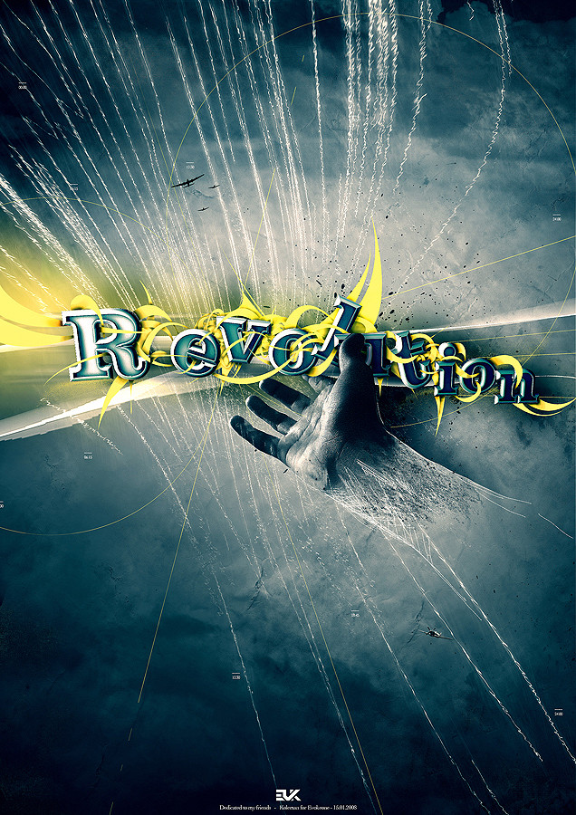
 DreamdustART — Revolution
by-nc-nd
DreamdustART — Revolution
by-nc-nd

Published: 2010-06-17 13:20:37 +0000 UTC; Views: 879; Favourites: 22; Downloads: 1
Redirect to original
Description
a Typography I did with Photoshop, actually my first typography so I hope you like it (Smile)")
Tips are welcome
 (Wink)")
Related content


Comments: 9


Wow I really like this haha. I like all the stuff dripping off the text.
👍: 0 ⏩: 1

")
👍: 0 ⏩: 1
Perhaps. I always multiple versions of my works haha.
👍: 0 ⏩: 0

first typography?
O.o
looks awesome. all those colours and flares give a very glamorous sort of feel. and all those tilted letters and paint splash give the piece a lot of force.
i think you pulled it off well and the piece has a lot of cohesiveness, because only after staring at this for 5 mins did i realize the line behind 'v' and 'o' are not part of the letters.
or maybe i'm going blind. -_-
one thing i would like to mention is, i think it would look better without the bevel and emboss sort of effect, ie, it'd be much sleeker if it were just flat 2d. well, imo anyway.
when you say this is your typography what does it mean? did you draw the letters out yourself without the help of any fonts? just asking, coz i don't really know typography. -_-
keep up the great work!

👍: 0 ⏩: 1
Thanks allot for your comment!
hehe, the line behind the v & o are indeed not part of the letters
About the embross I also wasnt really satisfied but lowered it now.
Yes I drew the letters myself in Illustrator
👍: 0 ⏩: 0

it is cool and i like it
congratulate you with your firs typography.
👍: 0 ⏩: 1