HOME | DD
 Drisela — Diverging Paths p.18 v.2.0
by-nc-nd
Drisela — Diverging Paths p.18 v.2.0
by-nc-nd

Published: 2010-06-04 02:19:02 +0000 UTC; Views: 1820; Favourites: 21; Downloads: 35
Redirect to original
Description
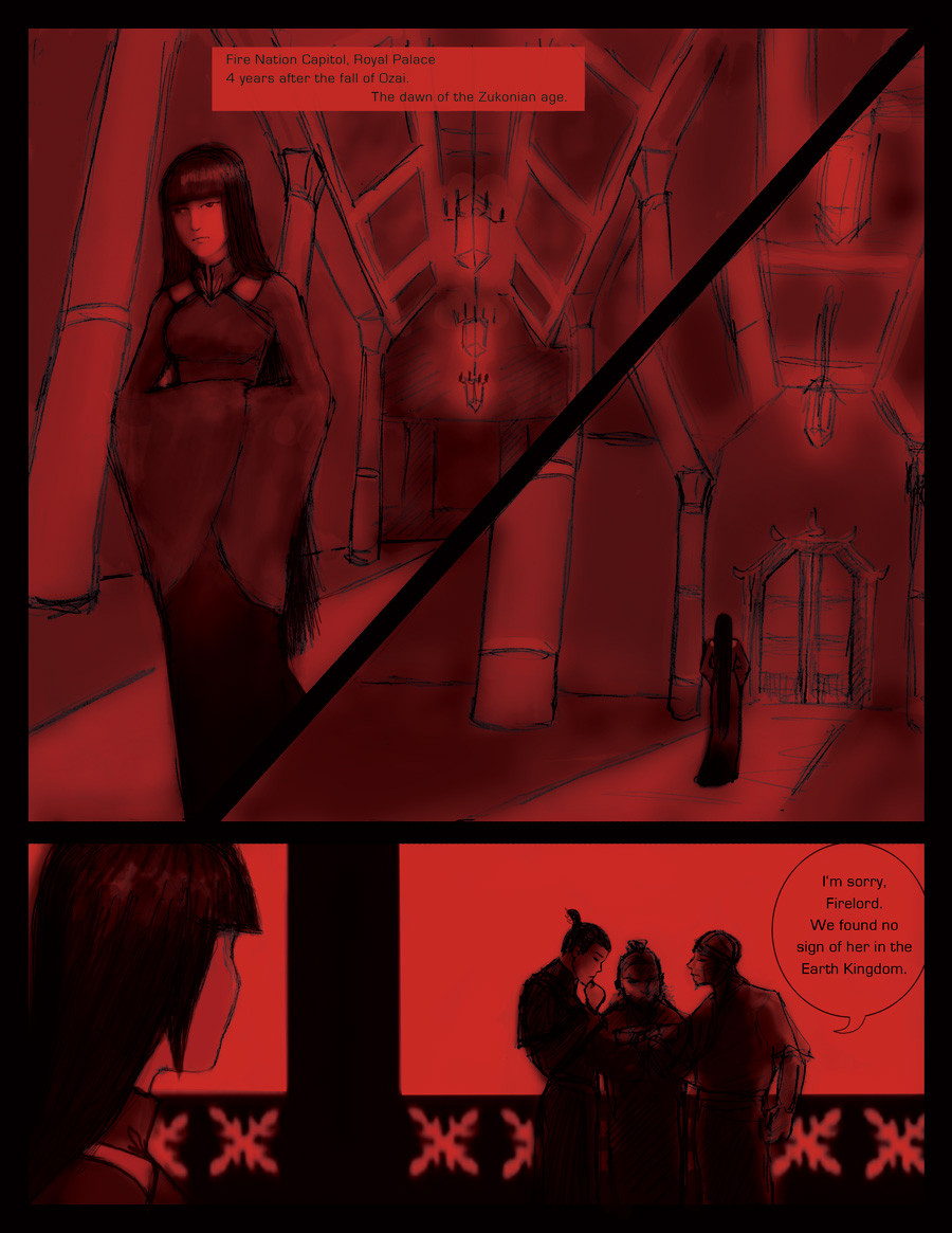
I read all your comments.And took things into consideration.
When I compared the Maiko Flashback to the Kataang Flashback,
it seemed to lack the same depth of shades.
But when dealing with red ...
it was going to go pink ... or orange.
Pink doesn't feel 'Maiko' to me and Mai doesn't like Orange ...
I decided to try the warmer shade.
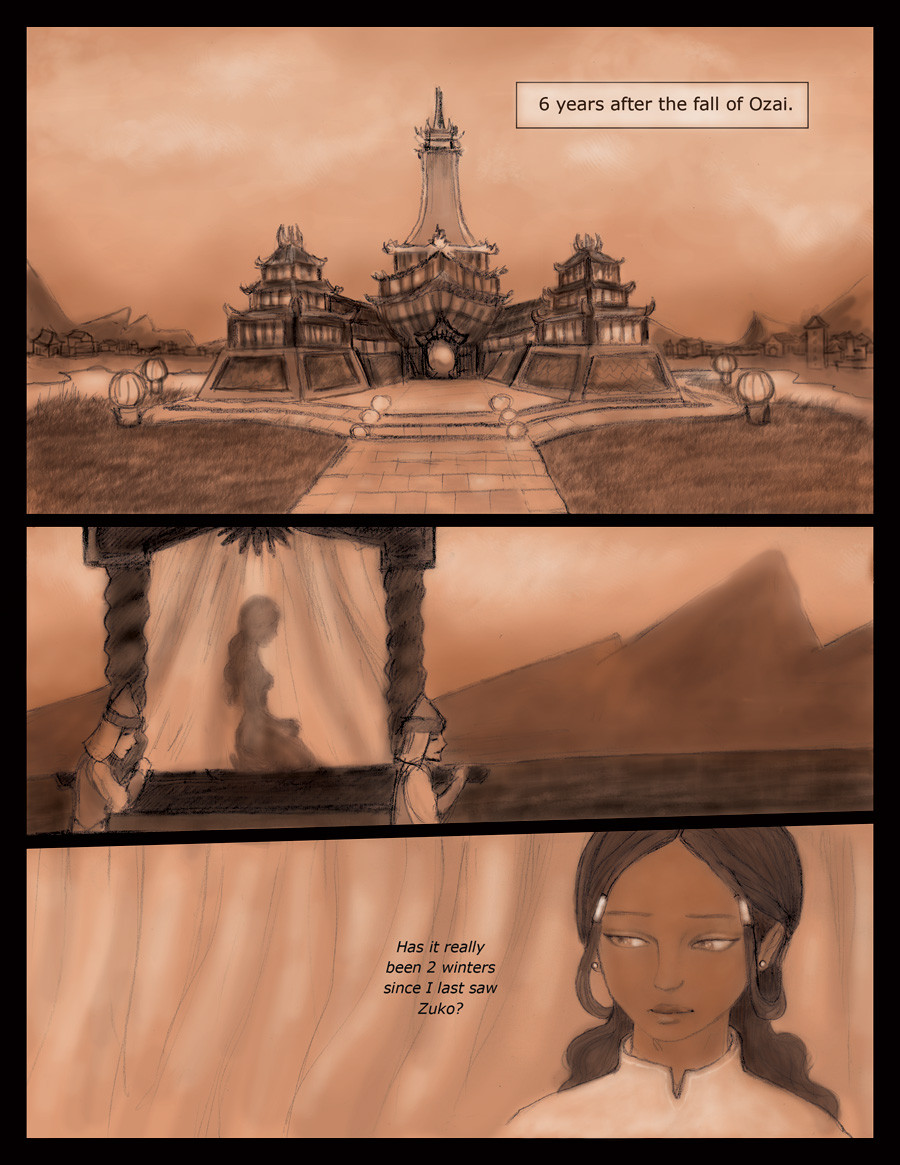
Most of this flashback takes place on that bright balcony .
It's enlightening.

p.18 [link]
Related content


Comments: 27

I really want to see where this is going.
Having trouble pronouncing Zukonian.
")
👍: 0 ⏩: 0

Wonder if that's why the split, 'cause he was obessed with finding his mama.
👍: 0 ⏩: 0

I must admit that although I didn't notice the lack of depth in the first one, and therefore didn't complain about it, I do like this one better. It's lovely. Plus, if I was ever put in this situation, I would say "YOU'LL LOOK AT ALL THE DAMN RED AND YOU'LL LIKE IT!!!!1" Instead of being nice, like you.
 (Smile)")
👍: 0 ⏩: 0

"Zukonian" That's a funny name.
And I know it's kinda irrelevant, but I loved Mai with her hair loose.
👍: 0 ⏩: 0


I didn't notice the "Zukonian Age" part before. I LOVE that.
I like both versions btw.
👍: 0 ⏩: 0

i really like how you changed it!!
but i also liked it before!!!
but either way is good!!
tehe
👍: 0 ⏩: 0


I enjoy the colouring on this one better.
I agree with you. The Fire Nation would definitely need to give Earth and Water war reparations, and they would have to heal their war-centric country. I'm writing a fanfic now that's set eight years after the events in the series, and I called it the Zukonian Age, too. XDDD It just makes sense.
👍: 0 ⏩: 0

ooooh much, much! better ")
this red is so..beautiful t-t
👍: 0 ⏩: 0

This really does look better!, I think Mai looking darker compared to the background works and there is more depth from the other shades,
👍: 0 ⏩: 0

so I guess I'm still unclear... are mai and zuko together in the sense that she's the Fire Lady? or were they only dating?
👍: 0 ⏩: 1
Yeah, I don't see that one either. I suppose I could go back and look at all of the comics and see if I can either figure it out or if it's in there, but do you think I'm gonna do that? Nope.
👍: 0 ⏩: 1
Then again, she's not wearing the crown thingy. So my guess is dating...
👍: 0 ⏩: 0

I do like this version better. However, the last two panels is slightly too much orange. Just a tad. It works though! It makes me think of a summery sunset.
👍: 0 ⏩: 0

Cabbage Merchant?!? (lol...-.-')
But seriously, I like this page, because to me it came out with more depth. Even though it has only about two tones, it makes an improvement!
And hey, if you want to go a step further, how about a brown ochre tone for...whatever parts in the page you would want it?
Great story!

👍: 0 ⏩: 0

I like this better, honestly - but I can see why you used the red tones originally. Maybe go for more of a reddish-hued orange for the best of both worlds?
👍: 0 ⏩: 0


I like the original better. The red is more subtle and I feel it fits more than the orange. The orange does give more difference in colors but...it's orange. XD Not red! I DON'T KNOW! ")
👍: 0 ⏩: 0

wow, after putting them back to back and seeing what you did, I like this one more. You see the contrast between light and shade here. I love it! and very very nice.
👍: 0 ⏩: 0

Ya but I dont like maiko so the color is fine by me
👍: 0 ⏩: 1


*sigh* Fine. Well the original color kinda was hard on the eyes. I think by tuning it down it adds to the appeal of the comic as well as making it easier to read. While I think I could see where you are going with the original I think this page is a great alternative and I would stick with it.
There was that better?
👍: 0 ⏩: 1

That was beautiful. 

👍: 0 ⏩: 0