HOME | DD
 dsymetry — Move On

Published: 2004-12-14 05:42:00 +0000 UTC; Views: 1463; Favourites: 27; Downloads: 446
Redirect to original
Description
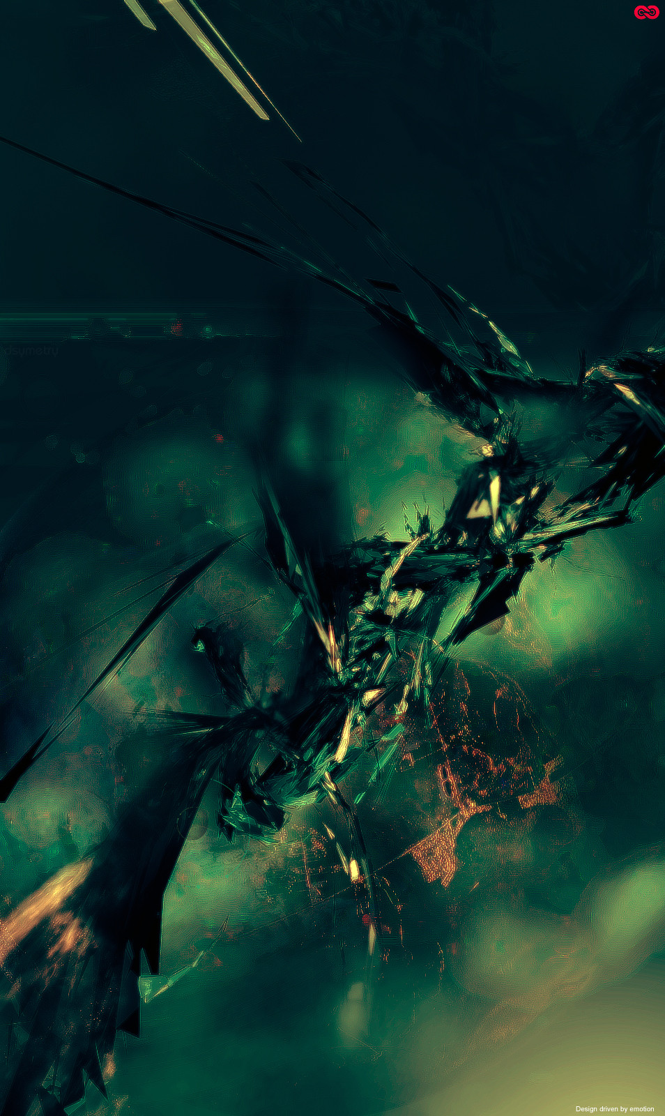
Eh? This one as personal meaning, Iam not going to share") . Made at work in lunch time over the past couple of days. It's an old C4D render of mine, and I guess thats another part of the title, I want to try some new things, but not sure, I love sharpness! Busy with work now as well, so it's alot harder to find the time. DSYMETRY05. static from now.
. Made at work in lunch time over the past couple of days. It's an old C4D render of mine, and I guess thats another part of the title, I want to try some new things, but not sure, I love sharpness! Busy with work now as well, so it's alot harder to find the time. DSYMETRY05. static from now.
Related content


Comments: 41

 (Smile)")


really awesome mate, dunno about the text (doesn't seem to fit in that well) but i love the colours +fav
")
👍: 0 ⏩: 0

A beautiful piece man. Great depth and color. But it could really do without the typo.
👍: 0 ⏩: 0

that looks like some hot stuff (in more ways then one)
👍: 0 ⏩: 0


wow man this is smooth. Great feeling/emotion. Hows work going for u?
Ive been bored as hell!
👍: 0 ⏩: 1

its all right, had to look at dirty porn sites made me sick to the stomach :< i havent been paid yet money should go in over night see how much i get :>
👍: 0 ⏩: 0

Wow. I don't know meaning behind this but it is excellent. I really wish I could learn C4D and 3dsmax more in depth, but I have no teacher and the tutorials I've seen to date haven't been written very well.
👍: 0 ⏩: 0


great!, much better without the lightnings... a calm explosion of human conditions...
👍: 0 ⏩: 0
great!, much better without the lightnings... a calm explosion of human conditions...
👍: 0 ⏩: 0

lol no one likes type bar me :>~ l
👍: 0 ⏩: 1


This goes up in my personal all time favourites with your my better half
👍: 0 ⏩: 0

looks neat, dunno if it would be better without "lightings"
👍: 0 ⏩: 0

I love sharpness too...
i understand the thing with busy at work.the same here and x-mass stress too.
hard to find the time and create good pices!
i really love the background brushes! likes an vulkan and fire together!
great set bro! much greetz!!
Fav.-

👍: 0 ⏩: 0

Yeah, the lightning and typo really do seem to ruin the flow a bit in my opinion. Other than that, fantastic rendering and brushwork.
👍: 0 ⏩: 1
Whatever... just do your thing.

👍: 0 ⏩: 0

WHY the lightning strikes and typo?!? I know it would look much better withouth them... damn it ruins the piece imo
👍: 0 ⏩: 1
yeah i did it at work ill prolly update later? or i might not
 (Wink)")
👍: 0 ⏩: 1
well just see waht you do with it
👍: 0 ⏩: 0


damn nice colors and brushing....+fav
the only thing i dont like are the lightnings oO
👍: 0 ⏩: 0


wow... i love the colours.. beautiful!
Great job with the brushing also..
👍: 0 ⏩: 0

the lightning doesn't work for me but the colors and brushwork are really nice, good job
👍: 0 ⏩: 0

awesome ambient lighting and coloring. very detailed brushwork, just dont like that zig-zag lines too much.
👍: 0 ⏩: 0

THe colors and brushing are awesome
Also the render looks pretty cool
Something i like less are the lightning lines
nonetheless very nice work
👍: 0 ⏩: 0


