HOME | DD
 E-Serrano — Metallic Device - HMI Web

Published: 2006-08-16 22:58:49 +0000 UTC; Views: 4196; Favourites: 12; Downloads: 46
Redirect to original
Description
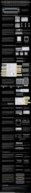
This is the web page design of my latest 3D short animation movie: "Human / Machine Interface" (HMI). As it is a science fiction film, its website had to be something related to futuristic machines and high-tech. So I thought that a combination of wires and chromed metallic surfaces would be appropriate.I will place a link to the movie as soon as I have it finished. I'll try to add some other interesting extras such as "making of" data and high resolution still images.
Some details about this webpage interface:
 Created from scratch with Photoshop CS, brushing and using layer styles. Four days working intermitently on it. Adding that huge amount of tiny details was rather time consuming. For numeric stat lovers: 109 layer sets, and 221 layers (yep, that's big!).
You can see the design working here [link]
As always, your feedback is much appreciated!
 (Smile)")
Related content


Comments: 17

It's truly awesome. I need the button textures (with credits of course), they're amazing
")
👍: 0 ⏩: 0


👍: 0 ⏩: 0

Like dat... But i think that there are too much details and it make some kind of noise.
👍: 0 ⏩: 1
Yes, I agree 
Thanks a lot for your appreciation!
👍: 0 ⏩: 1


damn man! This is nice!!
you draw that in PS??
im impressed...
cant wait to see this one done!
Good job E...very good!
/enik

👍: 0 ⏩: 1
Thanks a lot for your support, enik!
Yes, that's full Photoshop. The quicksilver layer style was a good starting point. But then I replicated many layers, used many blending modes and hand brushed a lot... And here is the result!
Now it's time to make this design a real web page. I'm on it!
By the way, you're gonna love my 3D animation film. I hope the release is coming soon.
 (Wink)")
👍: 0 ⏩: 1
wow! Well you did great and again..looking forward to see the movie!
👍: 0 ⏩: 0

Its cool, a bit too repetitive though, nice metal look.
👍: 0 ⏩: 1
👍: 0 ⏩: 0

I like the concept... but IMO the glossy/shinny buttons and background will look better with more degradation or more contrasts (at least the buttons... to make it more legible).
good look with your project
👍: 0 ⏩: 1
I usually work in a very contrasted TFT monitor, so I'm not having that kind of problem right now... Anyway I'll check the design in other screens, as I can still tweak it before creating the actual web page. Thank you for your advice!
Now that the animation movie is completed, I think that the rest of the project will be piece of cake!
👍: 0 ⏩: 1
...you're welcome
I prefer more simple designs for interfaces, but yours is quite cool nonetheless
👍: 0 ⏩: 1
Yes, this design had to be somehow complex, as it suits the overall looking of the film Thanks again!
👍: 0 ⏩: 1
de nada
no sabía que habla español... hace años fui a España
👍: 0 ⏩: 1
Pues sí, es verdad, ambos hablamos español
👍: 0 ⏩: 0