HOME | DD
 e-string — Waiting for gobo
[NSFW]
e-string — Waiting for gobo
[NSFW]

Published: 2010-03-02 22:27:50 +0000 UTC; Views: 3922; Favourites: 132; Downloads: 0
Redirect to original
Description
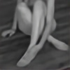
Model: The beautiful and talented Rebecca Lawrence. She's also our Wii Bowling champ. - :D")
Copyright: me
Rolleiflex
Related content


Comments: 23


Very nice design! I see this more that way because of ghe strong line and space elements dividing the space and your subject.
I see the title as an in joke because of the higher exposure (not over exposure) on her in the sun.
Well done Erin!
👍: 0 ⏩: 1
Sorry, just thought of this. It's something that actually easier to do in a darkroom than digitally. Drawing out detail in the high key area with water bath development of the print. I hope you do have a wet darkroom, otherwise you're missing 3/4 of the experience of shooting B&W. Otherwise you might as well shoot digital. That's why I hardly shoot pan film anymore. No darkroom. If I can't spend all day making one fine art print of one negative there doesn't seem to be any point to me.
Still I bet this is a gas for you and you're doing so very well! What a talent you are!
👍: 0 ⏩: 0


To me, this has an old school feel that I really like.
Could it be that she is your Wii Bowling champ because she has good form?
👍: 0 ⏩: 1

very beautiful done photo. Gorgeous light master and tones.
The title I don't understand, I do not Know Gobo. I just know Gopo, an interesting romanian movie maker.
👍: 0 ⏩: 1

[link]  (Wink) - ;)")
But seriously, thank you.  (Smile) - :)")

👍: 0 ⏩: 0


the use of negative space works well because of the detail in the shadow area. although some of the highlights are blown out, because the subject is fair skinned, does not cause distraction.
Composition is key since the subject area is rectangular, you've created more interest by extending the cropping area a comfortable distance above the triangular highlight.
B&W adds to the romance, and tonal quality gives the piece a classic feel.
Worthy of a wall hanging.
👍: 0 ⏩: 1

The blown highlights were intentional and I imagine pretty difficult to avoid without massively underexposing. There's dodging/burning, but I like the contrast. 
I'm not sure you were implying this, but no cropping was done. (Nor did I change levels or do anything but remove a bit of scan dust.)
👍: 0 ⏩: 1
The blown highlights were unavoidable given the light ratio, unless you were to fill the shadows with other light sources.
The cropping whether in camera or not, works quite well. I tend to crop in camera (learned this in school) but my trade taught me to loosen the crop so the creatives can do it.
Rock On!!
👍: 0 ⏩: 1
Yeah, I try to do as much in camera as possible. And I considered using lights that day but am so glad I didn't, as this came out of nowhere and took me by surprise - so I ran with it.

👍: 0 ⏩: 1

Thanks, wondered who would get it.
👍: 0 ⏩: 1
