HOME | DD
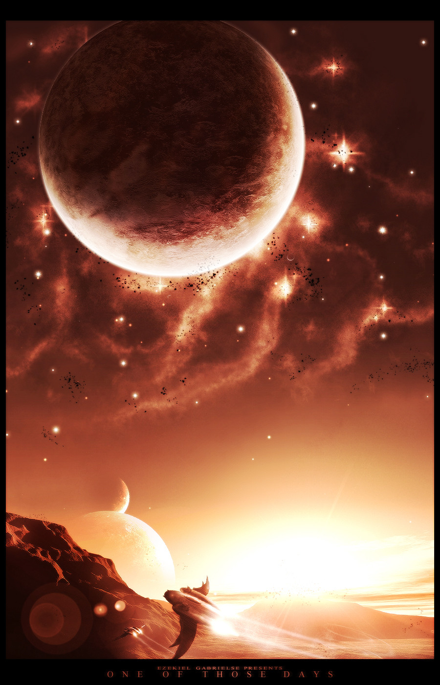
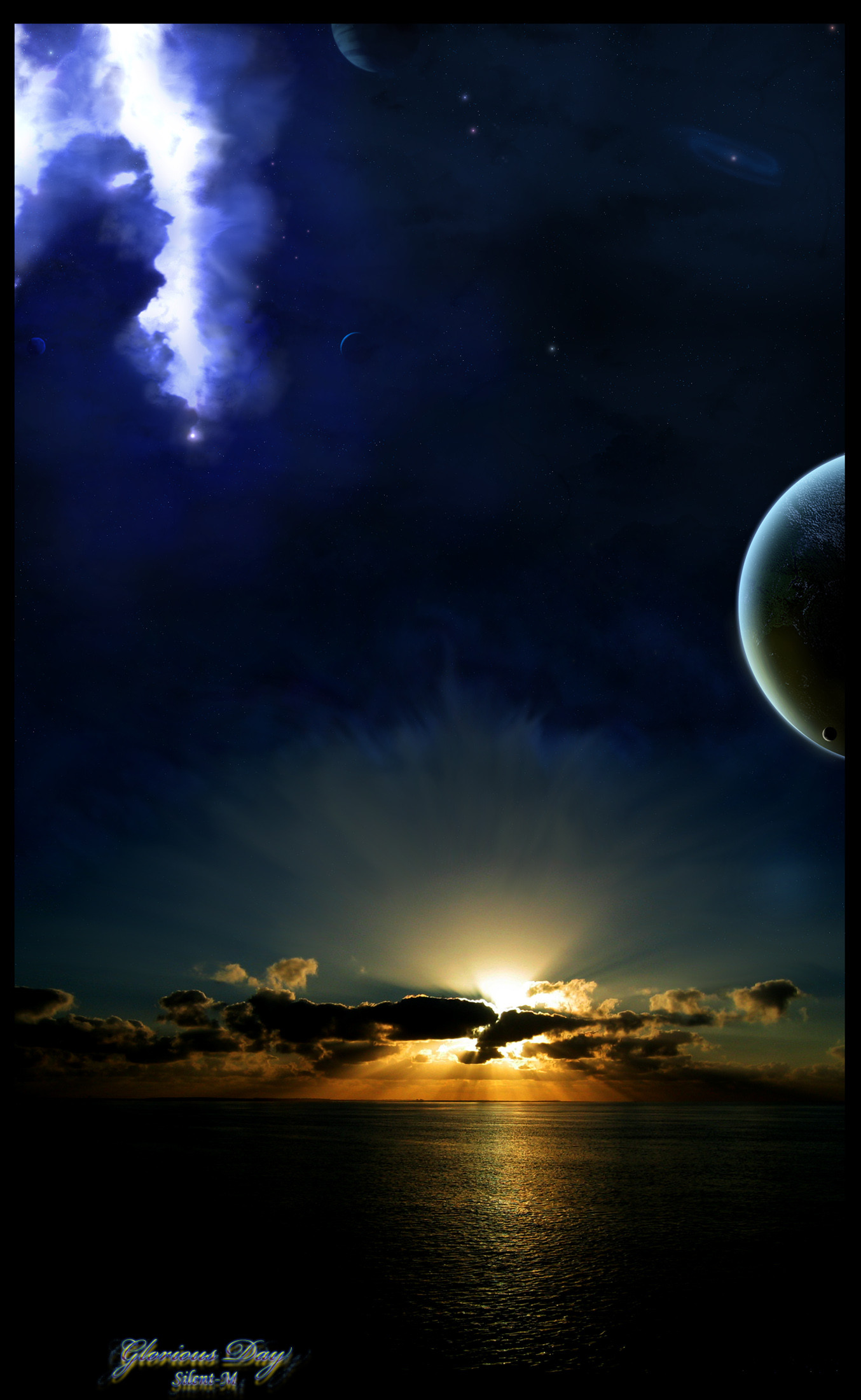
 Eclipse-CJ3 — One Of Those Days
Published: 2005-01-29 22:46:46 +0000 UTC; Views: 1630; Favourites: 47; Downloads: 267
Redirect to original
Description
Well, here's a new one. Hope you like it, I tried out some new stuff, as well as painting ships (Wink)") 5 hours or so, across 3 days.
5 hours or so, across 3 days.*If there's some errors it's cause this was just a practice piece, I needed to try something out*
comments and favs would be awesome!
")
Related content


Comments: 25

delightfull work!
the stars might be a tad over-done, but the starship takes off the edge.
👍: 0 ⏩: 0

damn this looks awesome...i like the coulors that you used here...very nice
👍: 0 ⏩: 0

Arrgh just to humilhate my lil ships again
awesome

")
👍: 0 ⏩: 0

Great work! The painting whas really good. You used terragen with this? And did you paint the ships with a mouse or a pen?

👍: 0 ⏩: 0

nice work .. love the brightness in this one..
beautifull colours as well..
The starfield is very well done and I love the planet..
great texture
the terragen work and spaceship are a great addition
I normally hate lensflares but it doesn't ruin the piece here..
nice work

👍: 0 ⏩: 0

To me, a lot of space art is just overdone. There are only so many nebulas you can do before they all look the same. There are only so many planet formations. And there are only so many pretty color combinations. After a while, some of the space artists get to know each other so well that their artwork begins to look like each other's, only adding to the (in my opinion) dullness of the pieces.
And then there is space art, and that's what I would call this. There's an original layout and style here that just isn't seen in other pieces around the site. I love the bits of rock that are about the planet above, and this method of lighting is definitely one of the most original I have seen on DeviantART.
It could use some extra stars in the sky, as *T3RMiN4T0R said, and they could be a little less generic than using the same shape at different sizes, but maybe you didn't want that; considering your original style, maybe it's intentional. Some of the critiques you received here, while I can agree on some points myself, seem to only be based upon what they (we) are used to seeing. Sometimes it's good not to look like you're from the same mold. Ultimately, it's your decision.
It's an amazing piece, considering it was used for practice. I think there are places that could use some refining, which is usually the case with practice pieces, but keep this original style. It gives you an edge that most lack.
 (Smile)")
👍: 0 ⏩: 0


Man, im watching you. This is inspiration... really...
👍: 0 ⏩: 0

excellent job eclipse i like the planet and nice ships!
👍: 0 ⏩: 0

REALLY COOL IMAGE!!!
Only 1 point could be better
But the rest is great!
👍: 0 ⏩: 0


Wow man, you've outdone yourself on this one. Nice work.
👍: 0 ⏩: 0

looks great mate...
as people have said the nebula needs a lil tweak, i like the low sun and the flare...those ships u painted are quite good...fit nicely in the piece
good one


👍: 0 ⏩: 0

how in the world do you make ships like that
haha this is great though

👍: 0 ⏩: 0

Awesome work on terragen. But I think you can work alot more on nebula. As * huang already pointed out, it does lack depth. One more critiq that I wanna tought on is the fact that it has so many sources of lights. It distracts a lot from the focal point. I hope that helps.
BTW I love the jets you painted
👍: 0 ⏩: 1

i like this one!
the terrain is nice. the spaceship is cool. the space is not bad. some crits though.
- space could use some small stars.
- the top planet shadow should be draker (more opacity)
- get rid of the lence flare
- i like the small asteroids
👍: 0 ⏩: 0

Cool work. Great job on the landscape and spaceships, but the nebula lacks a bit of depth and development. It looks a bit flat against the rest of the image. Still a great piece, though.
👍: 0 ⏩: 0


👍: 0 ⏩: 0


