HOME | DD
 edit-dsn — APHASIC v2.0

Published: 2004-02-15 05:02:19 +0000 UTC; Views: 1492; Favourites: 19; Downloads: 415
Redirect to original
Description
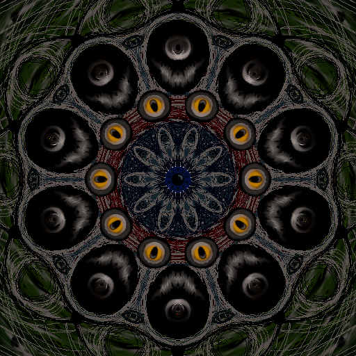
First in a 3 part series.i was feeling emotionally aphasic from post-new-years celebrations, and this is the result. the girl is a stock photo from
APHASIC v2.1 [link]
APHASIC v2.7 [link]
::specifix::
photoshop
illustrator
about 7 hours work
124mm x 338mm @ 300dpi
enjoi. c&c welcome
 (Smile)")
**updated with a new version
Related content


Comments: 34


lol you'll have to be a bit more specific than that. send me an email with any questions and i'll try to answer them.
👍: 0 ⏩: 0


and this one is the best from this serie ")
👍: 0 ⏩: 0

wow this is really beautiful, again i like the high contrast areas, and the slight use of colour is tasteful. And again with the grunge look.... its almost mechanical though, very amazing. nice work man

👍: 0 ⏩: 1
it's great when u can get a piece ouf of u and it matches your emotions perfectly. this one was therapy.
👍: 0 ⏩: 1

Of the series, I have to say that this is my favorite. It's just appealing and holds so many different emotions. The VERY subtle use of color intertwined here and there almost makes the eye search for more once it has a taste, and the shapes used are quite wonderful. The image of the girl is great, too.
I almost would have liked to see more red here and there for more flavor. That deep red used is very classy.
Also, there is almost a little TOO much white space there in the lower left area where the light just overcomes. It does allow for a place for the eye to regroup, but it's almost too plain to compliment the rest of the image.
Aside from my nitpicking, nice work.
👍: 0 ⏩: 1
i wrestled with more colour, but at the time it matched my emotional state perfectly, i didnt want to corrupt that by revising it later.
thx for the indepth comment mate
👍: 0 ⏩: 0

7 hours? u are crazy? ejjejej ")
👍: 0 ⏩: 1
it takes as long as it needs to...yeah?
why try to rush it?
 (Wink)")
👍: 0 ⏩: 2
are u really telling me that a piece can't take as long as it needs to?
i give every piece as long as it takes to tell me it's finished. i'm not going to abandon it halfway and know eveytime i look at it that there was more to be done.
wouldnt be fair to the piece, you knwo?>
👍: 0 ⏩: 0
seven hours it is too much for a one design, four hours would be perfect for a design XD, each goes to their rate
👍: 0 ⏩: 0


It would be great to place an eye... black eye in the center!
It would be a good contrast to blind girl.
👍: 0 ⏩: 1
mm nice idea, i might try it. thx
👍: 0 ⏩: 0


really great work man, the design is very unique and original... nice color tones, good composition
👍: 0 ⏩: 0

im curious to how the bubbly cog looking things were made?
👍: 0 ⏩: 1
lol bubbly cog-things, i like that
👍: 0 ⏩: 0


that looks really cool.... you should have some of your works avaliable for print.... i would buy.................................. that is ofcoarse if i had any money
👍: 0 ⏩: 1
might just do that. ive had a few other ppl say that.
might as well try and make some money off these scribbles.
cheers nath
👍: 0 ⏩: 0

