HOME | DD

edit-dsn — PURIFICATION

Published: 2006-04-22 01:50:26 +0000 UTC; Views: 2556; Favourites: 60; Downloads: 413
Redirect to original
Description 
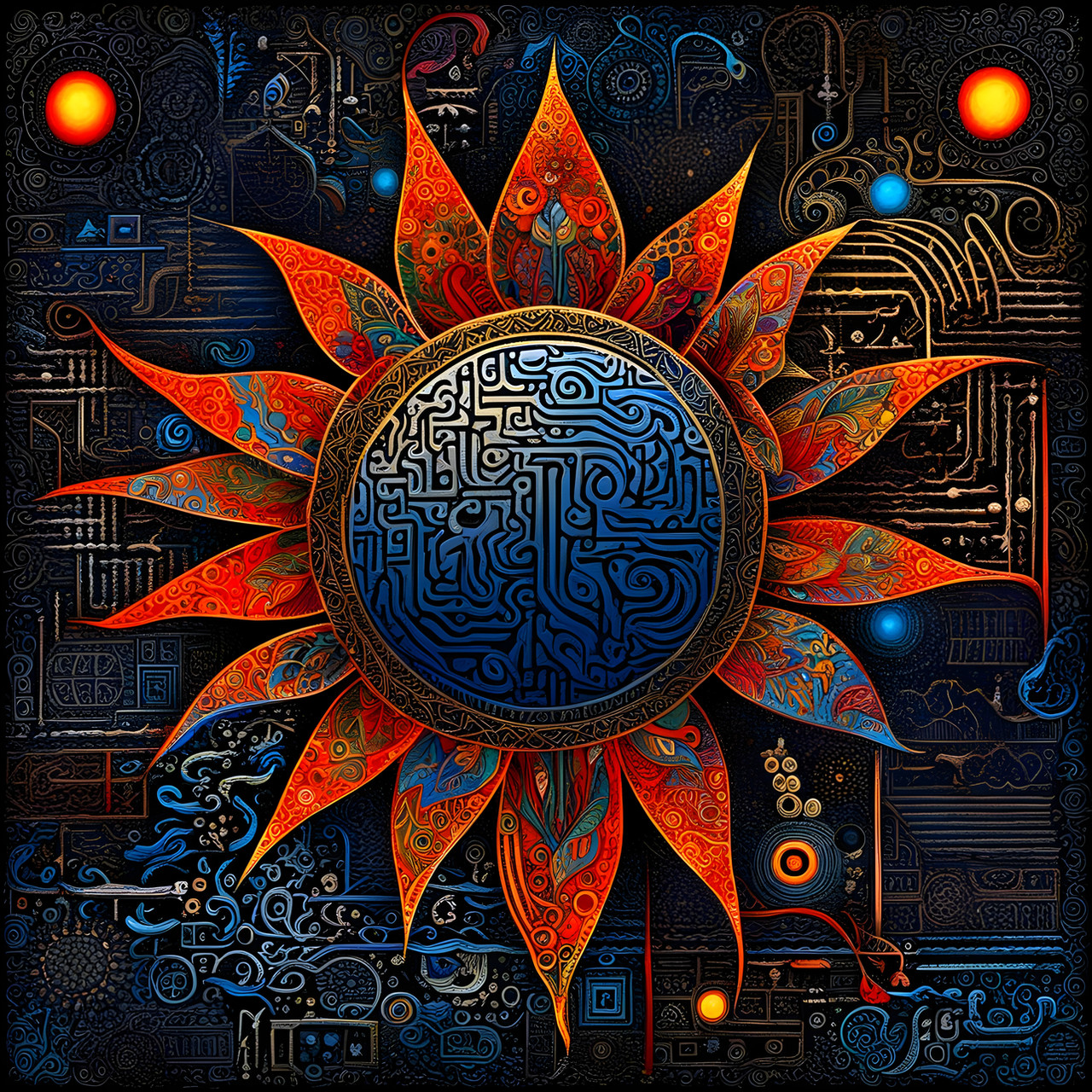
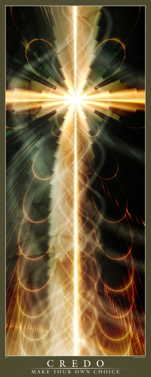
no more temptation, this tree bares no fruit.
Related content
Comments: 48

RuKkA [2006-10-31 16:27:56 +0000 UTC]

wow
Skilled!! !!

👍: 0 ⏩: 0

Ylys [2006-09-21 18:49:42 +0000 UTC]

interesting

👍: 0 ⏩: 0

NDroid [2006-06-26 22:09:32 +0000 UTC]

Awesome work, i'm stunned.

👍: 0 ⏩: 1

edit-dsn In reply to NDroid [2006-07-02 13:38:27 +0000 UTC]

ta mate, much obliged

👍: 0 ⏩: 0

discreet- [2006-06-25 14:49:53 +0000 UTC]

Needless to say, your truely amazing, i love all of your creations... almost as much as i love you.
But this one is so beautiful it hurts, in a peaceful kinda way, and it will always mean more to me then you'll ever know, ....personally, it blows me away.xx

👍: 0 ⏩: 1

edit-dsn In reply to discreet- [2006-07-02 13:31:00 +0000 UTC]

👍: 0 ⏩: 0

trevor-gfx [2006-05-01 13:36:03 +0000 UTC]

neat at the top

👍: 0 ⏩: 1

edit-dsn In reply to trevor-gfx [2006-07-02 13:37:41 +0000 UTC]

id say messy and busy at the top, but let
s not get all louis armstrong about it thnks for the comment

👍: 0 ⏩: 0

xaphan [2006-04-30 19:54:48 +0000 UTC]

cool.
i like the overall details that you put in.

👍: 0 ⏩: 0

Sternchen08 [2006-04-30 14:53:17 +0000 UTC]

great work!

👍: 0 ⏩: 0

GillsDigitalWorld [2006-04-29 16:54:23 +0000 UTC]

👍: 0 ⏩: 1

edit-dsn In reply to GillsDigitalWorld [2006-07-02 13:38:08 +0000 UTC]

thanks a lot!

👍: 0 ⏩: 0

krizzuLife [2006-04-27 22:27:47 +0000 UTC]

wooooooow

👍: 0 ⏩: 1

edit-dsn In reply to krizzuLife [2006-07-02 13:43:58 +0000 UTC]

ta

👍: 0 ⏩: 0

yulii [2006-04-26 14:05:06 +0000 UTC]

this is absolutely amazing..gorgeous piece! its like a gift for a queen gj

👍: 0 ⏩: 1

edit-dsn In reply to yulii [2006-04-26 22:02:46 +0000 UTC]

beautiful description. many thanks my friend

👍: 0 ⏩: 0

ahgrafx [2006-04-26 01:32:07 +0000 UTC]

damn nice bro I love it! lot goin on +fav

👍: 0 ⏩: 1

edit-dsn In reply to ahgrafx [2006-04-26 22:08:43 +0000 UTC]

cheers adam

👍: 0 ⏩: 0

zebr [2006-04-25 11:34:46 +0000 UTC]

love it! looks different... looks devilish!

👍: 0 ⏩: 1

edit-dsn In reply to zebr [2006-04-25 12:11:59 +0000 UTC]

danke

👍: 0 ⏩: 0

TomWilcox [2006-04-24 23:35:28 +0000 UTC]

I love this. Wonderful concept, and so well done!

Tom

👍: 0 ⏩: 1

edit-dsn In reply to TomWilcox [2006-04-25 08:56:12 +0000 UTC]

thanks

👍: 0 ⏩: 0

psion005 [2006-04-24 17:58:23 +0000 UTC]

Wickid artwork aaron.. G`day from another psy lover from Sydney

Me------> <-----You

👍: 0 ⏩: 1

edit-dsn In reply to psion005 [2006-04-25 08:54:42 +0000 UTC]

cheers mate good to see some more oz-psy crew around here.

👍: 0 ⏩: 0

liquin [2006-04-24 14:22:36 +0000 UTC]

👍: 0 ⏩: 0

merlinni [2006-04-24 07:19:48 +0000 UTC]

pefrectly...

👍: 0 ⏩: 0

4lmnts [2006-04-23 19:41:46 +0000 UTC]

wow, awesome! How did you do it? what softwares did you use?

👍: 0 ⏩: 1

edit-dsn In reply to 4lmnts [2006-04-24 00:38:23 +0000 UTC]

Photoshop, Illustrator, and UltraFractal
thx

👍: 0 ⏩: 0

vertigozero1 [2006-04-23 18:33:10 +0000 UTC]

This is a wonderfully creative and unique vision. Great work; very well executed.

👍: 0 ⏩: 1

edit-dsn In reply to vertigozero1 [2006-04-24 00:39:16 +0000 UTC]

thnk you

👍: 0 ⏩: 0

-fiction [2006-04-23 16:53:41 +0000 UTC]

im a huge fan of stretched lines and well chosen neon colors. the morphing vegas insect isnt bad either.
i like it.

the description text intrigues me as well

👍: 0 ⏩: 1

edit-dsn In reply to -fiction [2006-04-24 00:37:09 +0000 UTC]

vegas insect? does he bring you drinks while your playing craps?

👍: 0 ⏩: 1

-fiction In reply to edit-dsn [2006-04-24 02:24:15 +0000 UTC]

that'd be one of his numerous responsibilities.

👍: 0 ⏩: 0

straightjacket1973 [2006-04-22 23:20:56 +0000 UTC]

like it - ..............................................................................


towering - japanesey - antique yet futuristic and space aged...

👍: 0 ⏩: 1

edit-dsn In reply to straightjacket1973 [2006-04-23 02:52:04 +0000 UTC]

wow cool description thx

👍: 0 ⏩: 1

straightjacket1973 In reply to edit-dsn [2006-04-23 06:19:37 +0000 UTC]

juss sayin' what i see dude,
juss sayin' what i see.........

👍: 0 ⏩: 0

Fractured-Visual [2006-04-22 22:44:12 +0000 UTC]

wow really nice design mate!

👍: 0 ⏩: 0

ev4n [2006-04-22 15:57:31 +0000 UTC]

great job with the stretching effect. i would extend the lines coming off the tree so that it goes to the edge.

👍: 0 ⏩: 0

feel-numb [2006-04-22 10:30:59 +0000 UTC]

woah that looks awesome as crazy job

👍: 0 ⏩: 0

vahu [2006-04-22 10:03:52 +0000 UTC]

I don't understand why you chose *Critique Discouraged* here. This fractal is superb and I'm sure that nobody will write anything bad For me everything is perfect at this picture. Congrats and

👍: 0 ⏩: 1

edit-dsn In reply to vahu [2006-04-23 02:54:12 +0000 UTC]

It's a personal piece that's why, I just didnt want it dissected, just disliked/appreciated.
Thanks or the appreciation

👍: 0 ⏩: 0

buzveatesh [2006-04-22 10:03:29 +0000 UTC]

great!

👍: 0 ⏩: 0

3moX [2006-04-22 08:20:16 +0000 UTC]

great concept and realization, like it alot!

👍: 0 ⏩: 0

headwired [2006-04-22 07:56:39 +0000 UTC]

i don't usually like top heavy images. but this is fuckin' unique.
i still can't get my head around the design pattern along the top. it's veru intricate and the colours and glow are really appealing to me.

the stretched vertical lines work down nicely to the tree. which is probably my only gripe. it's a beautifully baron tree. but it looks pixelated. which is a pity because the idea of the type at the bottom instead of roots is interesting.

i lied, i have one more slight 'gripe' the background. i dunno if it's supposed to conflict awkwardly with the upper design. but i'm not too fond of it. i like the faded tone of it, but i woulda prefered it to resemble what foliage would have been on the lower tree.

👍: 0 ⏩: 1

edit-dsn In reply to headwired [2006-04-22 08:15:59 +0000 UTC]

thanks, i wasnt really looking for a critique, hence the "Critique Discouraged" icon. but thanks for taking the time.

👍: 0 ⏩: 1

headwired In reply to edit-dsn [2006-04-22 15:37:11 +0000 UTC]

ah. i ignore those icons. if i have something to say about someone's designs, i say it. they can choose to ignore it, or take it on board. but i feel better for saying it now that you apreciate it, even though you discouraged it.


...i'm confused now.

👍: 0 ⏩: 0

rainydaysaint [2006-04-22 03:49:24 +0000 UTC]

DAAMMN! All I have to say is, this is sweeeet. Wow , and oh my goodness this is good!

👍: 0 ⏩: 0

flisk [2006-04-22 02:24:08 +0000 UTC]

i remember this! still looks as rad as it did then

👍: 0 ⏩: 0