HOME | DD
 edit-dsn — APHASIC v2.1

Published: 2004-02-15 05:24:34 +0000 UTC; Views: 2155; Favourites: 30; Downloads: 578
Redirect to original
Description
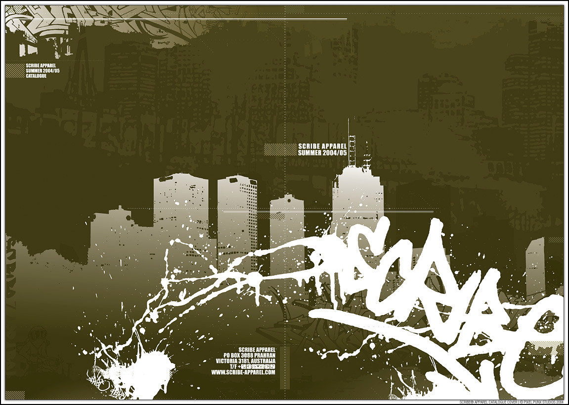
second in the -aphasic- series.:: the portrait photo by and used with kind permission
:: brushes by dubtastic [link]
APHASIC v2.0 [link]
APHASIC v2.7 [link]
::specifix::
photoshop
illustrator
about 7 hours work
124mm x 338mm @ 300dpi
enjoy.
**updated with a new version
Related content


Comments: 33

I really like the typography above...
Ratings: I always give...
9.5/10
0.5 - the bottom is too plain, like theres something left out... well i like this very much
 (Smile)")

👍: 0 ⏩: 1

thx mate glad u rate it so high
👍: 0 ⏩: 0


WOW ")
my congratulations man
👍: 0 ⏩: 1
thanks, i really appreciate the comment and compliment.
one of the pieces im really happy with, sometimes they just come out of you with no thought or effort... if only it was always so easy hehe.
thx again.
👍: 0 ⏩: 1
you´re welcome dude.
Really it´s an incredible composition
👍: 0 ⏩: 0


")

a beautiful thing, nice shapes and colours, also the chinese symbols look really good in here!
👍: 0 ⏩: 1
thx, i wasnt sure about the symbols, though it might be a bit too ciche, but i really liked the way they sit.
glad you like it.
👍: 0 ⏩: 0

this is my favorite out of the series. i LOVE the shapes and colors and everything. it all works sooo well!
👍: 0 ⏩: 1
this seems to be most ppls fave, mine too i think. i'll have to try some more pieces in this style.
👍: 0 ⏩: 1


only thing i would lose are those chinese symbols.
everything else 
👍: 0 ⏩: 1
yeah wasnt sure about those...but thought i'd try something i hadnt done before...
thx for the comment.
👍: 0 ⏩: 0


a i had never seen this before.
*blay goes and sits and sulks in the corner*
👍: 0 ⏩: 1
 (Wink)")

In your whole gallery of perfectness this is still my personal fav ^.^
I already fav it once, and I still wanna fav it but... nhan.
Awsome work, nice idea.
300 DPI ! Omg mines are 80 not less ^.^
lol Have anice day mate- thanks for your comments on shorehead.
👍: 0 ⏩: 2
thanks for your comment and support
did you mean 800? or 80dpi, cause 80 is kinda low.

👍: 0 ⏩: 0

OMG. this is so perfect. its my favourite, and i am awed by what you can do. great great work! everything looked sharp and shrew, and i love the colours, and...God...its so beautiful
👍: 0 ⏩: 1

only 1 comment .. how is that possible .. great work!!!!
👍: 0 ⏩: 1
pixel.trickery
thanks for the comment, glad u like it
👍: 0 ⏩: 0
