HOME | DD
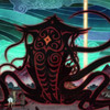
 Einsilbig — Necropolis

Published: 2014-01-27 16:46:07 +0000 UTC; Views: 2464; Favourites: 121; Downloads: 0
Redirect to original
Description
NecropolisTexture by halcyonshores
halcyonshores.deviantart.com/a…
-----------------
----------------
Kindly featured by
Tom-Ripley :
tom-ripley.deviantart.com/jour…
arctoa :
arctoa.deviantart.com/journal/…
Related content


Comments: 14
I love the black and white effect.
👍: 0 ⏩: 0


I like the lights what you used but I think If you leave the dark side from the right side the Necropolis will be more adjuvant. But this is my opinion : )
The scratch effect is a good idea which enhance your "creature's" status. I like it! +1
👍: 0 ⏩: 1

Thanks for pointing that out.
And thanks for +1
yes the light; I added some vignetting for a darker
atmosphere, but maybe I have overdone it a little bit
 (Wink)")

👍: 0 ⏩: 0


Such a striking perspective! I like how the photo is asymmetrical - though it has a strong vertical center line. The stark lighting is pretty cool. I am not a huge fan of the texture - but I generally dislike added textures (so the problem is not that *this* texture is especially bad). I wonder what it would have been like in color. Well done!
👍: 0 ⏩: 1
Hey, thanks!
I know what you mean. It got a while to find beauty in textures, but in the meantime
I really enjoy texture work and love doing it by myself.
For the color: The color version doesn´t look that different, it was a grey day, some red
spots on the facade. I liked the B&W version more, because it conveys this feeling of
darkness and oppression from my point of view
 (Smile)")

👍: 0 ⏩: 1
Too bad about the color situation. I like it as a b&w, it abstracts a bit, making it easier for the viewer to focus on the looming of the building. So I can see how the photo accomplishes your intention. On the other hand: if I was king of the world, I'd encourage more color photography. (If only the sky would cooperate more often!)
Also: I had meant to make that comment as a critique - but the critique thing ended up being a hassle, so I wrote it as a comment. I don't normally go out of my way to criticize the art of strangers on the internet. At any rate, I meant what I said: cool pic!
👍: 0 ⏩: 0