HOME | DD
 ejsing — Travellife Layout

Published: 2009-08-11 13:02:57 +0000 UTC; Views: 23724; Favourites: 187; Downloads: 1093
Redirect to original
Description
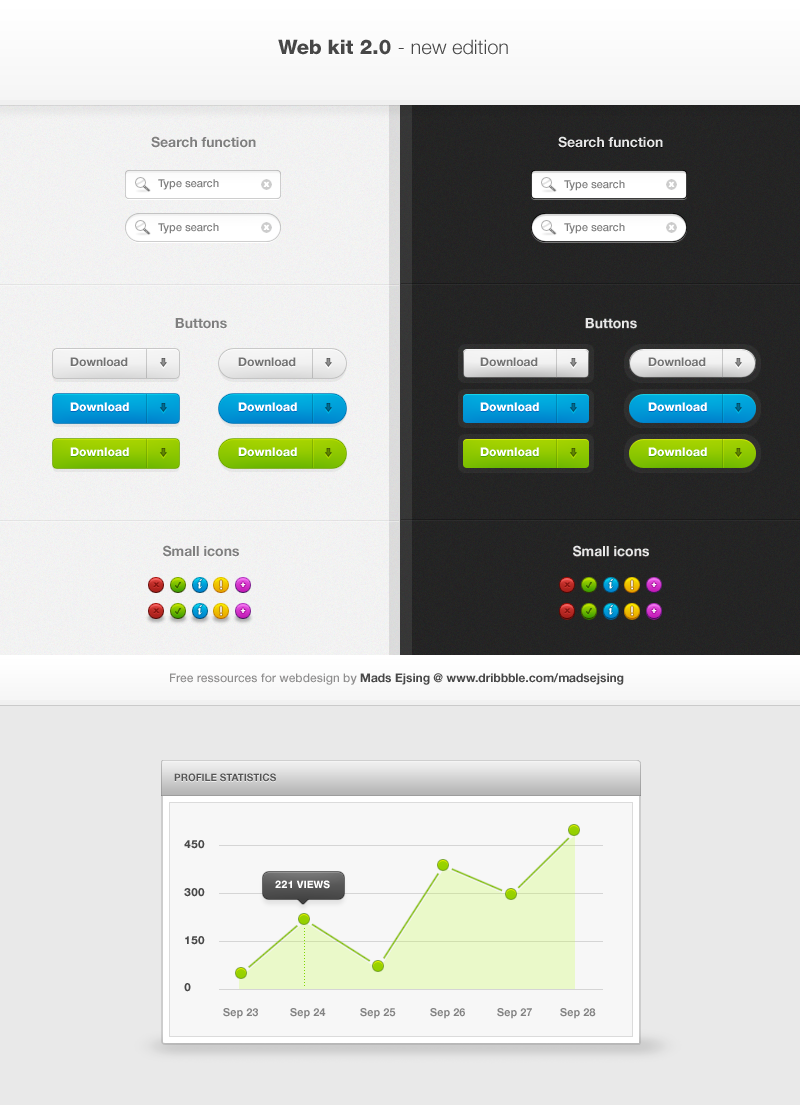
Well, an imaginary concept I worked out for practice last night - nothing special. Did the logo also, which I quite like. (Smile)")
Just messing around with colors and shapes. I know colors might be a bit off.
If any of you still having problems with seeing the low-contrasted text, please say so - and I will upload another version with clearer text, but I think this has the best feel to it.
Cheers.
Related content


Comments: 81


dude your gallery is so nice, every piece is just different, not even the same style as another piece
👍: 0 ⏩: 0


nice design n colors.. i like it well. BTW which font you used on logo?
👍: 0 ⏩: 0

This work is not just cool, it is very interesting. The play with the shapes really shows in the work. It feels like it is a summer version.
👍: 0 ⏩: 1


this is really good. how did u go un noticed from my radar ")
👍: 0 ⏩: 1

Hehe, you ask yourself.
Glad you found me, though.
👍: 0 ⏩: 0

 (Wink)")


Thanks, bro - I will, just keep you're eyes open for tonight or tomorrow afternoon.
👍: 0 ⏩: 0


Bro, you're officially one of my favourite designers arround here. ")


👍: 0 ⏩: 1
Hehe, thank you very much, Edu. Means a bunch to me, really!
👍: 0 ⏩: 1
That's ok bro! I really love your style! You're the BEST!
👍: 0 ⏩: 0

| Next =>