HOME | DD
 ejsing — www.madsejsing.com - LIVE

Published: 2009-12-08 21:39:34 +0000 UTC; Views: 6976; Favourites: 45; Downloads: 303
Redirect to original
Description
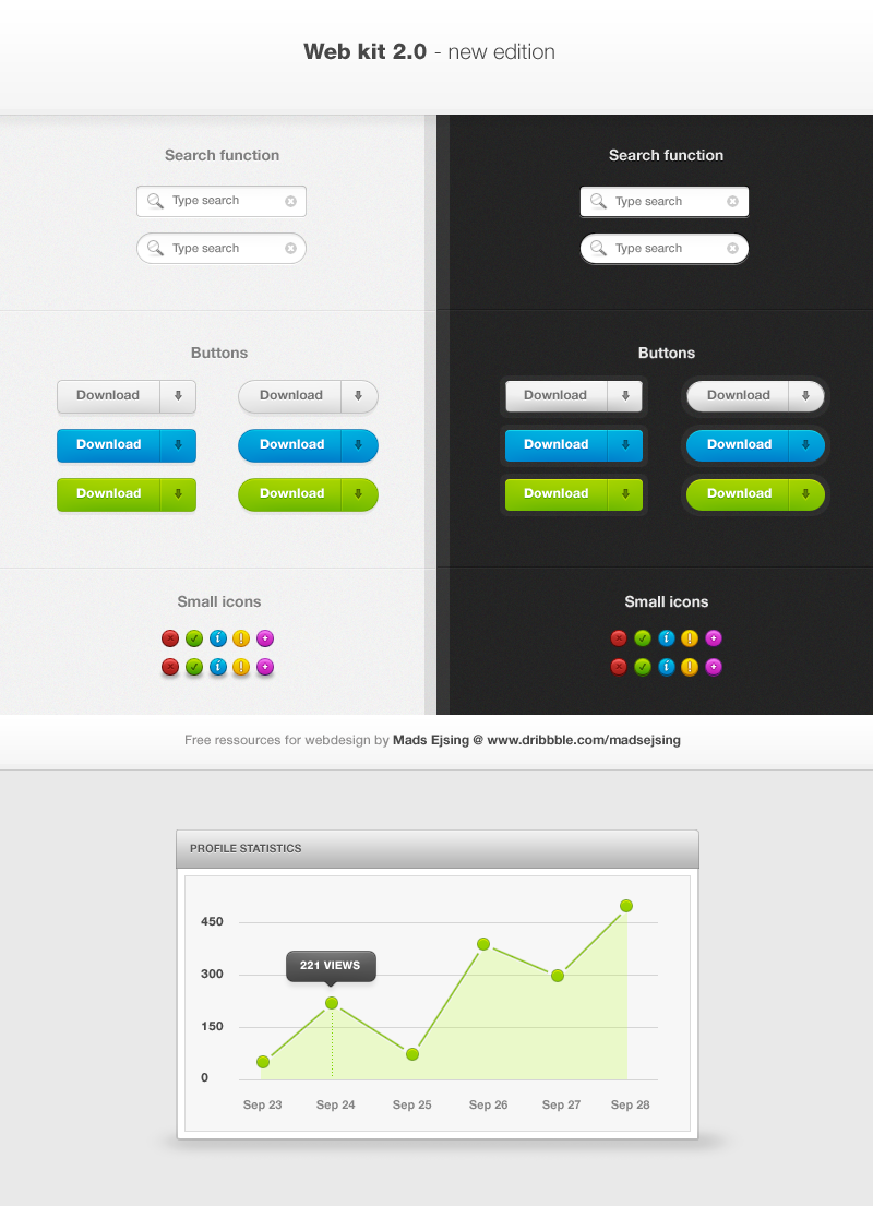
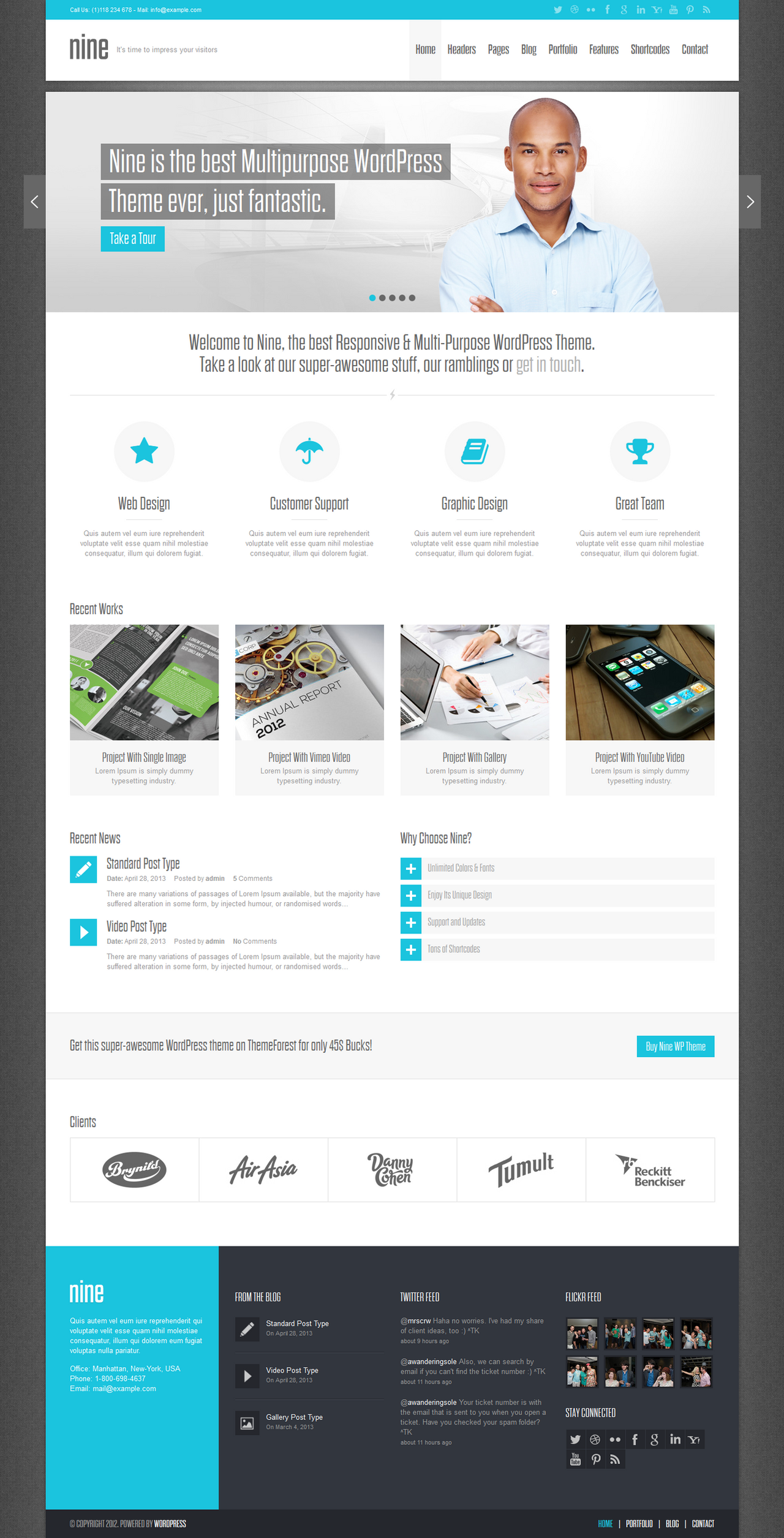
Hi everyone,Finally I have made my own site.
You can see it live here: [link]
Please show it some love!
 (Smile)")
*Note: The Design preview is slightly different from the live version!
Related content


Comments: 80

The yellow really works well with the blue. Good job.
👍: 0 ⏩: 0


I know what you mean - And thanks.
👍: 0 ⏩: 0


")


really .. its a wonderful my dear
but i have a good idea .. try make a good background on the header or some effects
👍: 0 ⏩: 1
I think I am gonna stick with the simplicity - but thank you very much for the suggestion.
👍: 0 ⏩: 0


Thanks! Yea, Live version is better.
👍: 0 ⏩: 0

very nice
congrats
In opera I see a little problem with the background of the textarea in the contact form.
👍: 0 ⏩: 1
Thanks.
- Okay, I'll see to it. Thank you for mentioning it.
👍: 0 ⏩: 0

alright! nice to see you're finally putting yourself out there now! hope you start making some money. of course there are sites that you can do freelance work for, i think i already told you about them though. good to see you're taking some initiative. thumbz up award.
👍: 0 ⏩: 1
Hehe, thanks a lot, mate.
👍: 0 ⏩: 1
oh most definitely, and thank you for the group you helped create if not created it on your own.

👍: 0 ⏩: 0

Fuck. Great work man
I like the colors and style.
Congrats
I need to make my new portfolio too

👍: 0 ⏩: 1
Thanks a lot, mate!
Yeah, you really should.
👍: 0 ⏩: 0


You should teach me a lesson with this modern usability which I always screw up XD
👍: 0 ⏩: 1

No, I got help from a friend of mine.
👍: 0 ⏩: 1

The colors are great, good Typo and a really fine contact section. The really big problem of this design is that the innovation goes toward zero. I have seen this kind of one pageportfolios so often. After a half minute of research I found 2 designs wich look like yours (the layouting) [link] [link]
Dont get me wrong, Your graphic skills are really great and you can do great things, but maybe you should be a little bit more creative
Oh and please, do not think that I want to blame you or something like this, I still like this design, it just looks like some others on the web and this attracted my attention
Good job overall.
👍: 0 ⏩: 1
I hear you, but I actually do not agree that those sites are so much alike.
The structure is the same, but there are so many website out there that has the same structure. I'd say that mine and Alx' page are quite far from each other in terms of anything but structure.
I could have gone for something more creative, but I wanted to keep it simple with focus on the references - and I wanted to keep it on track with the latest webdesigns trends. In order to do that, you'd have to be a little like the other ones out there.
👍: 0 ⏩: 1
Yes, of course it`s only the structure, I know it`s a trend at the moment (like these vintage/grunge designs this year) I just mean it`s not the best to do what the trend defines, just define your own trend  (Wink)")
Whatever... oh and the live-version looks fine but you really need a stop() funtion for the hover of a reference thumbnail. you see what happens when you hover in a short time over the same item.
👍: 0 ⏩: 0

Fucking A, man, it looks awesome! Btw, there’s a slight problem with your JS in your contact form I think, I’m getting some undefined strings on the slider.
👍: 0 ⏩: 1
| Next =>