HOME | DD
 ekud — FIVEDOCK

Published: 2003-05-10 16:26:40 +0000 UTC; Views: 7526; Favourites: 94; Downloads: 1208
Redirect to original
Description
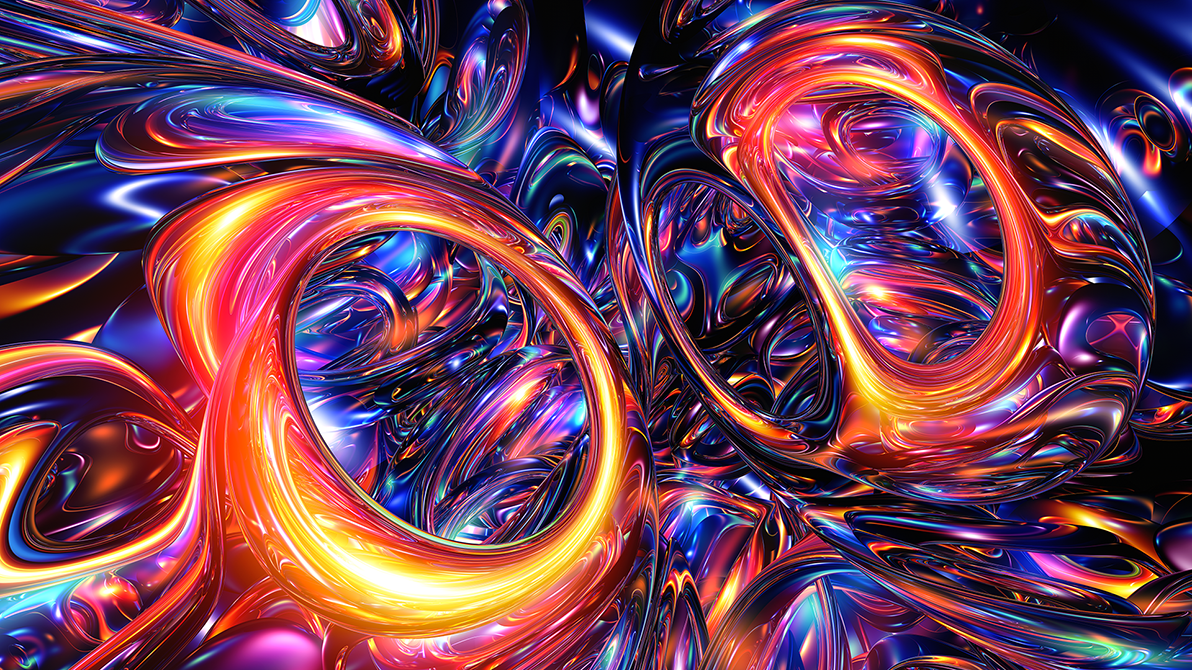
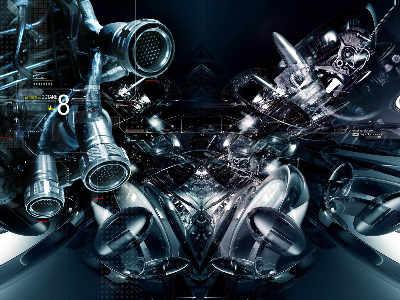
"FIVEDOCK+ekud vs ~aerosole for dC, which you must visit!
tony owns
- jus
Related content


Comments: 93

awesome and the evolution .....ouoauoauoa excellent
👍: 0 ⏩: 0


Perfect lighting and colouring. The two of you are unmatched in those departments.
👍: 0 ⏩: 0


boah the right one is nice...
great blue white...
u will do a WP version ??
👍: 0 ⏩: 0


hm, these are some nice abstracts 
but what I miss are some more concrete shapes, not just heavily disorted and noise-modifiered objects....and maybe some more of the 2d shapes, lines and typos  (Smile)")
anyhow, that's some really impressive work of you both!
dan
👍: 0 ⏩: 0


")


Nice use of colour and lighting. I LOVE the 3D work. Its looks like liquid in space.
Would love to know who its done but working it out for your self is more fun.
👍: 0 ⏩: 0


Wow that detail is amazing. Wish it were a little larger though. That color scheme really adds the punch to bring it all to life. Very nicely done.
👍: 0 ⏩: 0

Sweeeeeeeeeeeeeeeet. Love the colors, and Justin the right one is the best.
👍: 0 ⏩: 0

Very fine piece, the right one is my favorite of them.
👍: 0 ⏩: 0

WOW!!!
There isn't much to say except that i love ur work and that i love how u put 3 pictures like one picture.
EXCELLENT WORK!!
👍: 0 ⏩: 0

looks good .. real good actually .. I guess I might have to fav some more of ur stuff now .. lol gj bro's
👍: 0 ⏩: 0

theres something about that font heh enjoy n nice work
👍: 0 ⏩: 0


I like it! thats a grea composition, i like the blue tone.
👍: 0 ⏩: 0


ahh yes, i saw this at DC. Very nice composition, great job by the both of you.
I especially like how the lighting doesn't light up the whole image, it leaves some darkness on the renders, which is good. The faded renders in the backround give all three pieces nice depth and makes it look all the better.
The minimalistic 2d also helps to make this look very nice
Keep it up, you two. Much improvement can be seen in this image
👍: 0 ⏩: 0


The anomolies are interesting and this scores high with me based on aesthetics, mostly by reason of form and like to dark contrast. Also, the title is in a great font - original font? However, invention is the weakest area for me personally, there's nothing new about illuminated smoke and especially the small white glowing spheres abundant in the far right panel. In addition, blue undoubtedly works well to create a dramatic, nighttime/sci-fi feel but I wouldn't cinsider it an "awesome color choice" because it's the only color used in the piece and I think that blue could have just as easily been replaced by any other single color to produce an interesting effect. This says alot about the forms because they're the real success of the image. Your use of a single color tells me that. All in all you've manged to bring together the elements you chose to work with seamlessly and coherent but the final piece isn't able to translate anything new or limit pushing in regards to abstract art. I'm judging by your personal status in this community that you've learned by now to seperate yourself from your art and you're able to take this comment as simply an honest comment about your art, not you.
👍: 0 ⏩: 0


heyy, kewl.. i like the effects. Great job man!
.......
👍: 0 ⏩: 0

brilliant work my friend, looks like everything good i could say about this has already been said
👍: 0 ⏩: 0

Very cool stuff you made there. I like the last one the best.
Colors are great too.
👍: 0 ⏩: 0

Im speechless- Its incredible-- I like the colors!!!!
👍: 0 ⏩: 0

There is not one damn thing i dislike, I love everything. pluz fav
👍: 0 ⏩: 0

I tryed to lick it from the screen. So sweet! Great artwork!
👍: 0 ⏩: 0

love this piece, congrats on the DTF! hooray for depthcore!
👍: 0 ⏩: 0


*turns head sideways*. . . what .... what is it?
👍: 0 ⏩: 0

OUF!!! very impressif, nice techno work, is an abstract comic? lol
👍: 0 ⏩: 0


WHOA... If I ever managed to scrape up the spare money for a DA print (Jonno = cheap) then this is what I would get!
👍: 0 ⏩: 0

this is amzing ,love the colours and lighting gj guys +favs
👍: 0 ⏩: 0

yeah i absolutely agree with you that this one is the thriller . I think its awsome. Great flow lightning, forms, tones, great
👍: 0 ⏩: 0


| Next =>