HOME | DD
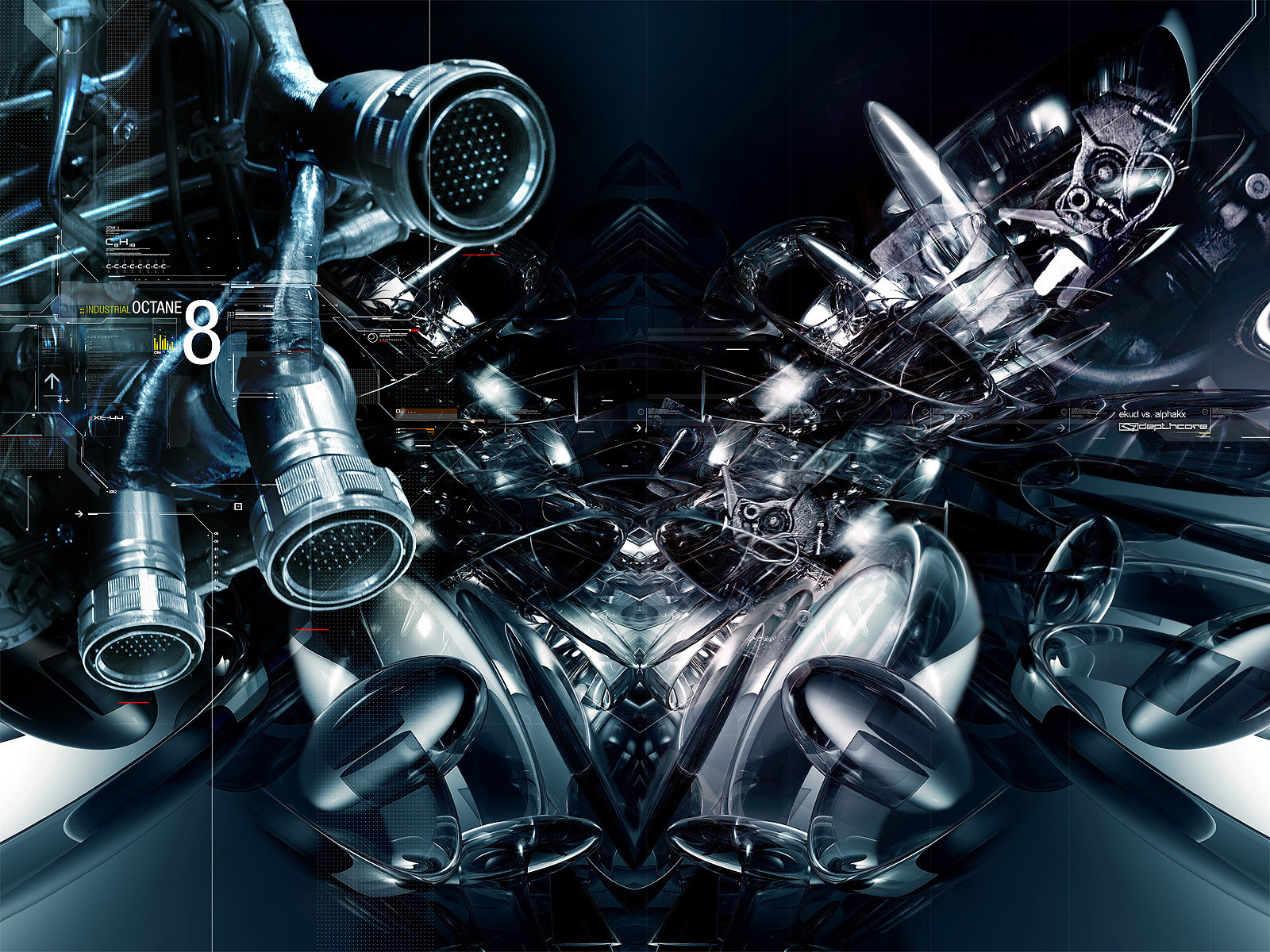
 ekud — NITROGEN

Published: 2002-04-14 13:23:15 +0000 UTC; Views: 31286; Favourites: 152; Downloads: 8815
Redirect to original
Related content


Comments: 122

HOLY SHIT HOW THE FUCK DID YOU MAKE THIS ITS AWESOME
👍: 0 ⏩: 0

i dont exactly see whats wrong. maybe the grill effect is a bit extra imo, but the rest of the wp is great. good work as usual.

👍: 0 ⏩: 1

Nah man, this piece is a hunk of shit. Its four fucking years old...
👍: 0 ⏩: 0


Comments: 116
Favourites: 116 [dosent make all that much sense to me]
I've seen stuff this good, if not better come from 3d noobs, that get 1 or maybe two comments, let alone a favourite.
This is just another example of the fact that DA is a popularity contest, not a place where people leave comments about the way they actually feel, or maybe even ways they think the artist could have done better. Instead people try to befrend artist based upon their number of pageviews. But I digress, you're not the person to blame. I bet you could submit a black dot in the center of a white spread and get hundreds of comments. It's not because of how amazing it is, it's because of the fact that people cant take time and tell the truth instead of commenting all of this BS.

WTF........neato!?

👍: 0 ⏩: 1
Dude, this piece is like 4 years old man, check the dates before you give a huge critique like this.
At the time, it was new and cool. Now it's quite obviously shit.
👍: 0 ⏩: 0

YOUR A MAC PERSON I CAN TELL YOU PUT THE LETTERS ON THE LEFT LOL WELL ANYWAY WHAT DID YOU USE FOR IT?
👍: 0 ⏩: 0


my favorite wall of yours, diggin the colors and everything
++fav
_ _ ___delicious___[link] ______________________ _ _ _
" you laugh at me because i'm different, i laugh at you because you're all the same "
👍: 0 ⏩: 0

brilliant job. I love this piece.
-----
++[Kieran Hall]++
👍: 0 ⏩: 0

Just as beautiful as his brothers man! Well, a lovely family isn't it? Wonder how the father is?
👍: 0 ⏩: 0

Reminds me of the materia from Final Fantasy (VII). Pretty cool radio-active look to it... Like the green a lot
The grid works out pretty cool, keeps me focussed 8D
👍: 0 ⏩: 0


damn. thanks for making my day better. wow. im impressed. great work.
-----
.:king-arthur-xvi:. [link]
support :ninjafella:! [link]
👍: 0 ⏩: 0

oh.. i just love the way you did this bit.
*shocked*
I have to add this to my wallpaper rotation.
-----
.: :.
nuf said
[link]
We are what we do, and the more we do it, the more we become it.
The only way out is to change our lives or to change our expectations for our lives.
And if we lower our expectations we are killing our dreams,
and a man without dreams is already half dead.
👍: 0 ⏩: 0

Sharp blue, i love it.
-----
the
will bite your toe whahahahahah
👍: 0 ⏩: 0


This is soo kicking nice! I love the colors, The grid's good, the only thing I don't like too much is that font, but as an overal work - I've said.. AWESOME! definitely.
-----
---> http://dannyyeel.hyperlink.cz :: Danny-
👍: 0 ⏩: 0

i like this most of all, i think the others are a little too trendy. the grids are too overbearing i think. overall, this is still a total badass piece though
-----
https://www.deviantart.com
http://www.wastedyouth.org
👍: 0 ⏩: 0

I like it, these 3 pieces would be nice to see without the grid.
-----
...Helping people love life through caring.
~I am keeper of secrets, despenser of hugs. I exist to despense love and caring~
Current Favorite: https://www.deviantart.com/deviation.php? id=286688
👍: 0 ⏩: 0

everyone uses grids! why?? WHY?! it's getting over done people! oh well, it's a nice piece of work, but it's similar to many other 3D pieces and I'm not too excited about it. fetus is right, dare to be different! I love 3D, but it's getting to be ridiculous at the ammount of similarity in these.
👍: 0 ⏩: 0

You obviously put alot of work into this. good for you. on a site where nearly half the submissions are 1/2 hour cut and paste jobs, it's nice to see effort being put into someone's work. who cares if its trendy? you obviously meant it to be and did a damn good job of it. and the gridwork, although more than what is my taste- is well done as well. nice one bro.
-----
THIS SPACE FOR RENT
SPAM OR LINKS
SEE http://its/a/joke/dumbass.com
👍: 0 ⏩: 0

the colors are nice, but what makes this different than the other 10,000 pieces of art that look like it? why should yours be chosen over them? i'm sure you knew that it was looking like every other 3d abstract shape when you made it. didn't you want to put someting it it to make it stand out? to make it unique? am i missing it?
👍: 0 ⏩: 0

not badly done, but its just a meaningless trend piece thats been done millions and millions of times b4, just makes me yawn :[
-----
liqachu / liquid
www.clanbio.com
👍: 0 ⏩: 0


Its a really nice peice, but i have to agree with dark that the grid doesn't belong over the entire image. A grid is always nice as a fundamental ideal, but in most of your image it just makes it incredibly choppy.
That said, i'm not bad-mouthing your design, it provokes emotion in me, therefore it's good.
👍: 0 ⏩: 0

the grid should not be throughout the whole deviation though..it would loook good in certain parts though
-----
_______________________
https://-dark-.deviantart.com -Dark-
👍: 0 ⏩: 0

great 3d and colors, a little heavy on the grid, but very nice otherwise =
-----
http://wwdesignco.com ~ WWDesignCo
👍: 0 ⏩: 0
awesome colors and design
-----
_______________________
https://-dark-.deviantart.com -Dark-
👍: 0 ⏩: 0

The grid totally killed an otherwise awesome wall.
-----
-j.m.
👍: 0 ⏩: 0


I think it is a good piece. Nice work.
-----
WWW.insiteswebdesign.com
WWW.insiteswebdesign.com
WWW.insiteswebdesign.com
👍: 0 ⏩: 0

"Personal opinion, the grids are killing this piece...and the typo too....I would use overlay to make the words better, maybe...
nice job~"
...but you knew that.
-----
just like clockwork.
👍: 0 ⏩: 0


sweetness, damn you are really kickin ém these days, fantastic work bro!!
-----
cazzanova is not an artist.....he is a state of mind
👍: 0 ⏩: 0

dude, the grid ruins it, and the + signs are overdone. I like the color though.
👍: 0 ⏩: 0


wow you've restrained yourself from adding lots of lines and little text
could you please tell me what is says under the text "nitrogen" tho, I cant read it.
good colors, but you shouldnt have add the crosses to the right side. it takes away the nice fades n flow. so does the grid sort of actually =/
-----
--------------------------------
- - - - - - K I P T O N - - - - - -
👍: 0 ⏩: 0


hmmm that picture didn't turn out very well on my last comment... ne'er mind lol
👍: 0 ⏩: 0
Shame aboot the grid, but HELL i love that font
Love the depth of colour too.
|~~~~~~~|
| |
| | -------------->> [FAVORITES]
|_________|
👍: 0 ⏩: 0


Excellent work i love the details, colors, it looks so calm and so chaotic at the same time. keep it up the good work!
-----
Progressive minds never lose their Objectives
👍: 0 ⏩: 0

The grid thing is a bit overdone. I think it would've been better if the grids were less accentuated. It doesn't matter really though, because this is really really really good regardless. Awesome work!
-----
_____________________
NJYN Digital Graphis Firm|
¯¯¯¯¯¯¯¯¯¯¯¯¯¯¯¯¯¯¯¯¯
____
http://www.njyn.tk
¯¯¯¯
👍: 0 ⏩: 0

That grid is excessive. The + signs too. A 48 hour render may have kept you from wanting to work too long on the elements in Photoshop. I know, it happens to me all the time.
👍: 0 ⏩: 0

this gets the "hot sakki!' squeal of approval..dizzamm!
-----
:: THE SYSTEM FUCKED ME LIKE A SLEEPING VIRGIN::
👍: 0 ⏩: 0

that's awesome ... what did u take while doing this ??? gg
don't tell me but this is really perfect !!! just the "+" are a lil' bit trendy but the whole 3d is amazing keep it up
-----
website http://www.dna-dezign.de.vu
👍: 0 ⏩: 0
| Next =>