HOME | DD
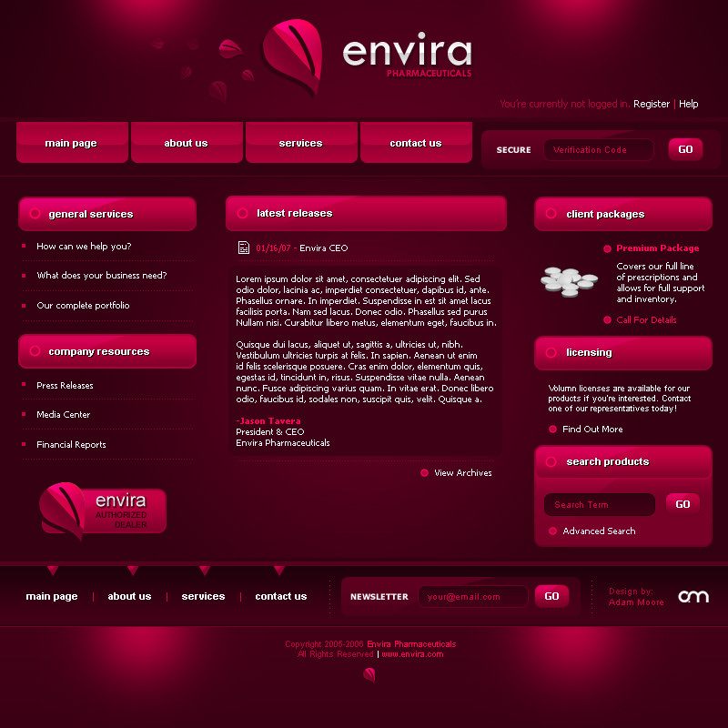
 elusive — Interface - Atom

Published: 2007-03-27 20:10:21 +0000 UTC; Views: 59485; Favourites: 596; Downloads: 0
Redirect to original
Description
Playing around.Enjoy.
PhotoShop CS2
*Updates:
-Changed the texture in the center (Gray area)
Related content


Comments: 316
")


")

Really great concept awesome!
hey this could be also be a really interesting Flash concept- i can almost see how this moves!
👍: 0 ⏩: 1

Haha, i'm glad you like it  (Smile)")
👍: 0 ⏩: 0


I don't know man, not really feeling all the red. Seems really overpowering for me, which takes away from any certain focal point, so the eye wonders a little too much for me.
Still really nice, just not loving the colors.
👍: 0 ⏩: 1
Thanks though, for the feedback
👍: 0 ⏩: 0


content is king?
colour is unfriendly
👍: 0 ⏩: 1
It's just for show ")
👍: 0 ⏩: 0

gorgeous work - the red and black work exquisitely together and are very appealing to the eyes. a little problem i have is with the bright red of the headlines and dates. they are a little too eye catching and hurt to look at - at least for me. do you think there's another colour you could use instead of the vibrant, bright red? maybe a grey? I just don't want to mess up the pattern of reds by you changing that colours though.
👍: 0 ⏩: 1
I was afraid of gray because too bright it's white, too dark it's unreadable
👍: 0 ⏩: 0


Love the color scheme, and the small lights are killer!! What font did you use for the header?
👍: 0 ⏩: 1
Danube I think it's called. I modified it personally though. I rasterized the text and edited it. Danube will get you the majority of it though
👍: 0 ⏩: 1
Thanks A lot, though I actually found the font on daFont.com just minutes after leaving my comment
👍: 0 ⏩: 0

Flashed-up, this will look even better. I can't seem to find anything wrong with it. Well done Adam!
👍: 0 ⏩: 1

Gorgeous design and rendering. Very lush indeed. And red & black is always a winner with me.
Great job.


👍: 0 ⏩: 1

Oh man, it's brilliant. Your designs always are. Pat yourself on the back son, cause this is gorgeous.
👍: 0 ⏩: 1
Hey thanks man. Always nice to hear your words
👍: 0 ⏩: 0


Up and atom!
No seriously..
Very nice man!
Just get rid of that shut down triangle

 (Wink)")
👍: 0 ⏩: 1


woah! 
👍: 0 ⏩: 1

this is hot man. nicely done. your layouts are always cool
👍: 0 ⏩: 1

damb thats hawt , killer work , sweet fonts , color , layout etc ... agree with Kwaku pwned
👍: 0 ⏩: 1

what I can say .. it's damn hot ! , and i'm not sayin' this too many times ... congratz ! everything is well done , great typography , pwned !
👍: 0 ⏩: 1
")
In the meantime -- textures =/
👍: 0 ⏩: 0
<= Prev | | Next =>