HOME | DD
 elusive — Interface - Phantom II

Published: 2006-10-19 02:37:20 +0000 UTC; Views: 3780; Favourites: 29; Downloads: 7
Redirect to original
Description
Got Bored?™Related content


Comments: 118

")

really nice , i tryed to make something like that but i cant make that shiny effect i tryed long and it still doesnt come out like yours. could you explain me how to make it like you do?
👍: 0 ⏩: 0

That is nice, clean and sleek. I like it, i am a pretty minimalist myself when i do my drafting and design (i should put some on here).
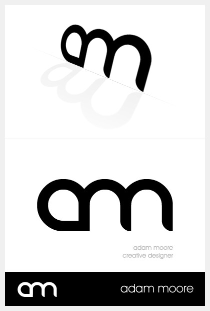
I just have a question, what font is used for the "am" logo/wordmark. And again, nice work, great gallery.
👍: 0 ⏩: 1

I don't know. *woyte made that logo for my custom, so...I don't even think it is a font.
👍: 0 ⏩: 0

Carbon was the replacement for this
👍: 0 ⏩: 0


you should scrap the nav, and make it into a bookmark thingo...
👍: 0 ⏩: 1
That design is scrapped anyways
👍: 0 ⏩: 1
*sniff* *sniff*

👍: 0 ⏩: 1
Carbon is the one that will be used, however
👍: 0 ⏩: 0

Really awesome work. I love the black, it makes the whole design look so classy...
👍: 0 ⏩: 1

Check out the Interface - Carbon, should be about 2 deviations newer. Carbon is what Phantom was suppose to be, but never was anyways
Glad you like it.
👍: 0 ⏩: 0

Nice work on this (and even at that, I've said more than most of these fuckers). I dig the "dark, but minimalistic" atmosphere you were going for, makes for quite a nice profile site.
👍: 0 ⏩: 1
Yeah I might actually put a few hours into this one when I get back to my apartment. I am down at my actually home right now as my Jeep is getting repaired...$557
")
👍: 0 ⏩: 1
If the problem was good, and if you're getting new parts, $557 actually isn't that bad.
And that's cool, I'm looking forward to seeing what you'll do with "Phantom".
👍: 0 ⏩: 1
 (Smile)")
👍: 0 ⏩: 0

Thanks. It was done by Woyte - [link]
👍: 0 ⏩: 0


 (Wink)")

Adam, I just love your work! It inspires me. Thanks so much!
👍: 0 ⏩: 1
Thanks for the very kind words, Nexis
👍: 0 ⏩: 0

wow i really like this one, its really hard to pull of a monochromatic scheme and im pretty sure you nailed it
👍: 0 ⏩: 1
I'm going to work more on this and see what else I can do to it. Thanks for the comments
👍: 0 ⏩: 0


nice ")
👍: 0 ⏩: 1
I need to learn about how to make it more glossy before I can make it more glossy
👍: 0 ⏩: 1


| Next =>