HOME | DD

elusive — Apollo Card

Published: 2007-04-30 18:45:13 +0000 UTC; Views: 1135; Favourites: 20; Downloads: 0
Redirect to original
Description 
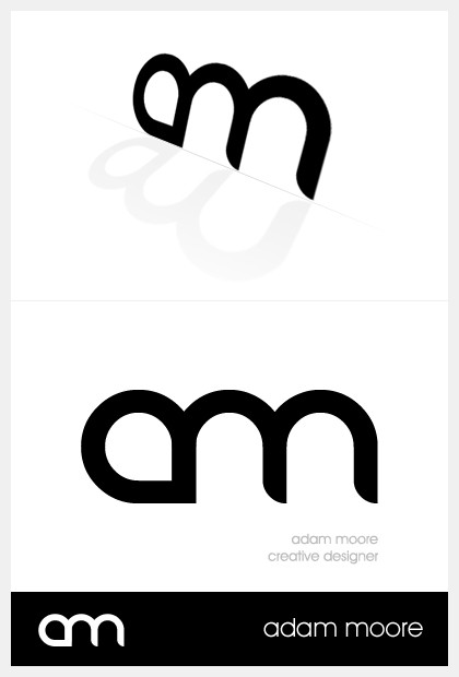
A simple easy-to-print design (monochromatic).

This is accompanying a design that will be uploaded shortly too. I may change this around a bit as time goes on.

*Moved to scraps.
Related content
Comments: 27

prototype03 [2007-06-29 16:39:58 +0000 UTC]

don't move this to scrap, I like it better than your other business card. I love it! + fav

👍: 0 ⏩: 1

elusive In reply to prototype03 [2007-06-30 15:13:56 +0000 UTC]

Thanks haha

👍: 0 ⏩: 0

mjarosz [2007-05-03 15:49:54 +0000 UTC]

Good job!

👍: 0 ⏩: 1

elusive In reply to mjarosz [2007-05-03 15:52:17 +0000 UTC]

ty

👍: 0 ⏩: 0

batetooz [2007-05-03 05:49:33 +0000 UTC]

nice face font

👍: 0 ⏩: 0

popcorn-pops [2007-05-03 02:33:52 +0000 UTC]

You're running for President?

Looks really cool though, great choice of a font.

👍: 0 ⏩: 0

zaoris [2007-05-02 20:49:09 +0000 UTC]

Nice logo there, some colors would have looked better, imo

👍: 0 ⏩: 0

krdnha [2007-05-02 13:14:06 +0000 UTC]

nice design man! it seems elegant and simply

👍: 0 ⏩: 0

inde-blokcrew [2007-05-02 12:37:20 +0000 UTC]

bravo! really beautifull and clean!

👍: 0 ⏩: 0

szyszylagfx [2007-05-01 10:24:13 +0000 UTC]

IMHO its not a good idea to depend only on freeware font which is used almost everywhere

👍: 0 ⏩: 1

elusive In reply to szyszylagfx [2007-05-01 12:05:09 +0000 UTC]

I'm not actually using this for print, the font is pretty generic too No worries. This was just for something to do.

👍: 0 ⏩: 0

7s-1k [2007-05-01 08:14:28 +0000 UTC]

I like your simplistic typography, I still don't get it though
I tried to play around with typography, but I can't seem to get it right :/
Ah well, nice job mate

👍: 0 ⏩: 0

ryangolla [2007-05-01 07:36:00 +0000 UTC]

Very simple design and professional! Great work!

👍: 0 ⏩: 0

kaethor [2007-05-01 06:37:03 +0000 UTC]

NIce my friend!

👍: 0 ⏩: 0

WorksByRaj [2007-05-01 06:10:13 +0000 UTC]

Nice work adam .. do like work what is it

👍: 0 ⏩: 0

roboflexx [2007-05-01 05:38:49 +0000 UTC]

NIIIIIIIIICE

👍: 0 ⏩: 0

alias-unr [2007-05-01 01:55:08 +0000 UTC]

Simply amazing!

Really like it, simple and professional.

👍: 0 ⏩: 0

NecroticNecro [2007-05-01 00:33:30 +0000 UTC]

looks good, i should really start making some of these.... meh, keep it up dude!

👍: 0 ⏩: 0

niponwar [2007-04-30 23:08:14 +0000 UTC]

very nice man, you have some originality at putting the text, logo and another things there!

👍: 0 ⏩: 0

TigerSystem [2007-04-30 21:21:59 +0000 UTC]

very nice card i like the logog

👍: 0 ⏩: 0

univrsltransl8r [2007-04-30 21:10:47 +0000 UTC]

Great job, man! This is awesome. I love that font! You have really done it justice.

👍: 0 ⏩: 0

blindfoldchalito [2007-04-30 20:17:22 +0000 UTC]

cool card!!

👍: 0 ⏩: 0

BloodGhost [2007-04-30 19:17:43 +0000 UTC]

what font is that?

👍: 0 ⏩: 1

elusive In reply to BloodGhost [2007-04-30 19:27:04 +0000 UTC]

Danube.

👍: 0 ⏩: 0

shftfrm [2007-04-30 19:08:14 +0000 UTC]

looks cool, like the round parts.

what's the reason for this? new website?

👍: 0 ⏩: 1

elusive In reply to shftfrm [2007-04-30 19:10:23 +0000 UTC]

Just something to do.

👍: 0 ⏩: 0

archnophobia [2007-04-30 19:07:12 +0000 UTC]

nice idea

👍: 0 ⏩: 0