HOME | DD
 elusive — Interface - Carbon

Published: 2006-10-23 03:27:50 +0000 UTC; Views: 96696; Favourites: 671; Downloads: 0
Redirect to original
Description
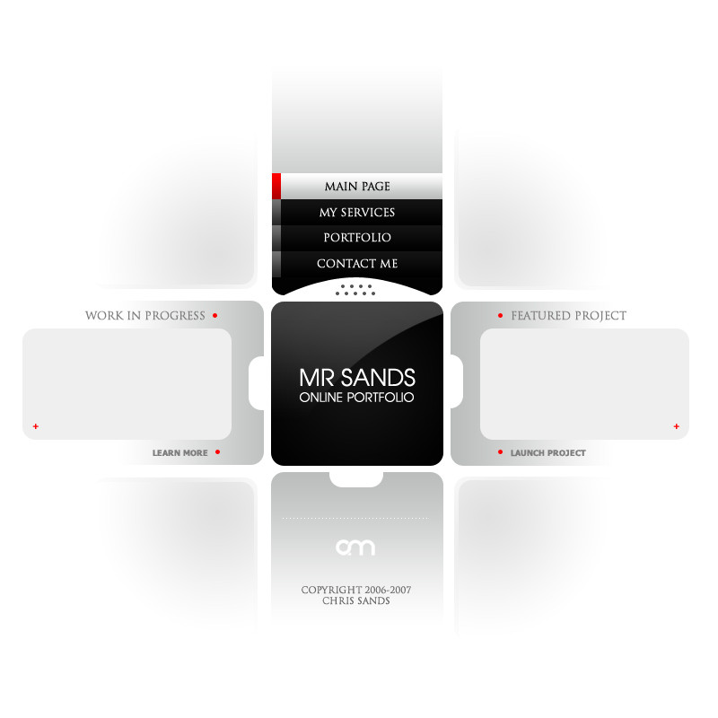
A work in progress. This one actually might get made for exino.comI only showed two of the pages in the preview, and they're not final designs. The main image will be done in flash and will most likely end up looking a lot different.
Anyways let me know what you think!
 (Smile)")
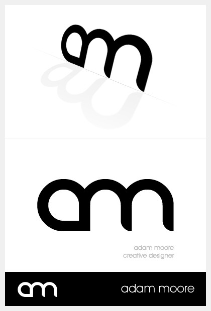
*The AM logo is thanks to my friend Woyte ([link] ). Be sure to check out his gallery!
Related content


Comments: 483

Clear. I love the black. the logo font looks like last.fm's .. Take care.
👍: 0 ⏩: 1


wow real nice, i like how theres almost nothing there with the design but really theres so much.
👍: 0 ⏩: 1

Glad you think so. Thank you
👍: 0 ⏩: 1

BTW, Can I ask you something? A kind of a favor? How do you do those gradients? Like the one in the buttons... black and another lighter color... it gives such a great look to the interface, and I never get that effect in my works
")
👍: 0 ⏩: 0


This is so smooth. Its not flashy like all the other pages or modern tech that I'm use to. Something so simple can speak so much. And god knows black on black is anything but easy to pull off.
👍: 0 ⏩: 1
I hope people don't think my design coming sucks and want Carbon instead ")
👍: 0 ⏩: 1
I dont know if its the booze or drugs but Im way confused by your response. What do you mean by "carbon" like a texture?
👍: 0 ⏩: 1
nah, the deviation"Carbon" (featured deviation) that we're talking on
👍: 0 ⏩: 1
goch ya sorry its been a long week. I feel like an idiot.
👍: 0 ⏩: 0


I really like this one, Adam. Nice colours and composition, nice job!
👍: 0 ⏩: 1
Thanks man. Glad you like it, and thanks for the 
👍: 0 ⏩: 0

 (Wink)")


Reminds me of apple tv..
Looking good. Very clean and sharp. One sugestion. Reduce the size of the reflection, just a little bit.
👍: 0 ⏩: 1
Thanks for the kind comments; and i'll look into the reflection
👍: 0 ⏩: 0

Lovely work man ")
👍: 0 ⏩: 1

whoa.. I'm a big fan of dark pages. this rocks.
👍: 0 ⏩: 1


PascalPixel [2007-05-04 18:15:30 +0000 UTC]
this website is absolutely stunning, it's a shame my noa site has been build allready, because this is very inspiring
👍: 0 ⏩: 1

Nice job dude i love colors black blue glow awesome
👍: 0 ⏩: 1

Aww man! The logo for this looks very similar to the one I was creating for my self (autumnights=an). Guess I'll be doing somethin new
Really awesome design though! Sleek, simple, easy to navigate, not too distracting... who could ask for more?!
👍: 0 ⏩: 1
Hey, thanks for the kind comments. I should REALLY start working on it, according to this it was done back in October. I'll probably re-design it now it's been so long lol.
Thanks for the kind comments
👍: 0 ⏩: 1
You're most welcome! I've been practicing a lot making those shiny looking styles. So far I'm failing quite miserably but I'm sure now that I've found your gallery, I'll have some new inspiration

👍: 0 ⏩: 1

wow, it's so simple but it looks badass!
👍: 0 ⏩: 1


<= Prev | | Next =>