HOME | DD
 elusive — Interface - Diamond
Published: 2006-11-24 03:43:52 +0000 UTC; Views: 6502; Favourites: 23; Downloads: 90
Redirect to original
Description
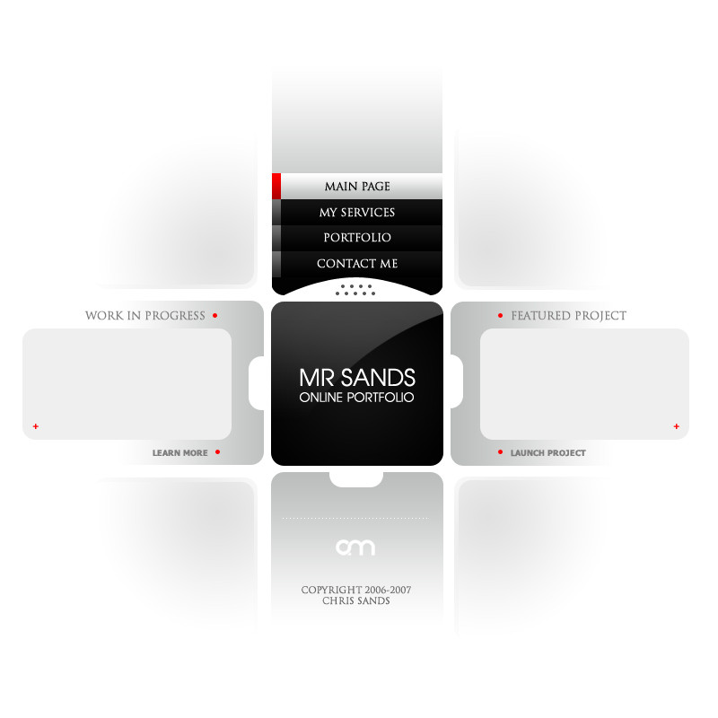
Personal project of mine. Demonstration prototype 2.This is just the main page.
Related content


Comments: 63

very interesting template, will u flash it ?
that could be really kewl
👍: 0 ⏩: 1

I'm not sure. It's a work in progress right now
👍: 0 ⏩: 1
If I could help, don't hesite to note me ^^
Keep up the good work : )
👍: 0 ⏩: 0

youre works are stunning mate. i wish i had youre tallent
👍: 0 ⏩: 1
:S It's not that good. Thanks for the kind comment!
👍: 0 ⏩: 0

looks nice. and by the way mr sands is another name for fire. indeed
👍: 0 ⏩: 0


Very nice and fresh design. It really sets apart from the generic layout every site seems to have.
👍: 0 ⏩: 0


")


 (Smile)")
👍: 0 ⏩: 0

A lot more interesting than the red version you've got. However, I think I'd need to see how this navigates/functions. Right now I like the simplicity, though.
👍: 0 ⏩: 1
I'll probably do a crazy version of it later with a lot of details and polish. I hope lol
👍: 0 ⏩: 0


I like that alot. The type could maybe use a little work.. I'm not sure it's spot on yet. Awesome stuff though.
👍: 0 ⏩: 1
Yeah I think it could use some polishing
")
👍: 0 ⏩: 0

you what i love about your designs? That no one make same ones like you!  (Wink)")

👍: 0 ⏩: 1
lol well that's a good thing. sometimes they try though (illegally)
👍: 0 ⏩: 0


I do like this. But, the red dots/signs just don't seem like they're needed. I think if you made them black, it'd be a bit more better. They just seem to distract and take away from the sleek-ness of this piece.
👍: 0 ⏩: 1
Yeah it needs some touchup work.
👍: 0 ⏩: 0

A great idea to use a cross as interface.
Actually I would suggest this being flash, because you could make great zooming in boxes or so...
Well, but [link] , what more do we need?
👍: 0 ⏩: 1

Looks very cool, would love to see the transactions between the pages
👍: 0 ⏩: 0
Very nice, not too complicated, but that's a good thing.
👍: 0 ⏩: 0

Very nice, but I think the colors are a little bit too heavy.
👍: 0 ⏩: 0


personally i would work on that menu more ( add lights and so ) , this center of the design - add him better lightning
like it a lot mate
👍: 0 ⏩: 0


Very flashy, very nice, very different, and last of all very unique
👍: 0 ⏩: 0
| Next =>