HOME | DD
 elusive — Interface - Vista Micro

Published: 2007-01-31 18:51:45 +0000 UTC; Views: 22296; Favourites: 122; Downloads: 0
Redirect to original
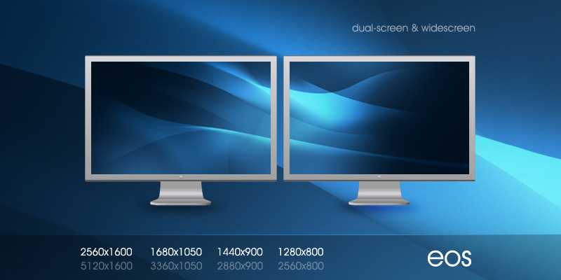
Description
No real point for this. Wanted something shiny and blue, and I remembered "Hey Vista is out?" so I used that as my base for a change.*Windows Vista is a registered trademark of the Microsoft Corporation. All rights reserved.
Related content


Comments: 187

")


very very very good!!!!
so beauti4....
I want original files....
may i...?
👍: 0 ⏩: 0
 (Wink)")

Hmm ")
👍: 0 ⏩: 1

hmm... hey how about making a layout about mac os x? XD
👍: 0 ⏩: 1

If you actually fleshed it out more and gave it a more 3D feel to it, this could be hot.
👍: 0 ⏩: 1
Yeah it was really a really rough go at it. I'm not a fan of it
")
👍: 0 ⏩: 0


nice work here
the color was very strong to send message...
cool vista!!
i like your glasses effect too

👍: 0 ⏩: 1

Thats very professional n very nice colours i like it dear

👍: 0 ⏩: 1

That's like made for Windows Media Center that goes with Vista. Really great.
👍: 0 ⏩: 1

Looks glassy. I like the colors. I have VISTA however  (Smile)")
👍: 0 ⏩: 1
I ment i have Vista and i hate it.... Didn't finish the sentance. Jumped to the next point
👍: 0 ⏩: 0

wow. this is so clean and smooth. i love this look.
👍: 0 ⏩: 1

WOW! one word and it says it all
👍: 0 ⏩: 1


i think it all looks good, but the "Windows Vista" text should be white seeing as the background is rather nearly at white, becomes unreadble to some people.
👍: 0 ⏩: 1


[link] - thought you may want to see this. Thanks a ton for allowing us to use this!
👍: 0 ⏩: 1
Did we completely destroy your work?
")
👍: 0 ⏩: 1

nice, but the message in the center has too much style and no text readability.
👍: 0 ⏩: 1
Yeah It was just a toy around. Thanks for the feedback
👍: 0 ⏩: 0

| Next =>