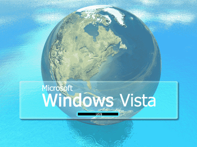
HOME | DD
 elusive — Interface - Vista Micro

Published: 2007-01-31 18:51:45 +0000 UTC; Views: 22185; Favourites: 122; Downloads: 0
Redirect to original
Description
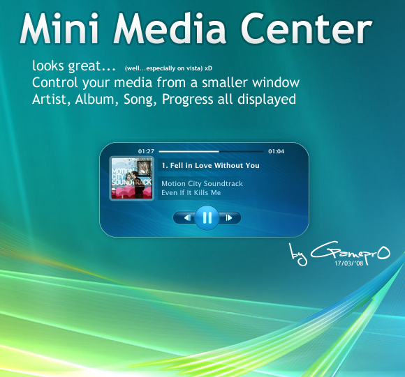
No real point for this. Wanted something shiny and blue, and I remembered "Hey Vista is out?" so I used that as my base for a change.*Windows Vista is a registered trademark of the Microsoft Corporation. All rights reserved.
Related content

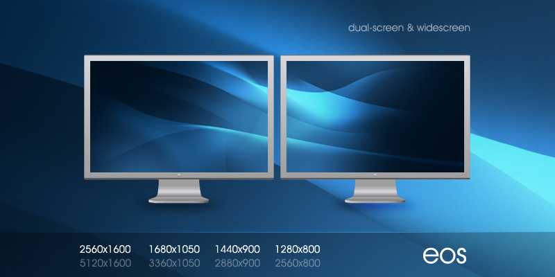


Comments: 187

I was using Vista today. The BASIC HOME upgrade is $129 here. $250 or so for the normal premium.
👍: 0 ⏩: 1

no upgrade editions here too, its rare. (since piracy is widespread here, no XP to be upgraded to begin with)
")
👍: 0 ⏩: 0

amazing interface  (Wink)")
👍: 0 ⏩: 1


This is really shiny!
lol you keep saying red is cool but keep doing things in blue haha....not complaining though!
👍: 0 ⏩: 1
Cool, red & black will make great combination...or perhaps red & white or perhaps.... red & blue??? *confused* LOL.............sorry...just joking!!!
👍: 0 ⏩: 0

I like shiny colors, but I don't like Vista. Linux or XP for me.
👍: 0 ⏩: 1

For interests sake, if you don't have access to the Segoe font that Microsoft are using, you can approximate it with either the original Frutiger, or Myriad. Microsoft rarely use Tahoma or Verdana for headlines these days.
Typography is an important part of branding and layout, as I'm sure you're aware
👍: 0 ⏩: 1


Very nice, you've got the shiney style down pat!

👍: 0 ⏩: 1

")

Should have guessed you made this. Looks amazing as usual.
👍: 0 ⏩: 1


I like it  (Smile)")
👍: 0 ⏩: 1
")

Very different, but it looks great!
Just to nitpick, I would probably blend your logo in the corner differently, so it looks less gray.
👍: 0 ⏩: 1


Yeah, that's why I trashed the one I made you, and you're getting a new one -- I wasn't happy with it.
👍: 0 ⏩: 1

because it has no use by any chance could you give me the PSD file of the other one? I'm interested of going into web design.
👍: 0 ⏩: 0


awesome work man .. really stylish, love it ...
👍: 0 ⏩: 1

awesome interface... definately a lot better than the one that is on the vista site now...
👍: 0 ⏩: 1
<= Prev | | Next =>