HOME | DD
 Emberblue — T-shirt Lettering WIP

Published: 2014-04-16 18:26:54 +0000 UTC; Views: 1024; Favourites: 23; Downloads: 0
Redirect to original
Description
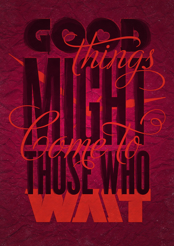
Hey guys, I've been working on this t-shirt design for a while and I need some constructive feedback. The client wants a red shirt with white print. They want hand lettering with this verse in a kind of circle shape. I've been staring at this for too long. Do you have any ideas how I can improve this?"Let no one despise your youth, but be an example to the believers in word, in conduct, in love, in spirit, in faith, in purity." - 1 Timothy 4:12
Related content


Comments: 34


Thank you! 


👍: 0 ⏩: 0

It kind of reminds me of a baseball.
Maybe a circular object like that can inspire something more familiar/catchy?
I think all your work is lovely.
👍: 0 ⏩: 1
lol! Now that you mention it, I see what you mean! lol!
Thank you so much

👍: 0 ⏩: 0

 (Wink)")
")
That is very encouraging to hear. thank you!
👍: 0 ⏩: 1
 (Smile)")


You normally orient the design as a whole straight up and down, so the slight rotation's throwing/putting you off a bit (my guess). It looks good this way though. Just let it go. It's there.
👍: 0 ⏩: 1
Thanks for the encouragement. I appreciate it.

👍: 0 ⏩: 0

It's a tee-shirt. It's not going in the Louvre. For your purposes (and his) it's fine the way it is.
👍: 0 ⏩: 1
lol! I know I know....I just like to always improve my skill.
👍: 0 ⏩: 0

Epicness! It's amazing!!
But If you are looking for a critique ( And it's really really hard to find one) ; Do something about the 'But'. It's fine as it is ( as in it looks great!) but do something so it stands out a little and becomes sort of a turning point for the verse, not a little side point tacked on the end, you know what I mean?
Everything else is utter perfection!
👍: 0 ⏩: 1
Thanks for that!
I know what you mean. I had a difficult time with the "but"
Thanks so much!
👍: 0 ⏩: 1
No problems!
Is it working out for you?
👍: 0 ⏩: 1
Honestly, I haven't made any changes yet. I gave it to my client to see what they think before I change it and they are still thinking about it. They like it, just haven't made a final decision. So I might not need to change anything.
Thanks for the input!

👍: 0 ⏩: 1
WooHoo!! That's what I like to here!!
And no extra work for you!
👍: 0 ⏩: 1


I feel like something just isn't right. It looks awkward and off balance. I just can't place my finger on it.

👍: 0 ⏩: 1

Nonesense, there is perfect balance.
👍: 0 ⏩: 0