HOME | DD
 EnamoredGhost — It's Harsh in the Gray
Published: 2016-10-11 02:28:52 +0000 UTC; Views: 743; Favourites: 45; Downloads: 6
Redirect to original
Description
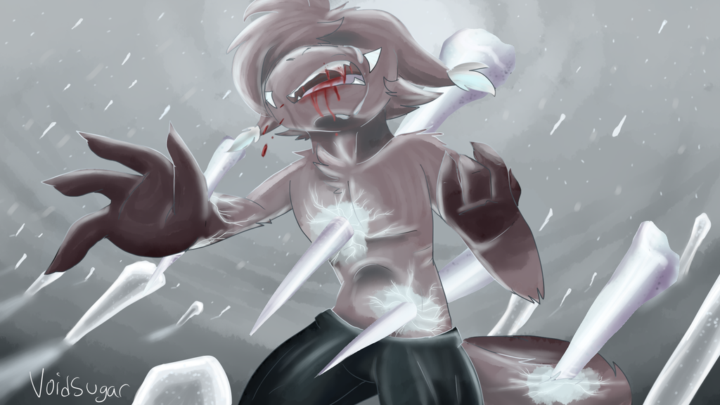
I used to be passionate. Then I ruined everything for myself.---
a second icy boy for the day but this time with ANGST
i feel like i FRICKED up the anatomy/perspective here but. o well ig.
Related content


Comments: 7

whenevr something is 1920 by 1080 i instantly love it
its full
it has room for perspective
a lot can be done within it
really, all i have to say is positioning the head for perspective, but other than that, id say it all goes really well! its a nice picture and theme, a great one!
your color choice is real nice too
practice and have fun with blurs, perspective, and hardlines, see what you can play with!
nice job tho!! vasha always gets my attention aaaaaaggha i lova the bab
👍: 0 ⏩: 0

This is honestly one of the best pieces i've ever seen from you! The perspective and anatomy are beautiful in my opinion!! The way the ice pierces his skin is very realistic but also has a 'Illusion' type quality.
👍: 0 ⏩: 0


ALRIGHT! Let me take a crack at this critiquing thing.
First off, I like it cuz it's about pain. You get to be evil and hurt your character which of course is fun. But I think you could've gone further! His body posture could've shown pain a little better. But on the other hand, I think this posture works pretty well too.
Perspective needs more work. So does anatomy. That arm coming outward is very awkward and if you compare both arms, one looks skinny and short while the other looks thicker and longer. It could've used way more work.
Composition wise, it's not too bad. Except, you cropped off the top of his head/hair. Maybe you have moved him down the canvas more. Personally, I would have drawn it out in a portrait canvas instead of in a landscape. Since the image is taller rather than wider.
On the other hand, those ICICLES!!! They look amazing like... I COULD TELL RIGHT AWAY THAT IT WAS ICE!!! Unfortunately, because the icicles are pretty realistic, the character starts to look flat in comparison. Better shading on the character would've helped.
Also, You kinda always know which are the right colors to choose, too. Like the correct temperatures and which will complement each other while also giving the correct mood! Color and temperature is this piece's strength.
This piece isn't all that bad. I would've wanted it to be more "painful" tho. But then again I'm a sadist lol. The temperature and colors on this are amazing and the ice looks great! The anatomy and perspective are definitely the weakest point of this and needs to be fixed. As a whole, I don't think it's quite finished so you can still work on it, if you want to.
Not a terrible job, I like it, but needs work.
👍: 0 ⏩: 0

he needs some milk
but seriously this is pretty nice in terms of anatomy :'y
👍: 0 ⏩: 1

👍: 0 ⏩: 0

I HAVE EXPERIENCED A SUPANATURAL EVENT
MY WORLD HAS BEEN SHAKEN FOREVER
cool picture
👍: 0 ⏩: 0