HOME | DD
 engkit — Draw this again: Fire Enchanter

Published: 2012-10-24 16:38:53 +0000 UTC; Views: 29068; Favourites: 686; Downloads: 200
Redirect to original
Description
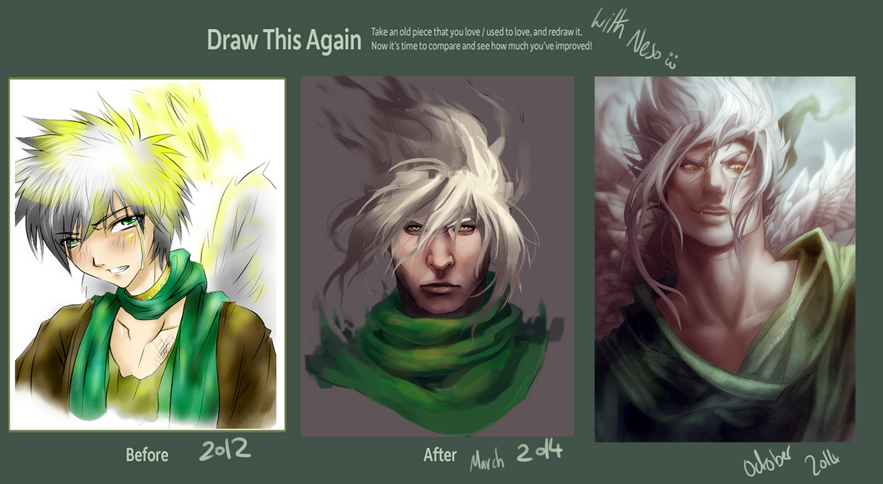
When I saw a friend posting something called 'draw this again meme' I got inspired to remake a drawing. It's been 2 years since I made the original piece.Last year, I got a nice tablet, became a DA member, saw a lot of tutorials and do a lot of practice. I hope I'll keep on improving. I still have a long way to go so wish me luck!
Final artwork: [link]
painting process: [link]
Related content


Comments: 32


If they were two twins, I would take them both xD damn
👍: 0 ⏩: 0


The both are great! I like de 2010 version because resemble a game character.
But the 2012 is great, is so real.
👍: 0 ⏩: 0

Both absolutely amazing! You are a brilliant artist, I must say.
👍: 0 ⏩: 0


Very cool. I can see that you had skillz when you drew the first one but the composition of the second one is a lot more interesting. You can practically feel the tension in the pose like he's coiled, ready to be unleashed.
👍: 0 ⏩: 0


The composition has improved - on the first picture the figure looks rather static - but you added some diagonals to the final composition - and now it looks dynamic) Changing hair direction was also a good decision)
👍: 0 ⏩: 0


Reminds me of God of War. HAHA :'D
Awesome job, btw.

👍: 0 ⏩: 0


The second one looks like he should be saying "Bitch I'm fabulous"
👍: 0 ⏩: 0


I have to say that the first one was better in my opinion
👍: 0 ⏩: 0

Wow, this is an epic exemplar of 'Draw This Again'. The character has so much gravitas in your reworked version - his stance exudes confidence and menace, the armour and weapon have a beautiful continuity to them and the lighting, background and overall style really pop. Superb!
I hasten to add that your original is a good piece - it makes it all the more impressive that you've been able to improve it so effectively...

👍: 0 ⏩: 0

first has better colors, contrasts. second has better shapes and perspective.
👍: 0 ⏩: 0

1st was better. even if I prefer the blade on the left side.
👍: 0 ⏩: 1


I feel like your skills improved and the second's design is more interesting, but I prefer the older one's body...it is more realistic in the first one. Still both are great. XD
👍: 0 ⏩: 0

I like them both, what I like the most is how you bulked him up.
 (Smile)")
👍: 0 ⏩: 0

nice real good love it!
the colours are richer than before and anatomy inprovment nice!
sorry................. i like it
👍: 0 ⏩: 0


Both are great, but of course the newest one is the best. Keep improving like a boss!
👍: 0 ⏩: 0


Jesus, it looks fantastic even in the before picture. You have some serious talent. I really love how everything just flows together so nicely in your finished piece.
Vaaair nice.
👍: 0 ⏩: 0
