HOME | DD
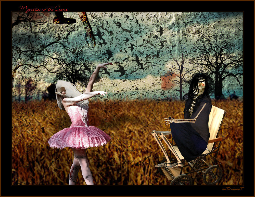
 enticement — Apocolypse

Published: 2005-09-30 19:49:18 +0000 UTC; Views: 1474; Favourites: 27; Downloads: 172
Redirect to original
Description
The storm is coming.Be prepared.
There's a bit of graininess to parts of it, but it was the stock that I used.
First serious attempt at photomanipulation. (The last one I submitted doesn't count.
 )
)Thanks to all the stock I used to make this.
[link]
[link]
[link]
[link]
Related content


Comments: 37

I can see why this is one of your most favorited. It has a lovely magical atmosphere because of the conflicting light directions and the beautiful mixture of colours. The only thing I'm not to sure of with this is it's frame, it seems to bold for the delicate beauty of this piece.

👍: 0 ⏩: 1


the color and wave of the sea looks very great along with the contrasting of colors in the clouds.
👍: 0 ⏩: 1

I have been trying forever to start back manipulating, but I just haven't had the inspiration and motivation to do it... ~thiselectricheart has had some wonderful stockart lately, and I want to use some of it SO badly, but my mindset is on photography so much right now that I can't switch it.
👍: 0 ⏩: 1

well whatever you focus your energy on I'm sure it'll turn out great
👍: 0 ⏩: 0


I have never tried photomanipulation, so I don't have any wisdom to come with, but this is one of the very best I've seen so far!! I'm faving it!
👍: 0 ⏩: 1


Wow, love the light coming through the clouds, amazing.

👍: 0 ⏩: 1
Thank you for the favorite! ^_^
👍: 0 ⏩: 1

I like this alot, i'm not a big fan of skies and seas, but i think this works well  (Smile)")
Thanks for the nice detailed comment too!
👍: 0 ⏩: 1
Thank you... and you're welcome!
👍: 0 ⏩: 0

It's very nice, especially that gorgeous blue in the upper part
👍: 0 ⏩: 1
The blue is my favorite part!
👍: 0 ⏩: 0


the composition is excellent ")


👍: 0 ⏩: 1

O_O Now that... I thought it was a painting at first, or something! Since this is your first go I will be a bit harsh but I do honestly love it, ok?
OK, first off you blened everything really well. The water is great, it looks very natural, although if you had made it either a little greyer or a bit green it would have seemed more flowing, more wild. The sky is lovely, you chose a great stock there and I actually quite like the grain. The high contrast clouds look pretty damn good, although the black is a tad too much, you could try painting over with a low opacity grey maybe? The beautiful siunray look unbelievable, they're really bright and so powerful looking. Also, the way this is long/thin is amazing! It really makes you look down and drink it in.
Amazing work
👍: 0 ⏩: 1
Thank you for the comment and critique!

👍: 0 ⏩: 0


This is a very beautiful attempt at a photo montage, however, the colors and lighting don't quite add up. The bottom half of the image is too dull against the top half. The rays of light seem to be coming from two different sources and, I think to provide more realism, you might want to consider cutting out the middle of the image, merging the two clouds together, and applying some more color correction to the bottom of the piece. Right now, it just look too "torn apart." (but that could be what you were going for!)
Very nice though!
👍: 0 ⏩: 1
They're supposed to be coming from two different sources.
I did apply a lot of color corrections and this was as close as I could get without making it too saturated so I left it alone.
Thank you for the critique!
👍: 0 ⏩: 0

Wow, that's awesome. If that's your first serious attempt I can't wait to see what you come up with after some more practice!!
👍: 0 ⏩: 1
I've done a lot of silly things like Martha Stewart lying on a table drunk, and Kirstie Alley as an iceberg... stuff like that, but this is really the first REAL attempt to make it look really good and I think it came out really well.
Thank you for the comment!
👍: 0 ⏩: 0