HOME | DD
 ericinprogress — Joker
Published: 2006-03-10 19:36:35 +0000 UTC; Views: 3240; Favourites: 33; Downloads: 115
Redirect to original
Description
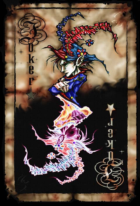
Here's another old piece from a few years ago...Prints available:[link]
Related content


Comments: 10

I would SO buy that deck of cards ")
👍: 0 ⏩: 1

Yeah, it's a project on the books. No idea when they'll be done though.
👍: 0 ⏩: 1
Are you going to design all the deck?
👍: 0 ⏩: 1
It's only in a concept at the moment. I have no clue when I'll actually go through with it, but yeah I'd like to do the whole deck.
👍: 0 ⏩: 1

i want an entire deck like this. But that would probably drive you mad, and that's not a good thing.
👍: 0 ⏩: 0

Those colours are so wonderfully uncomfortable, it´s kinda eerie. Really great!
👍: 0 ⏩: 0


I really like the concept and the top half, but unfortunatly for me, the inverted colours are far too distracting. Perhaps if you made the opposite black and white, or maybe just the outline white and remove all the colour from inside the lines, the mass amount of colour wouldn't be so distracting
Great image, I just think something needs to be done to town down the "loudness" of the colours in the inverted Jester
 (Smile)")
👍: 0 ⏩: 0

I love the idea that rather than simply flipping the joker over, you made both halves complete opposites.
I also love jesters.
👍: 0 ⏩: 0